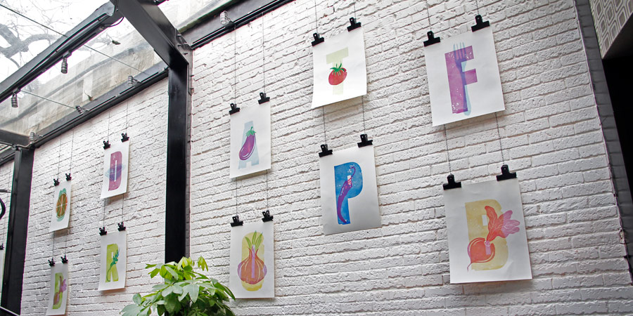
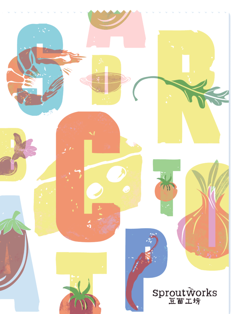
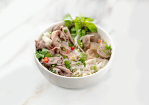
How can you stand out from the crowd by making salads and health food exciting? With potato prints and beetroot blocks!
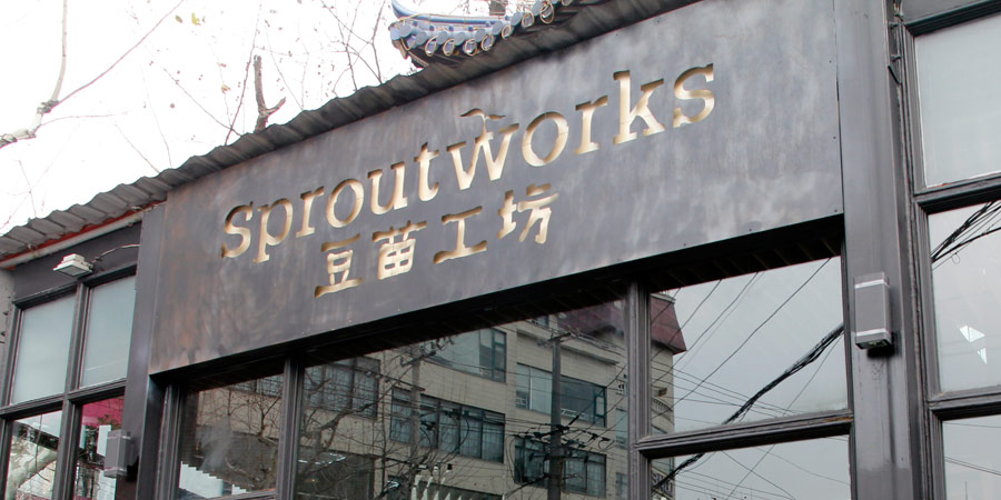
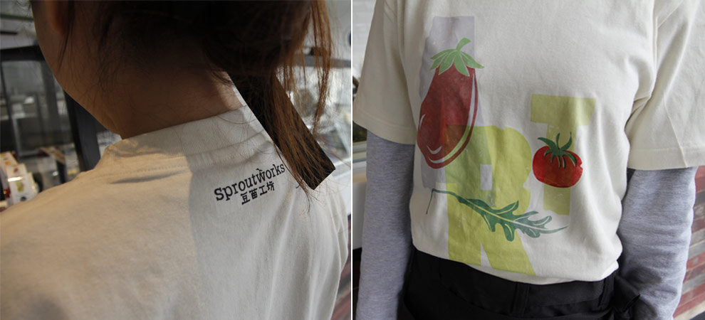
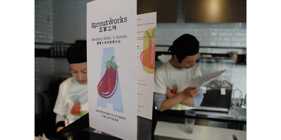
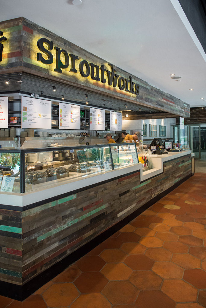
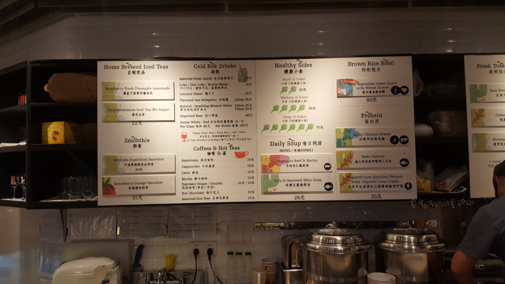
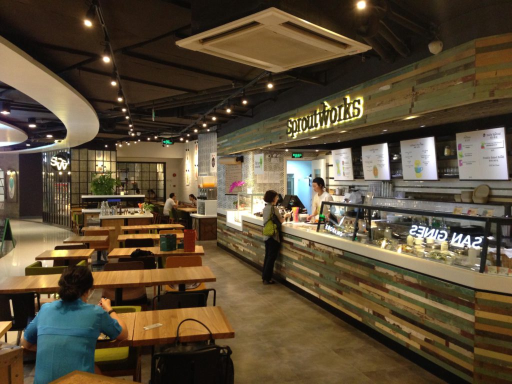
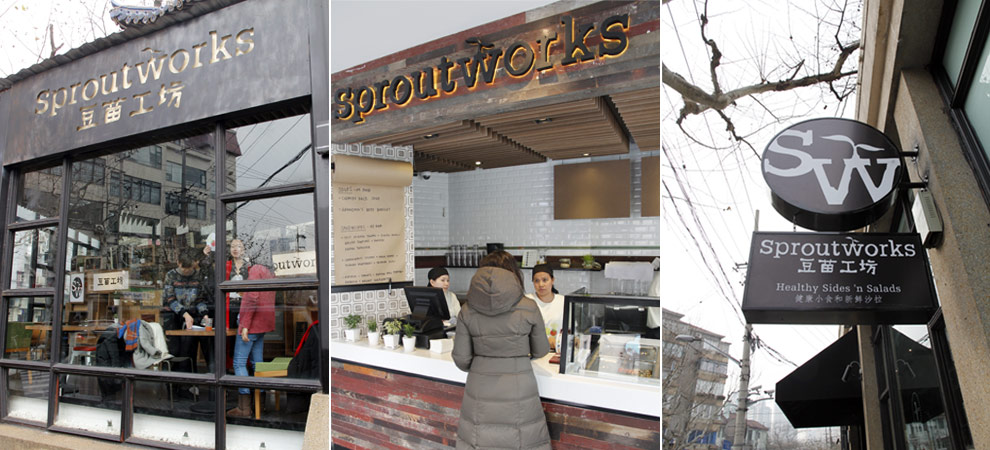
We were asked to pave the way for Sproutworks, a new, vibrant, café concept in Shanghai that specializes in healthy salads and sides. The food served is creative and colorful, so we took this as the inspiration for the project. We wanted to create big, bold art work that looked like it had been made with food. The print style and the color palette draws inspiration from print studios and children’s potato printing. The logo is simple and raw. The name “Sproutworks” was created through a combination of fresh vegetables and creative workshops.
Now a franchise Shanghai venue, Sproutworks is a household name (almost) in healthy eating due to its iconic naming, lettering, brand graphics, logos, interior decoration artwork, menus, website and signage.
We’d love to be able to create a project like SPROUTWORKS Brand Creation with your company. If you’d like us to be part of your team, and create something incredible, get in touch.