Especially from the Gen Z’s and Y’s?
Well if ya think about it, traditional brands can easily come off a bit boring, safe and stale. Yet on the other side, you’ve got a young fresh brand that has the ability to surprise and fuel social media-worthy content. When done well, a collaboration will help both brands. A rejuvenation for the traditional brand and the opportunity to attract a younger audience, while the modern brand can prove it’s value and ability to hold it’s own against a long-standing time tested brand.
With a series of successful crossover cases, brands are paying more attention to these, which ultimately brings more challenge to an agency’s creative work. It’s a fine balance when bringing two brands together. Here we’ve analyzed five crossover cases in the F&B industry from a design perspective.
Star-Crossed Lovers, Finally Together
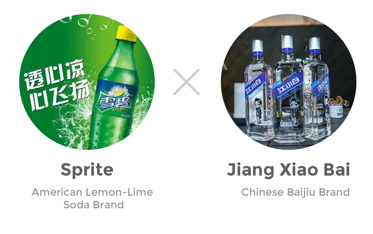
Have you ever seen the movie Romeo and Juliet? That’s the same as soda and baijiu, star-crossed lovers meant to be together but always kept apart. *sigh* Alas, we all know sooner or later they’ll be together! Well wait no longer, Sprite and Jiang Xiao Bai has done us the honour of creating the “Lover’s Tears”. They’ve done all the heavy lifting by mixing these two brands and flavours together.
Two products, packaged as a pair (of lovers, obviously). Sprite, stays non-alcoholic but has the flavours of baijiu. Jiang Xiao Bai, the baijiu, has a bubbly lemon lime touch to it. As they say, a lover’s tears is sad… with a passing of sweetness. *bigger sigh*
The Design Approach
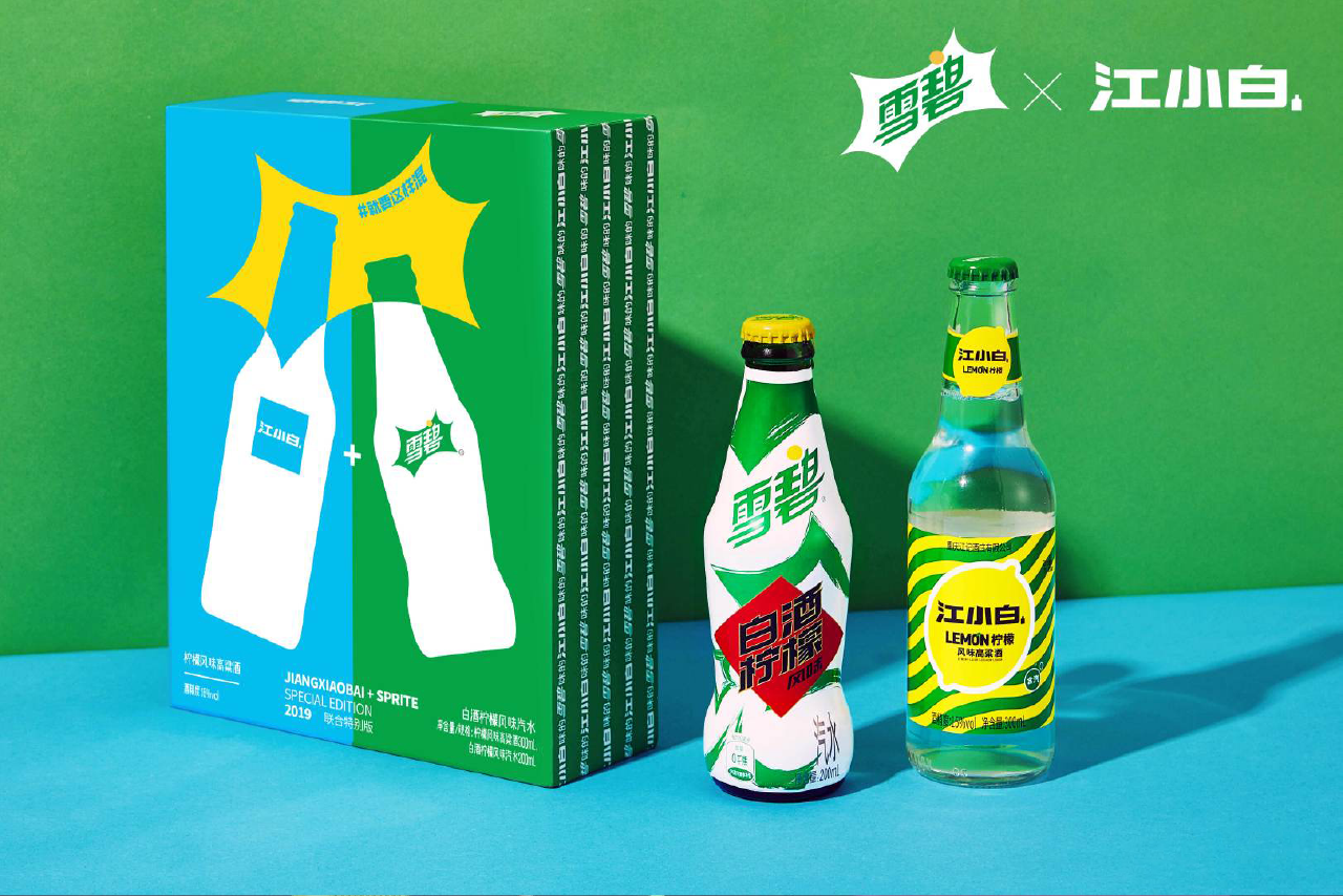
Jiang Xiao Bai moves away from their traditional rectangular bottles and hard lines, but stays within the realm of alcohol by choosing the shape of a beer/cocktail bottle. The bold lemon, colours and geometric pattern are all a nod to Sprite which makes the whole look and feel very refreshing.
On the flipside, Sprite’s design is meant to avoid being too alcoholic. They retained 80% of the classic packaging and only used the traditional red baijiu label design as an ornament.
All packaged up in a gift box that screams ‘Buy me Gen Zs!’
In 60 seconds, 3,000 limited editions sets sold out
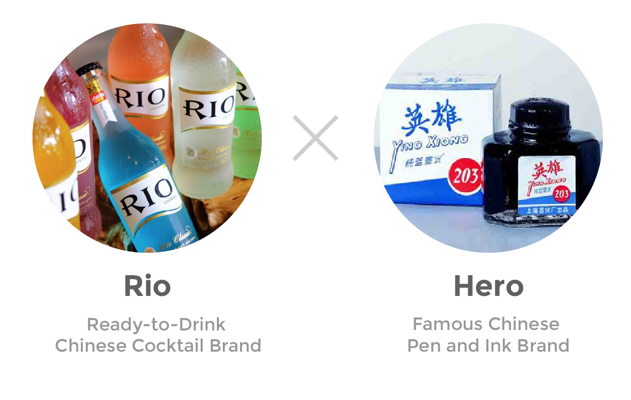
The mashup of a cocktail and ink brand is likely more of a surprise than our “Lover’s Tears” from above, unless you were a kid growing up in the 80s/90s in China! Hero Ink was one of those brands that every kid used, just like Crayola for those overseas. In ancient times, there was a Chinese saying 肚子里有墨水, loosely the meaning is ‘You are a man with knowledge, because you consume a lot of literature’. Ink is used to write literature, therefore also ties to knowledge. Stay with me for a moment. Collaborating with Rio, was an opportunity to reach that same market who used the ink, but is all grown up and drinking now! The idea playing on, become a hero with knowledge!
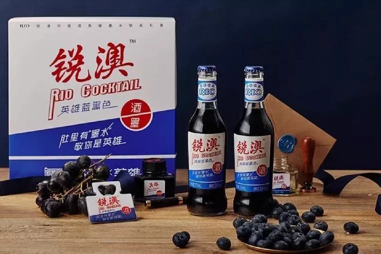
The Design Approach
Nostalgia was key here. The fonts and layouts almost completely refer to the ink packaging of the classic Hero brand. The classic red, white and blue colours were leveraged to create a retro style, even Rio’s logo has been stylized. All of this done with consideration to the “New China” design trend, giving Chinese consumers the feeling of freshness.
Awaken your inner child with the smell of sweet candy
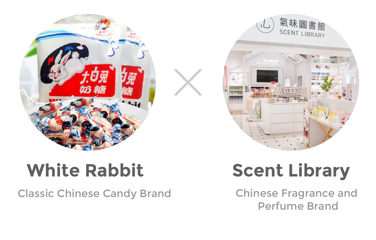
White Rabbit candy is another classic Chinese brand that brings up childhood memories. Over the years this simple and loveable candy became lost in the sea of other candy options. This collaboration with Chinese fragrance and perfume store Scent Library was their revival, releasing shampoo, shower cream, perfume, hand cream and body lotion. Nothing beats smelling like candy to awakening of your inner child and those childhood memories.
The Design Approach
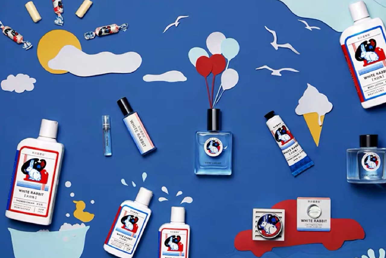
This new line of products are almost entirely based on the classic illustrations and fonts that have remained unchanged for decades. They’ve leveraged White Rabbit’s iconic rabbit image and the familiar wrapper elements to apply against different shapes and applications for a renewed feeling. If you saw this in passing, you could easily have thought White Rabbit launched their own fragrance line instead of a collaboration. As a forewarning, if you’re looking to smell like milk sugar candy, you can only purchase through Scent Library.
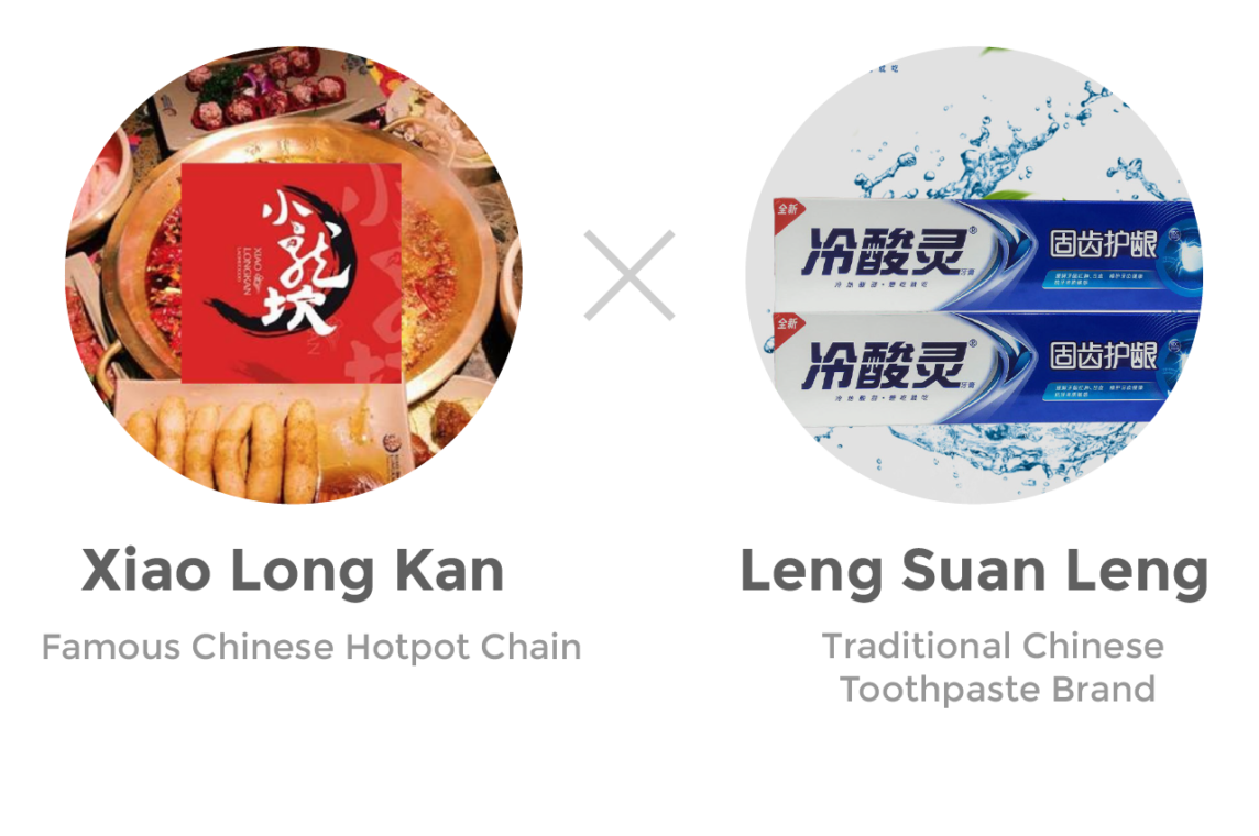
A Lil’ Extra Spice and Minty Breathe
Another head scratcher right? Not really! For decades, the traditional Chinese toothpaste brand Leng Suan Ling’s slogan has been “Cold or hot, sweet or sour, eat whatever you want”. It’s been drilled into people’s minds, so what else would be hotter (in temperature or spice levels!) than hotpot! Cue entrance of well-known hotpot chain Xiao Long Kan, a well-known Sichuanese Hotpot. Marry together these two and out pops three flavours: Medium-Hot, Slightly Hot, and a very hot! Common, I know you’re curious.
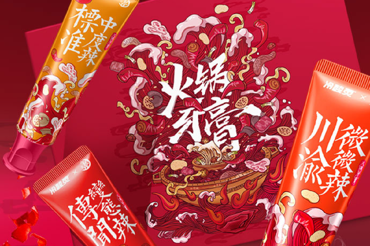
The Design Approach
In reality, this was made for the younger generation and although we’ve seen the nostalgic approach work for that market, this was done on the other spectrum. Get it while it’s hot! Bold bubbling illustrations, firery orange and red colours, punchy fonts – all touching on the hot pot soup flavour packaging. If you’re curious, purchase wisely as spice levels or flavours are split based on colours. Artful hotpot, we’re making it a thing.
Letting tradition take lead and giving it the highest respect
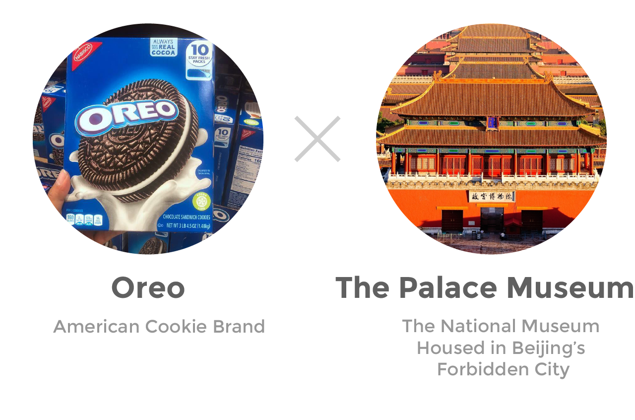
OREO really keeps knocking it out of the park in China. In America, OREO is all about playful fun with a childlike personality. In China, in most cases, has that same personality but with this collaboration you can tell they really took it to heart working with such an iconic piece of history. They integrated the Chinese culture and history with elements of the western brand and biscuit, from a product, packaging and design perspective. Six flavours were introduced, from traditional Chinese flavours like Red Bean Cake and Hawthorn Berries to modern flavours like Green Tea and Lychee-Rose, to savoury meat flavours like Cantonese BBQ Pork Pastry and Spicy Pepper Pastry. It was such a hit, that even western media covered this tie up.
What does the Forbidden City look like made out of 10,600 cookies?
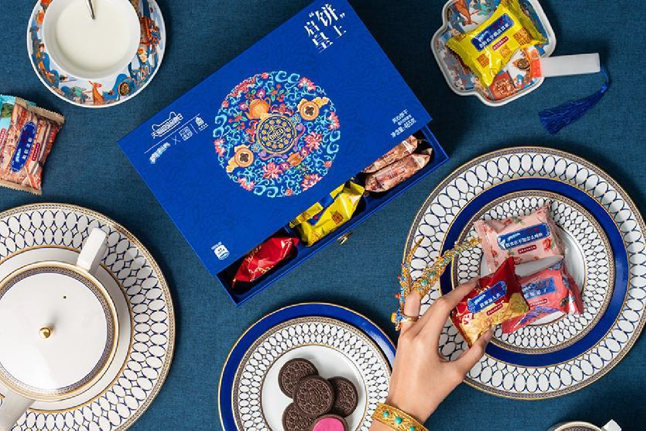
The Design Approach
The only element retained from OREO’s original identity, is the logo and bright blue background colour, almost as a sign of respect to the Palace Museum. The remainder of the packaging adopts a traditional Chinese illustration style while emphasizing the exquisiteness of the space. This beautiful design gives the cookies a (new) premium and special feeling, almost like you should only be eating these in the palace or amongst the cultural relics in the Palace Museum.
Collaborations aren’t an easy win
In the perfect world or for the brands above, they’ve found a way to make 1+1 greater than 2. The individual brands have the ability to shine and as a joint brand through their new product. They’ve succeeded to expand their audience and the influence of their brand. Who would you consider collaborating with?