A Brand Book acts as the core and soul of a company, bearing the brand’s mission, outlook and values. However, in most cases, brands did their Brand Books before they even needed half of those applications. In such cases, assumptions about applications would often come with impractical rules which limits the flexibility of designs or just doesn’t work at all. What’s more, all that unnecessary content gives the illusion that more pages means it’s more important – which is not true!
In any case, we’re here to help banish all those terrible Brand Books out there. Here are 5 Design Principles for you to think about while flipping through your Brand Book.
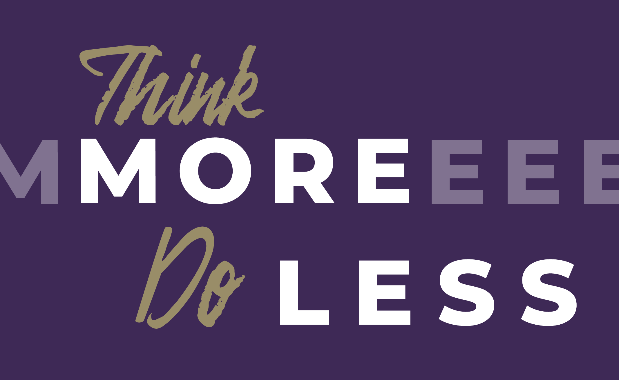
1. Think more, Do less
Many times, brands would develop a range of logo variations to accommodate applications of different media. This may include wordmark, symbol mark, different colour versions and combination lockups. For designers, choosing a logo format from such a number of options becomes a nightmare. I beg you, please don’t do this to us!
In reality, two or three versions for a brand logo are enough for regular usage. Unless there’s a creative request, special versions of the logo should be kept for exclusive cases and separate from regular usage. Fewer versions of brand logos will significantly make other relevant design tasks easier, with a bonus of enhanced brand image in the customers’ minds.
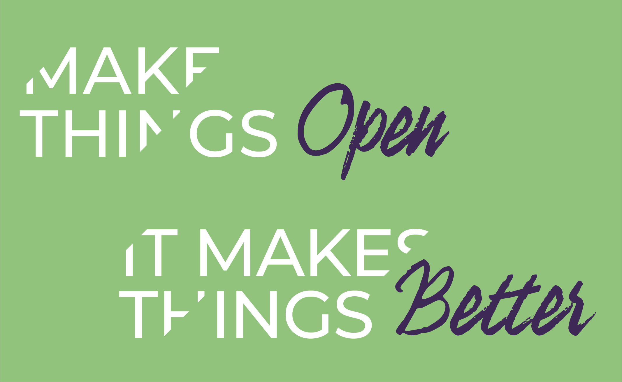
2. Make things flexible to makes things better
Many Brand Books list very specific rules for the logo size and positioning (ie. logo must always be placed on the bottom right corner and a maximum of 1/8 of the total poster height). Trust me, this isn’t always beneficial. You want your logo to clearly stand out but have missed other factors to consider, like whether you’re working on something for large digital screens vs. mobile screens or how close/far the reader is to the piece. Try not to limit the logo, especially if there’s a more optimal layout.
Make rules that are more flexible. When determining the size of the logo, consider the distance between the viewer and media. When determining the location of the logo, consider if anything might block it. Brand Books should suggest a preferred position, then it’s up to the designer to work with the “Dont’” rules to avoid inappropriate usage. Visual consistency is kept, without sacrificing design.

3. Start with the user’s needs
Before planning a Brand Book, know who’s going to use it. For example, some Brand Books have a lot of unnecessary print layout dimensions. If designers are the only users, this would only complicate their job, plus they’re just not interested in all those numbers.
Think about the info you’d actually look for in a Brand Book if you were the user. (Tip: If you don’t know, ask the person that needs to use it!) Adding extra rules doesn’t make the Brand Book more professional. Believe it when I say, designers don’t need this kind of data.
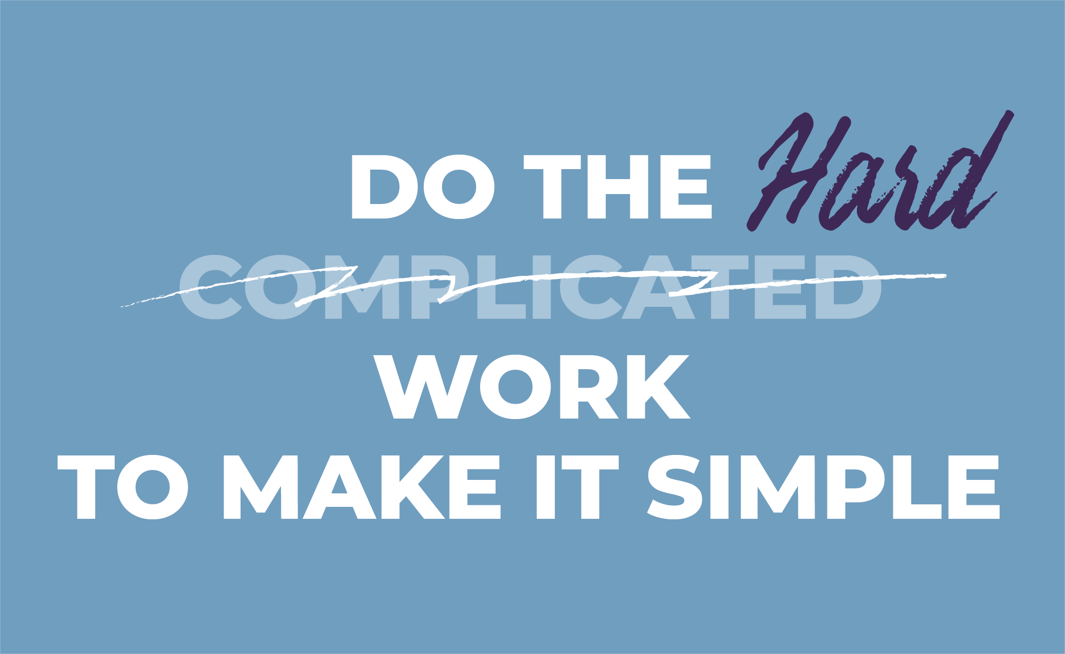
4. Do the hard work to make it simple
Let’s face it, when there’s a huge paragraph of text beside an image, you skip the text and opt for the pretty picture. There’s a major misconception that having more content in your Brand Book means it looks more important, valuable or special. It doesn’t. You’re just wasting the user’s time as they search through all that text.
By visualizing the information first, it’ll help make your Brand Book more concise and clear. When it’s absolutely necessary to list a large amount of rules, divide the information into multiple sections to create a more user-friendly experience. Highlighting key info or take-aways will make life easier for everyone too!
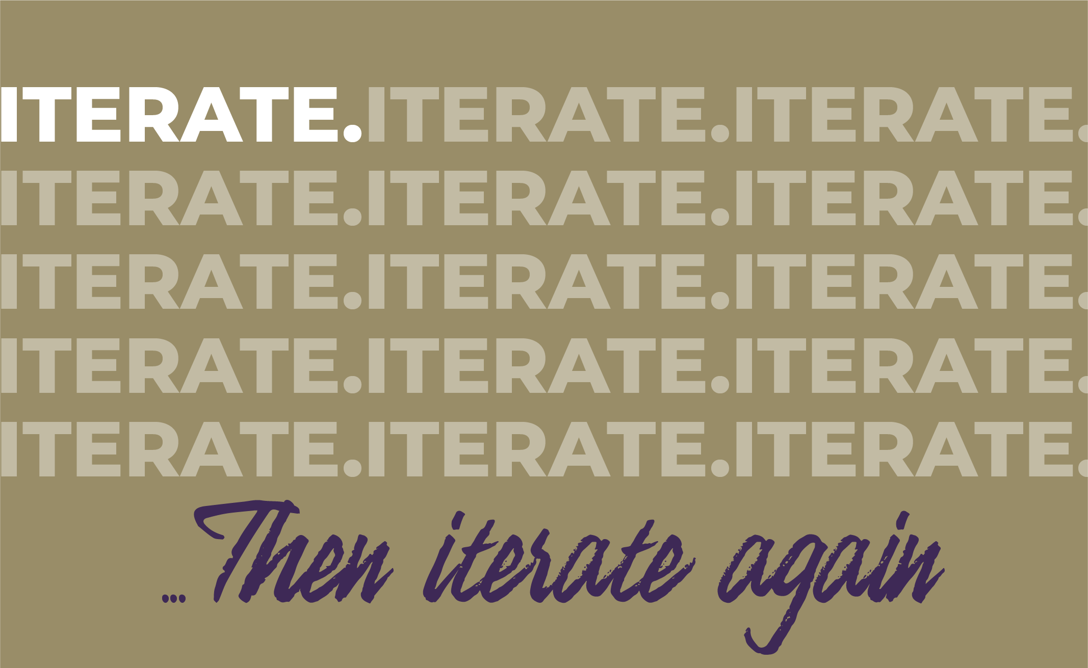
5. Iterate, then iterate again
If your Brand Book hasn’t been updated in more than three years, don’t force designers to follow the rules. Nowadays, things are developing so quickly that everything is changing. If you ignore updating your Brand Book, you’ll quickly find yourself at a competitive disadvantage.
A mature brand is always looking ahead, it’s considering what is relevant to it today and in the next 3-5 years. While the brand’s core value stays consistent, the brand’s expression is always moving to new stages and evolving with the business. It’s not just the visual aspects of design we’re talking about, but also the brand’s behaviours and tone of voice.
Conclusion
The easier it is to understand your Brand Book, the easier it is for everyone who uses it, the better off your brand will be. For so many years, we’ve been on the receiving end of over complicated or useless Brand Books and we beg you to listen, for the greater good of agencies, clients and customers! If there’s one thing we want you to walk away with, it’s that – more content does not mean your brand is more important!
If you have a feeling you might need a bit of work done on your Brand Book, give us a call! We’d love to take a look and let you know what you think.