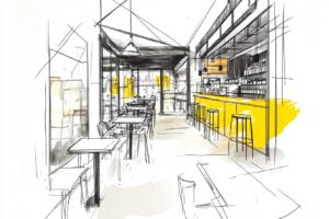
In 2025, we (Thread) think restaurant branding and interior designers for cafes are embracing a nostalgic return to the aesthetics of the 1950s and 60s. We could be wrong, but after spending quite some time in Bali, this design trend became evident, and is leading the way with creative dining experience. We’re seeing a lot of modern restaurant design elements blend with retro influences. Globally, restaurant branding firms are crafting identities that reflect this revival.
Nostalgia on the Menu
This isn’t just a vintage rehash, it’s a reaction to the ultra-sleek, digital-heavy design trends of the last decade. The pendulum has swung back to something more tactile, more human. Ironically, real 1950s diners and restaurants were often garish, kitschy, and not exactly design icons. (and the food was probably awful) But today’s designers are picking up on the charm and exaggerating it into something that feels stylish, warm and welcoming rather than outdated. (not to mention, instagramable, thanks Tod)
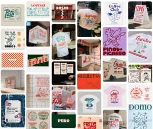
The food and beverage industry has always been influenced by nostalgia, but right now, we’re in the middle of a full-blown mid-century revival. Everywhere you look, restaurant branding is embracing the aesthetics of the 1950s and 60s: bold, whimsical typography, playful illustrations, and a sense of handcrafted authenticity. But why?
Key Menu Design Elements
Typography: Big, Bold, and Playful
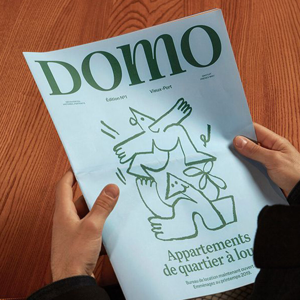
Retro typography is dominating menus, signage, and packaging. It’s all about exaggerated serifs, hand-drawn scripts, and blocky sans-serifs that recall old-school advertising. Playing around fonts inspired by diner menus, soda bottles, and roadside signage. It only need to search cafe branding on pinterest to see how common this style is.
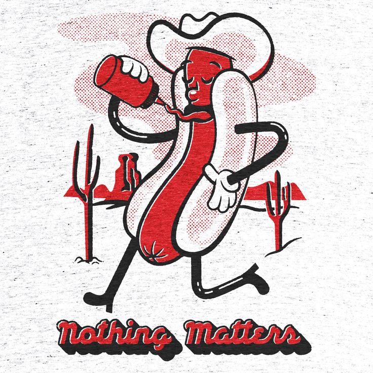
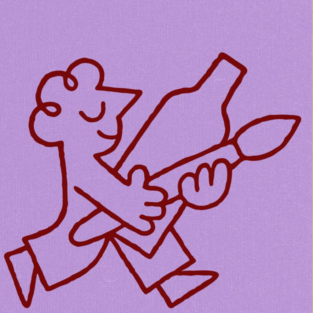
Food Illustrations: A Touch of The Whimsical
Hand-drawn, cartoony illustrations can be spotted all around, and they often feature food with personality—literally. Think hot dogs with legs, dancing lobsters, and smiling cocktail glasses. This trend is already hitting peak saturation, so expect it to fade out soon in favor of something more understated.
Color Palette: Aged, Not Aged-Out
The colors of this trend take inspiration from the past, but they’re not quite as loud as they were back then. What would have been vibrant reds and yellows in the 50s now appear slightly desaturated or printed on natural, textured papers to mimic vintage printing methods. The result is a design that feels nostalgic but not cartoonish.
Designers & Brands That Defined the Style:
If you want to trace this look back to its roots, here are some designers and brands that helped shape the original aesthetic:
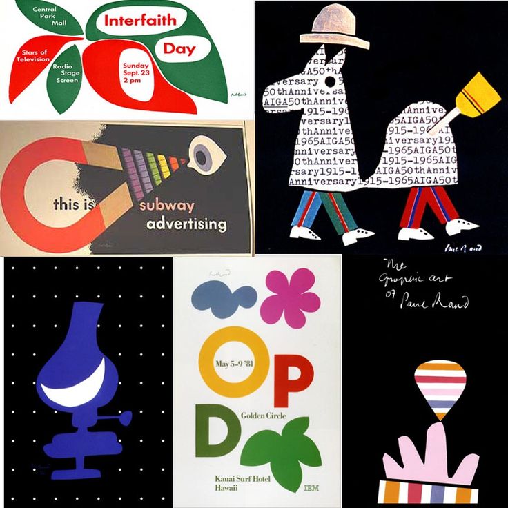
Paul Rand – Graphic designer known for playful yet structured branding (though more corporate than food-focused).
Saul Bass – His bold, graphic style has inspired many modern branding projects.
Historical Origins of Contemporary Food Illustration trends:
This style can be traced back to mid-century European and American commercial illustration, particularly in:
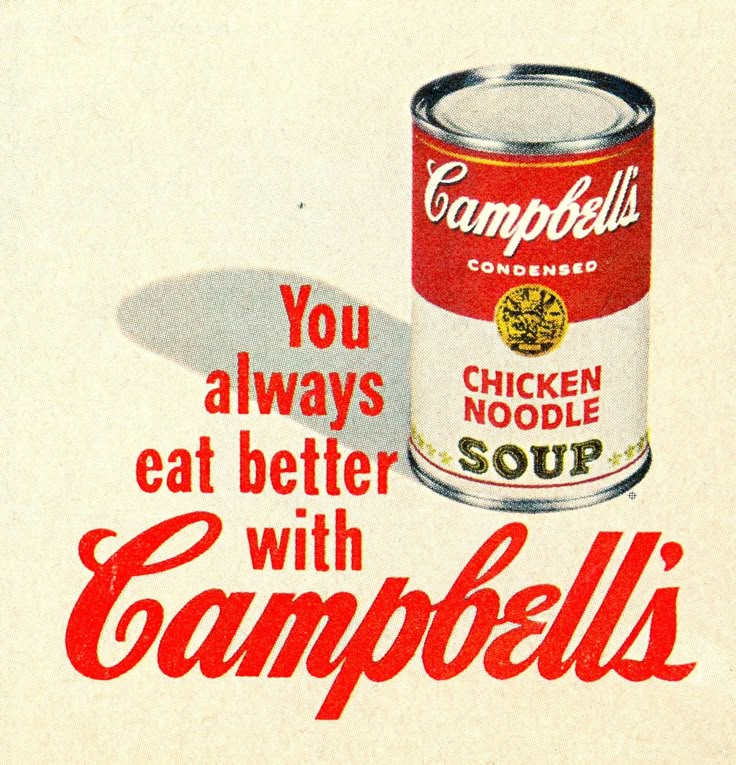
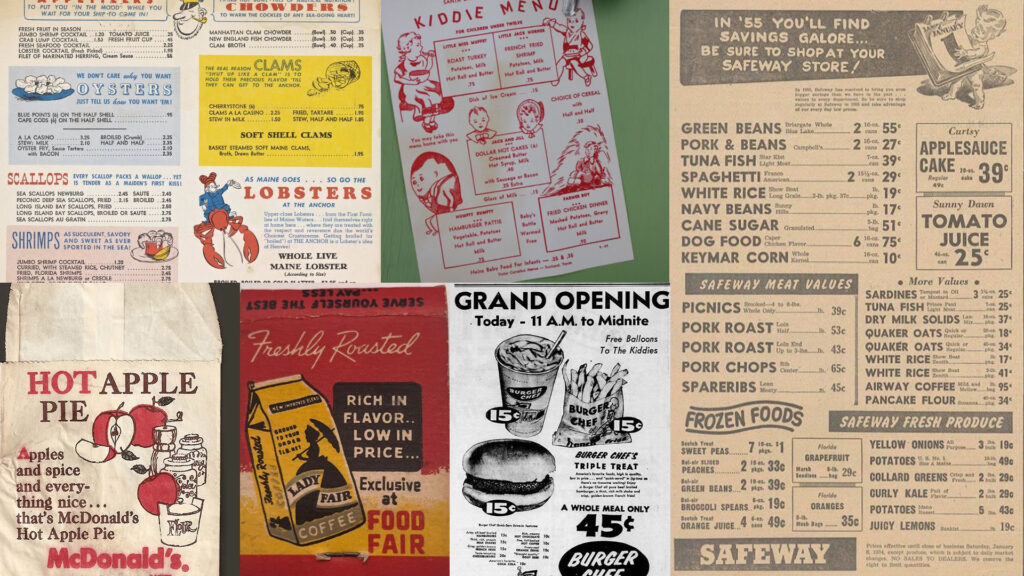
Vintage Food Packaging – Companies like Heinz and Campbell’s had some of the most iconic mid-century packaging.
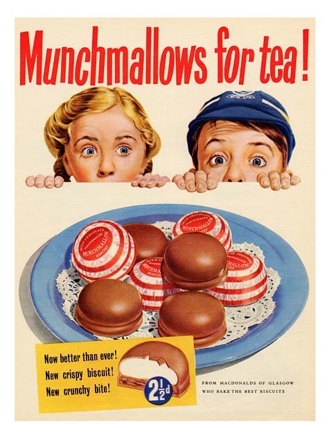
1950s advertising – Seen in work for food, fashion, and lifestyle brands.
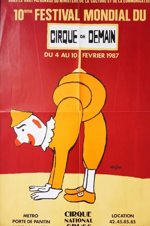
French & European poster design – Artists like Raymond Savignac and Hervé Morvan used simple, exaggerated figures with high energy.
Jazz and restaurant scene artwork – Popular for menus, cookbooks, and packaging in the mid-20th century.
Notable Artists & Influences:
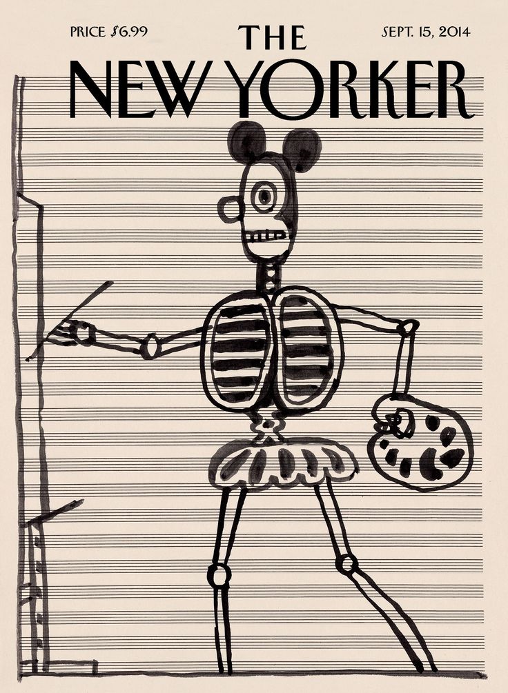
Saul Steinberg – A master of minimalist, witty line work. His drawings for The New Yorker defined this playful but intellectual style.
Beppe Giacobbe – More contemporary, but uses a similarly bold and dynamic line.
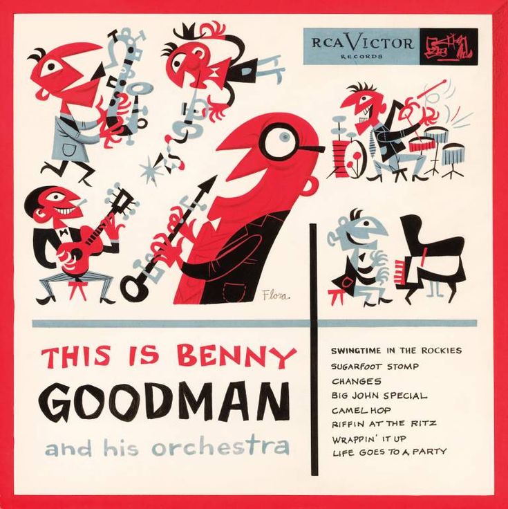
Jim Flora – His jazz album covers from the 1940s-50s share the same energy and whimsical movement
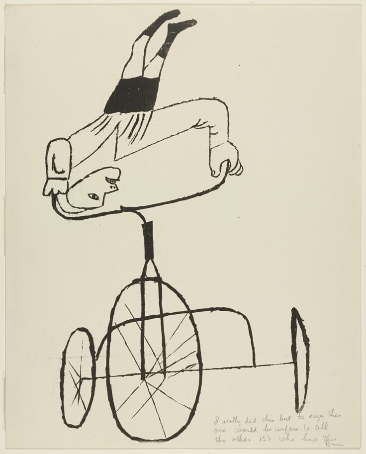
Ben Shahn – Known for expressive, loose figures with a modernist edge
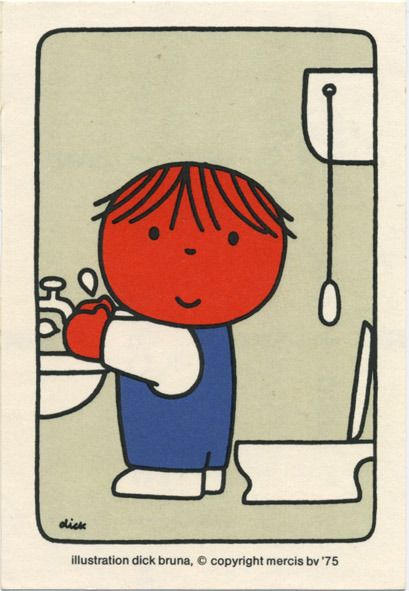
Dick Bruna – Though more minimal, his use of thick, simple strokes has parallels
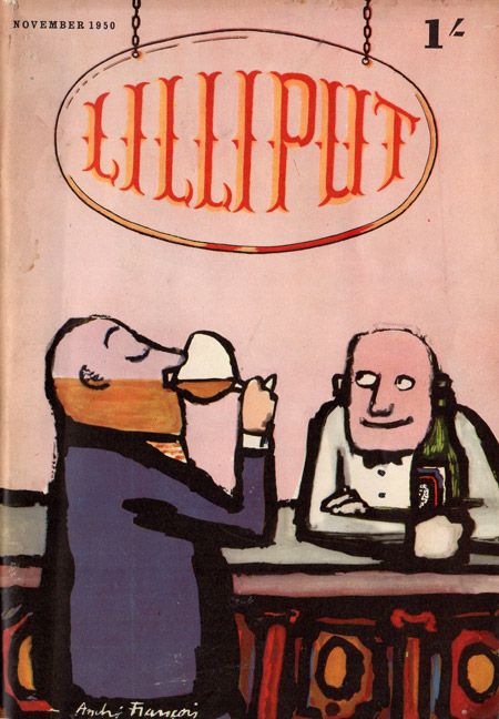
André François – A French illustrator who played with expressive, exaggerated figures
Modern Revival & Usage:
- This style is currently experiencing a resurgence in branding, editorial work, and hospitality branding (restaurants, cafes, organic food brands).
- Contemporary illustrators working in this vein often combine it with digital tools to mimic traditional brushwork.
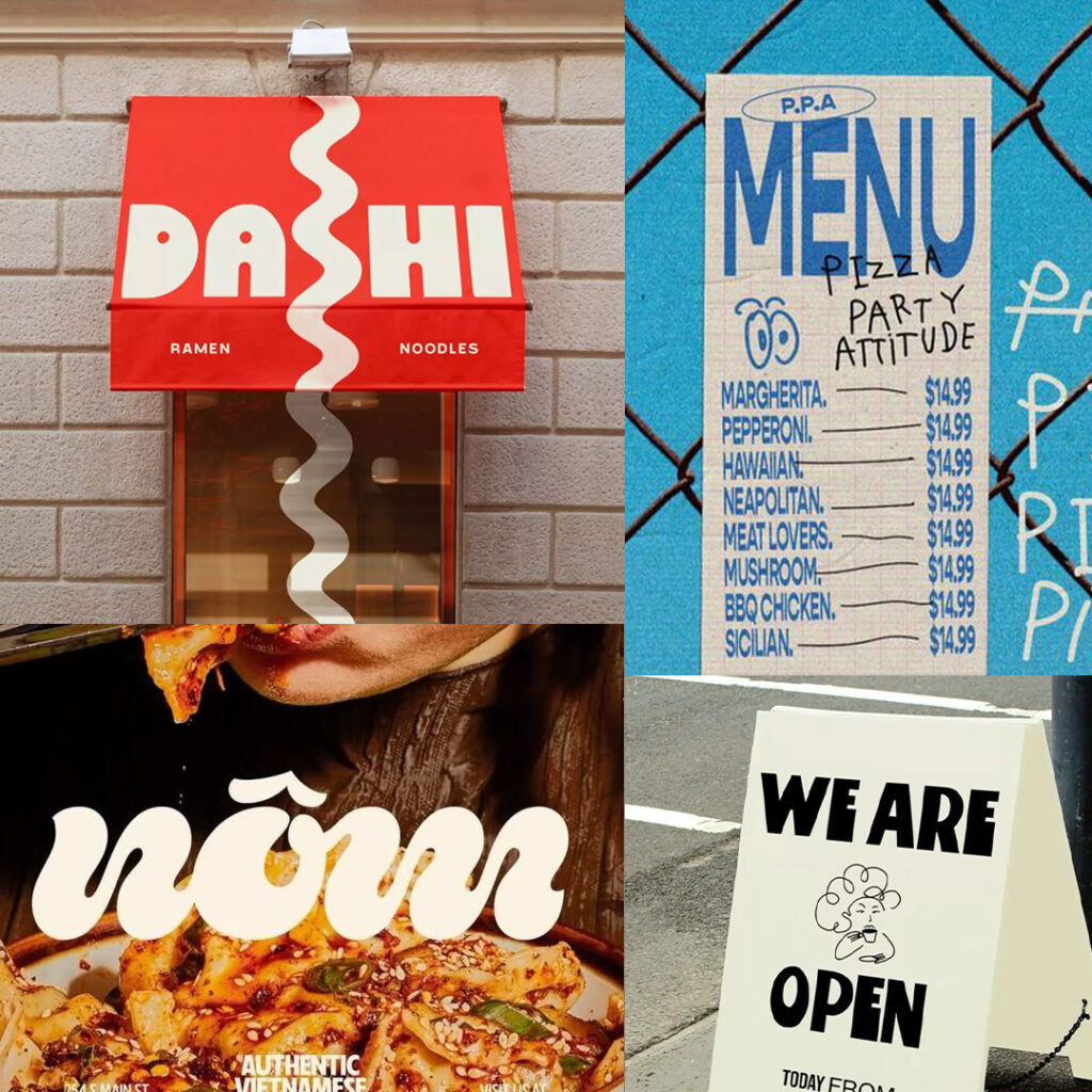
One of the more interesting aspects of this trend is its rejection of digital perfection. The slick, ultra-minimalist designs of the 2010s are giving way to something that looks imperfect—hand-illustrated, rough edges, slight printing misalignments. It gives the sense that there’s a person behind the design, not just a computer.
This plays into the broader cultural movement toward authenticity in food and drink. Restaurants like Bokashi are showcasing their natural ingredients, hand-crafted cocktails, and artisanal sourcing. The branding needs to match that ethos.
A Shift Away from Digital Perfection:
One of the more interesting aspects of this trend is its rejection of digital perfection. The slick, ultra-minimalist designs of the 2010s are giving way to something that looks imperfect—hand-illustrated, rough edges, slight printing misalignments. It gives the sense that there’s a person behind the design, not just a computer.
This plays into the broader cultural movement toward authenticity in food and drink. Restaurants are showcasing their natural ingredients, hand-crafted cocktails, and artisanal sourcing. The branding needs to match that ethos.
Where This Trend Is Headed
While mid-century nostalgia is riding high right now, design trends move fast. The food character illustrations (hot dogs with legs, anthropomorphic sandwiches) are likely to feel dated soon. Expect a move toward more refined, typography-driven branding with subtle nods to the past rather than full-on retro overload.
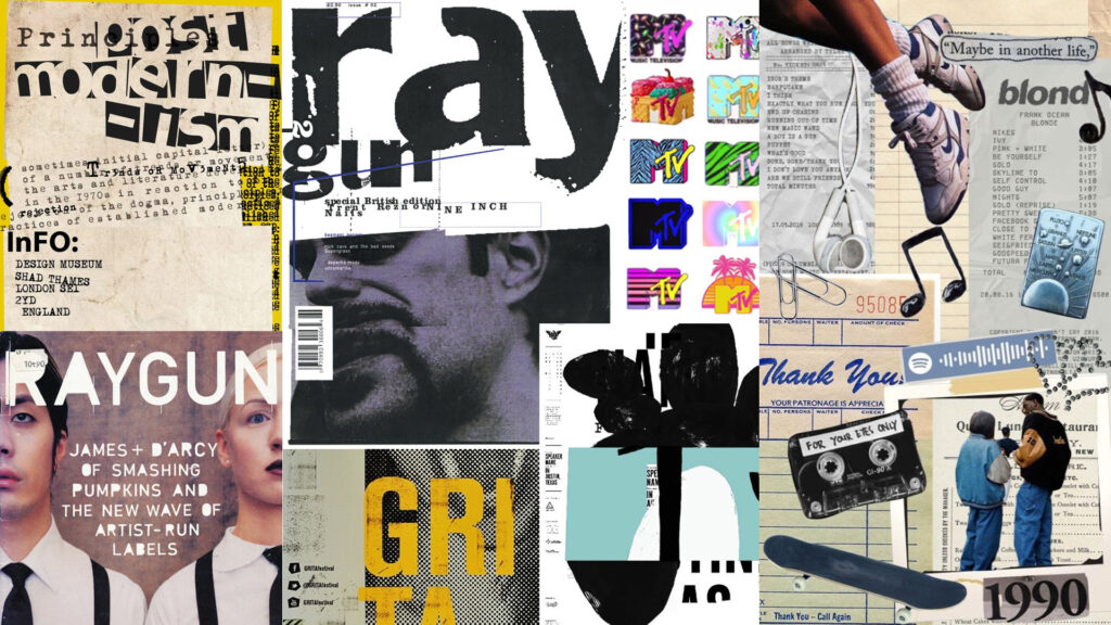
Will ‘90s design be the next big trend? With bold neon colors, playful geometric shapes, pixel art, and grunge textures making a comeback, it sure looks that way. Retro tech, graffiti-style fonts, and Y2K metallics are blending with modern minimalism, creating a fresh yet nostalgic aesthetic. It’s not just about looking back—it’s about reinventing the fearless creativity of the ‘90s for today. So, are we stepping into a new era of ‘90s-inspired design?
Case Study:
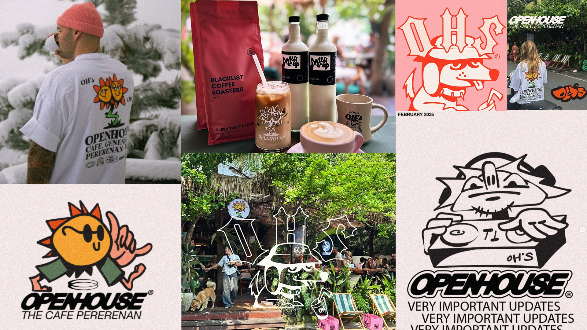
Open House, Bali. Y2K graphics in branding
One of the hottest cafés in Bali right now, Open House. (Honestly, you can’t get a table before 3pm)
A jump from mid century. They use the energetic visual language of the 1990s rave scene. Low tech, hand drawn, underground. Openhouse (OHS) exemplifies this trend perfectly. Their mascots channel the wild-eyed characters of original flyer art, with bold outlines, warped perspective, and that knowingly chaotic energy. For such a young crowd, born around Y2k, this is the 1970’s cool of my generation (Showing my age here)
The VI, by a young Aussie designer, feels rebellious and refreshingly human—an antidote to Canggu’s obsession with generic but cool Pinterest mood board inspired branding.
Visual references for comparison or inspiration:
UK ’90s rave flyers – Designers like Junior Tomlin and Pez contributed to the surreal, graffiti-meets-clubland aesthetic now being referenced again.
Brain Dead – A cult apparel brand whose DIY sci-fi punk look often overlaps with rave-era chaos and illustration.
Fromental’s zines and merch – Character-driven illustration meets Gen Z colour palettes.
Palace Skateboards – Brash, nostalgic, and self-aware use of low-fi digital textures, rave-era typography and mascots.
Boot Boyz Biz – Known for recontextualising underground music and art movements through apparel, including throwbacks to club scenes and anarchic youth cultures.
This new wave of graphic branding isn’t just about looking retro—it’s about feeling like you stumbled across something unfiltered, underground, and alive.