WHAT'S OUR RECIPE FOR THREAD DESIGNED RESTAURANT BRAND?
Deep dive into our process, we're sharing our steps from concept to completion
If you haven’t picked up on the buzz already there is a new super venue in town, not one, but four food and beverage experiences launching at the same time. Bonica, La Mezcaleria, El Paisa and La Barra. Here’s the story of how we pulled the project together.
To give a bit of context, we’ve been doing this since 2005. Over the years we’ve refined our process, introduced as well as removed steps. It’s an ongoing trial and error that evolves with the market. For now we’ve got it down to the following ten steps and this process works whether you’re a tech crypto start-up or luxury Bund champagne bar!
STEP ONE
Research
Deep dive into what’s happening locally and internationally for similar concepts.
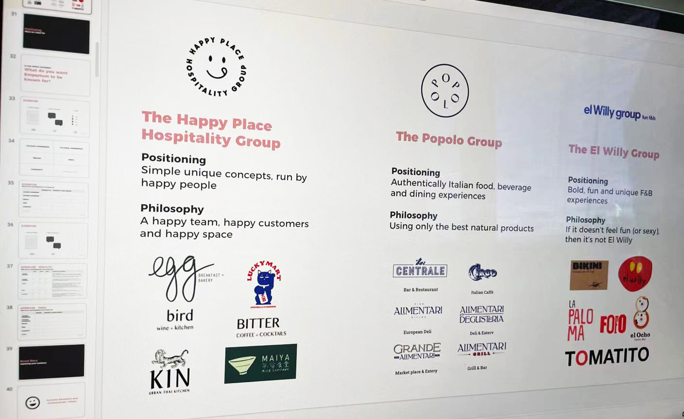
Trends and possibilities change so fast, even after years of branding restaurants there is something new to learn every month. Our research covers stakeholders, competitors and inspiration. Something that is uniquely Thread however is how we look at brands, we try and think about how concepts come together.
It’s our opinion that the coolest brands these days are a mixture of two things.
A great example of this is when you take a concept like Dishoom in UK. It’s a story of old cafes in Bombay, mixed with the story of the building they are housed in (for example a train station or an old movie theatre). The result is a mix of two concepts! It’s our belief that every strong food and beverage concept in the market today brings this fusion together and creates this memorable experience. We look at hundreds of these, present the most interesting ones to the client and from there we turn it into a game!
STEP TWO
Theme Games
How do we hone in on two concepts that’ll mix well?
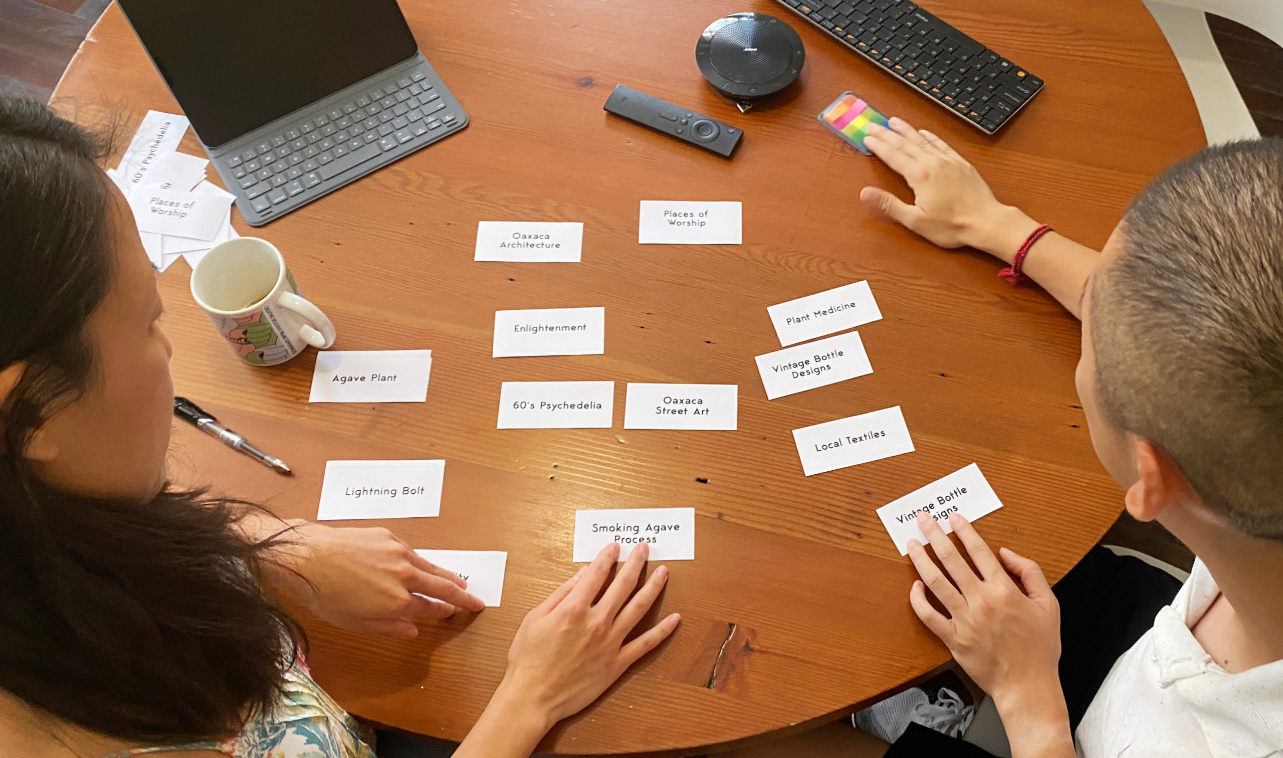
We take into account all the background research, competitor visits, and stakeholder interviews to build our proprietary pairs game that’s tailored to the client. Starting with a set of 50 – 60 ideas that could be the basis of a concept, we play through multiple rounds to narrow down to just two ideas! It’s harder than you think, we swear. Now multiply that by four brands!
For Bonica, this could have been a whole host of romance, the founders’ marriage, shipping, travel, vintage, modern, Spanish, Mediterranean, ports, barrels, historical, ocean or mountain themes! So many possibilities, however together we reduced it down to charcoal cooking and 17th century Spanish trading ships. This became the basis of our brand concept.
From that starting point, we build a story, the identity and the interior design brief. Even the brief for food presentation comes from these two concepts.
The approach was the same for La Mezcaleria. This became a combination of spiritual plant medicine and gritty Oaxaca street art, giving a unique twist on a Mexican bar which could have easily been a cliché of day-of-the-dead skulls, cactuses and sombreros. It’s through this process that enables us to create a concept that stands out and is clear for designers and marketers to roll with.
STEP THREE
Moodboards
Building a story through visuals and creating real emotions
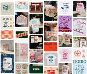
We love moodboards! As the years have gone on, creating new boards has become an art form. We sift through pages and pages of Google images, stock photos, and all sorts of travel-historical-design-food blogs to create rich boards.
Finding examples of the right places, people, textures, objects, furniture and food can take time, especially since they need to fit cohesively together. It takes a jump of imagination from the client side to see how this moodboard of 20 curated images will become their brand in the future.
STEP FOUR
Interior Design
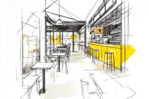
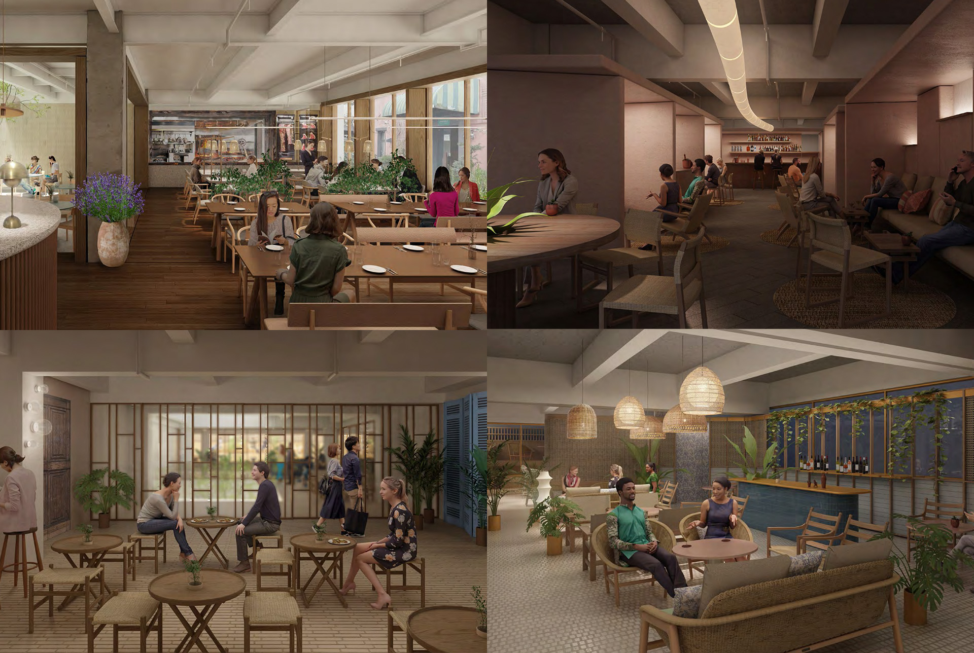
One of the biggest challenges as a branding agency is creating a concept when the interior design has already been decided. This is because our work should help brief and inspire the interior design in the first place. The value that comes from this is a holistic experience the moment your customer walks through your doors.
For these projects, together with the client, we collaborated with the awesome architects at Ortiz Leon. We briefed them with our moodboards and concept directions, and together with the client’s operation team’s input, they incorporated in into the construction plan. Throughout the process, we supported them at a few different touch points as well as furniture and objects selections. The process becomes a two way street, we loved how they used their creativity to inspire our designs further.
STEP FIVE
Logo and Identity
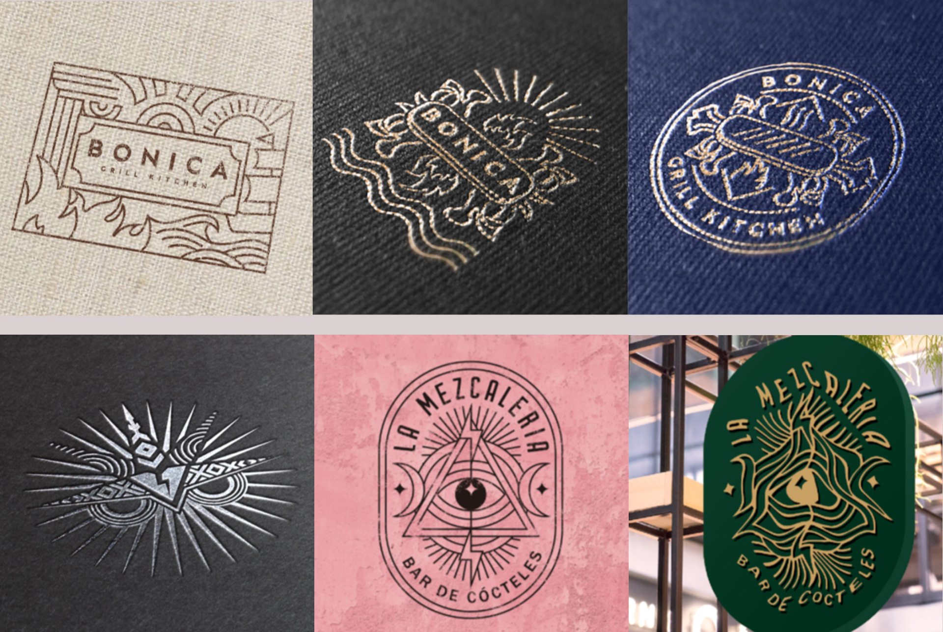
The identity phase of the project is a comparatively small, yet critically important step in the process. With a well defined brand strategy, the amount of design exploration at this stage should be narrow. We know what we want to say and the style that will say it. A logo should be clever, not creative.
At Thread, we pitch designers up against each other to compete for designing the identity. Each designer creates a concept based on the strategy, moodboards and a creative brief. From there we develop two or three concepts, the “winner” is chosen by the client and we refine it until we have the final concept.
STEP SIX
Secondary Graphic Identifiers
Industry mumbo jumbo? Probably, but this is what we call all the graphics that are not the logo
Broadly, this could be quotes, icons, patterns, illustrations, the list goes on!
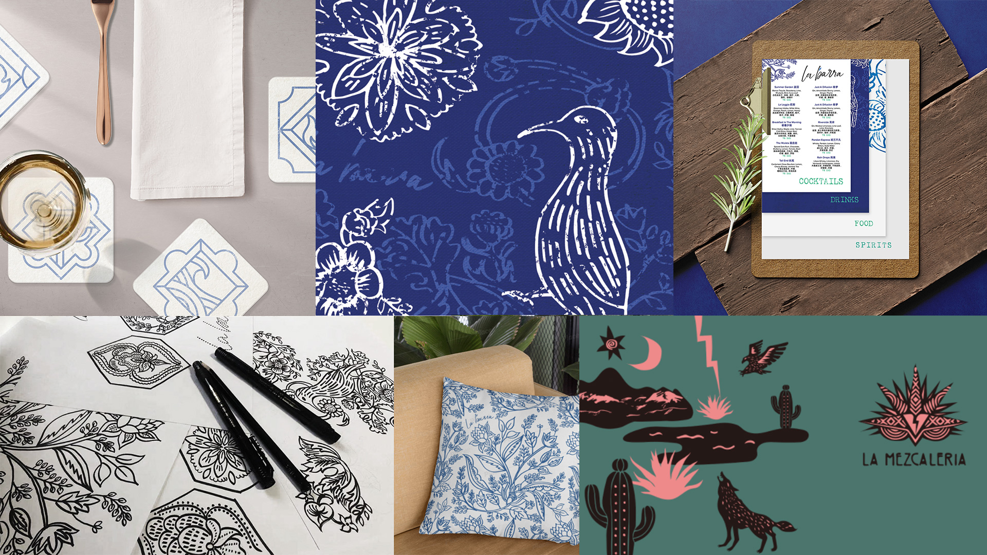
As we design, it’s important to test these identities against actual applications so we can see first hand whether it works. Therefore, instead of an incremental process where you design the logo (get client approval), then fonts and colours (get approval), then only signage and menus (get approval), we jump to the end first. We look at exploring the design across different applications like menus, signage, wayfinding, and uniforms, but also other elements used by the interior designers or marketing teams. We’ll be able to see whether a cool pattern from the concept stage actually helps build the brand’s tone of voice properly or just looks like cool graphic design, the latter which we’re trying to avoid!
Once we can see most of the pieces working together and what the entire experience would look like, we’ll pop back to the earlier stages and design in more detail the logo, colours, fonts, and secondary graphics.
STEP SIX AND A HALF
Threadstar (not actually a step!)
What’s this? Not so much of a step but a working process.
For a big menu project like CHILI’S – MENU CONSULTING AND EXECUTION we would quote for the whole project which includes strategy, planning, menu psychology, wireframing, photography, layout, final artwork etc. However, for this project the client needed 18 different menus of various sizes and content that wasn’t quite nailed down. Additionally, while the menu design was ongoing, we were supporting production for all the other elements. This is where a different billing model becomes more appropriate for the client. Rather than a scope of work, we hire out a senior art director for a month at a time, who is managed by the client directly. This gives full focus, maximum hours and minimum cost with no surprises for the client.
STEP SEVEN
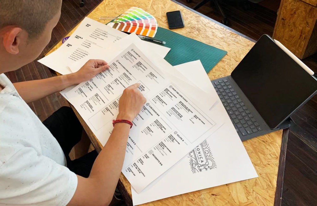
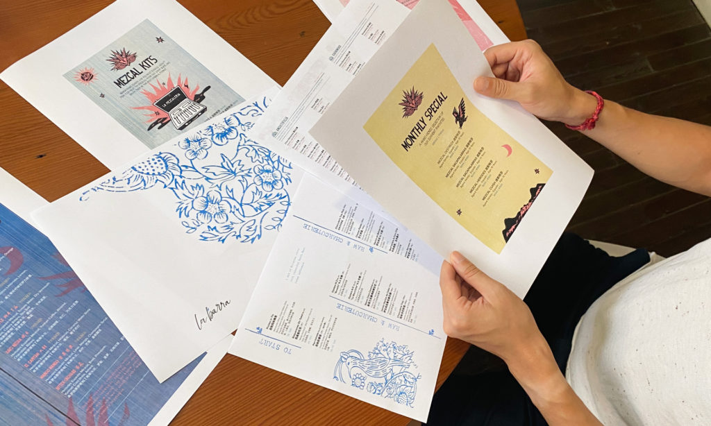
Menu Design
As mentioned above menus are huge projects on their own, let alone when you have 18 of them to design. Menu psychology is a polarising topic, and with a new brand with no POS data there is a lot of intuition involved. We try and bring in as much insight as possible to encourage upsell, cross sell, or a higher average check, however there’s always a trade off between selling and delivering on an experience.
Another influential factor is copywriting. Dishes and cocktail names should match the brand story, in English and Chinese.
For this project, each of the four brands had its own set of menus. In order to support the client in the best way and help maintain their sanity (don’t forget they were also juggling opening a restaurant!), we focused on a single concept week by week. As we got closer to opening, we leveraged the Threadstar model to create templates and train the client’s team so that they could update themselves until the very last minute before printing.
STEP EIGHT
Signage and Wayfinding
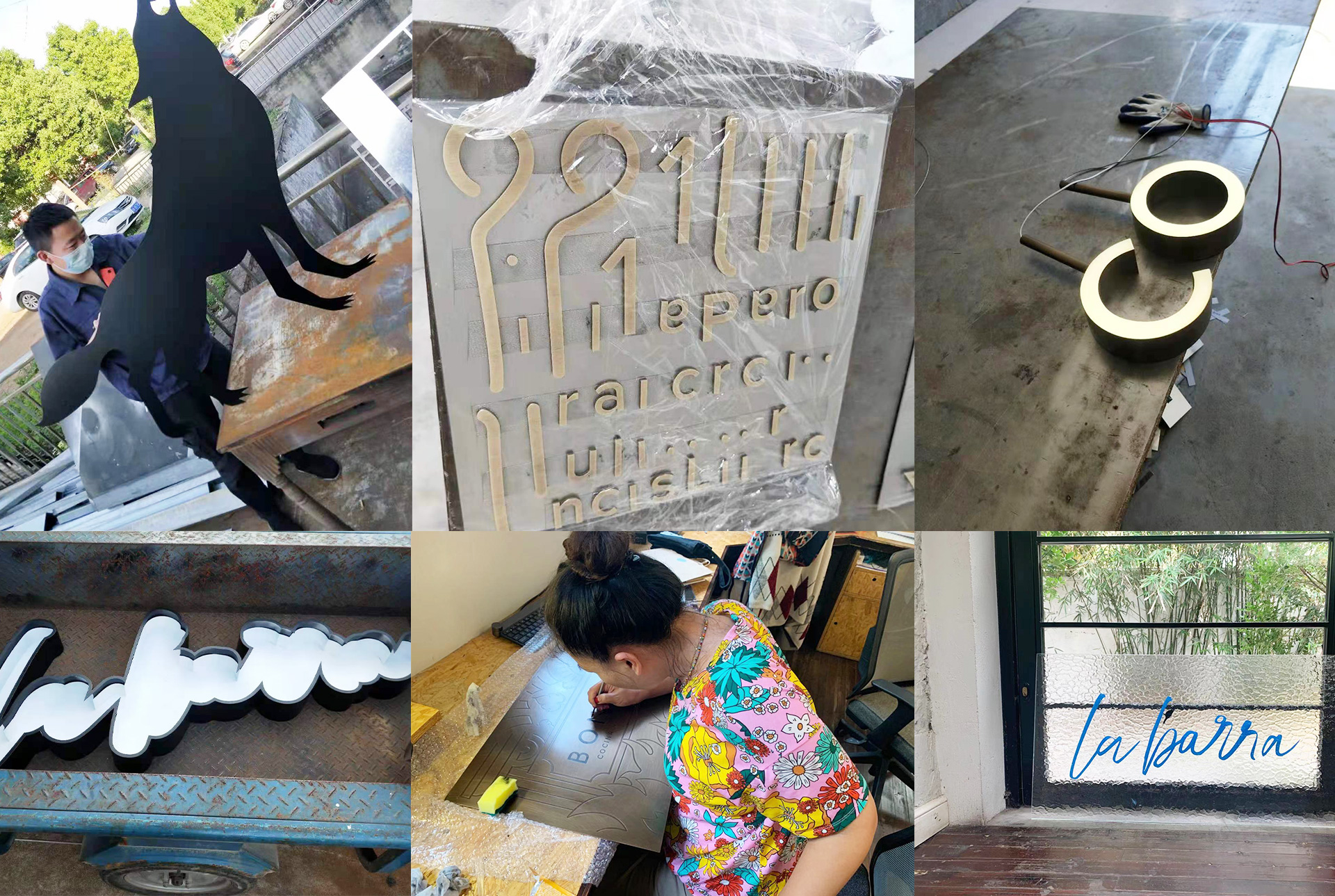
Happening hand-in-hand with menu design, this is where the brand names come to life
Arguably the most tricky part of the project, as not only does this require design skills, but also an in-depth knowledge of materials and production methodologies. Sometimes the most stressful part of the project, as mistakes cost money and there’s always an eagerness to experiment (a terrible combination). Fortunately experience helps, as does having a solid partner MADE. If you’re curious, our process by now has become fairly smooth. Design > photoshop mockups > production samples > supplier meetings > final specs and approval > production and installation with design team QA. It’s dirty work, but it looks sexy in the end.
STEP NINE
Guidelines
There comes a time to hand the baby over. Rather than dump 500 design files on a marketing team, we created four sets of guidelines and templates to make the transition as easy as possible. From the expected logo usage rules, typography and image choice, to marketing templates, file naming and folder layout maps, to all the documents a team might need to keep the brand developing for years.
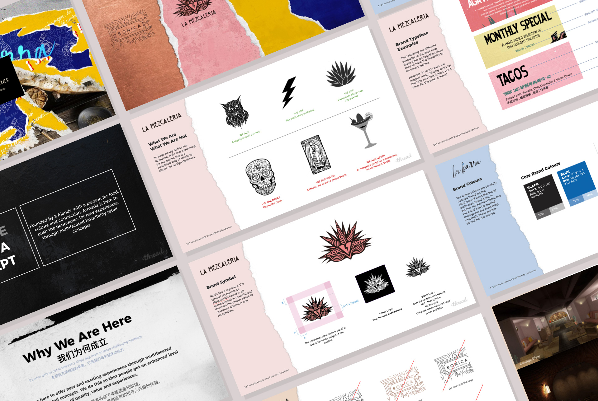
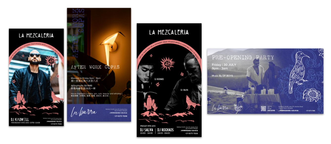
Few examples of what the Armada team have been producing.
STEP TEN
Go eat...
and make conclusions over wine!
As a team of foodies, our favourite reason to get involved in restaurant projects is being able to experience the fruits of our labours, something that can not be said for investment bank annual reports or logos for hospitals. When all is said and done there is nothing better than being inside the experience that you played a part in creating.
We were only a piece of the larger puzzle, a project like this could not have come together without the dedication of a huge number of teams, many of which we haven’t mentioned.
Incredible photography from Graeme Kennedy
Key takeaways in a nutshell?
- If you’re reading this as a client; get the idea right and everything else will follow.
- If you’re reading this as a young designer; logos are not important, what the logo represents is.
- If you’re reading this as a senior designer; spend all of your time in Google Slides, moodboards are everything
- If you’re reading this as a strategist; try playing games
- And if you’re reading this and you’re none of the above. Bless you, and thank you for your support! x
`
Bonica, La Mezcaleria and La Barra opened July 2021
You can find them via Smart Shanghai or just come to Jing’an District, Shanghai
1/F, Bldg. 5, AUNN,
No. 60, Lane 273 Jiaozhou Lu,
near Yanping Lu
现所5幢1楼,
胶州路273弄60号,
近延平路
If you’d be keen to learn more about this process, or how a process similar to this would work for a different industry, then get in touch, lets get a coffee at Bonica!

