DMAST - Art Supplies for the Next Generations
Art Supplies and Stationary Packaging Designs for Deli
Project
Packaging Solution
Product Range Identity
Location
International
China
In collaborating with a branding and packaging design agency, Deli’s vision was driven by a necessity to transform the conventional art supplies into tools that felt more approachable to the university students and younger hobbyist.
Deli – the largest stationery and arts supplies manufacturer worldwide -, we helped them create a packaging system that could carry their [gigantic] range of paints, pencils, brushes, and everything in between. Aimed at art students and hobbyist, the new brand stands out by borrowing the codes of cosmetics and chocolate branding.
Brand Alignment
Creative Strategy
Visual Identity
Packaging System
Brand Applications
Brand Guidelines
It all starts with the brief...
- guides university students and hobbyist through a large range of products (aka is flexible enough to work across different products, works well online and offline,
- gives them confidence and motivation in their creation, whatever level they are at
- is aligned with the values of Deli and Pébéo
- a packaging system that contains a handful of key SKU but can populate quickly hundreds more, using inhouse resources.
It’s a lot of boxes to tick!
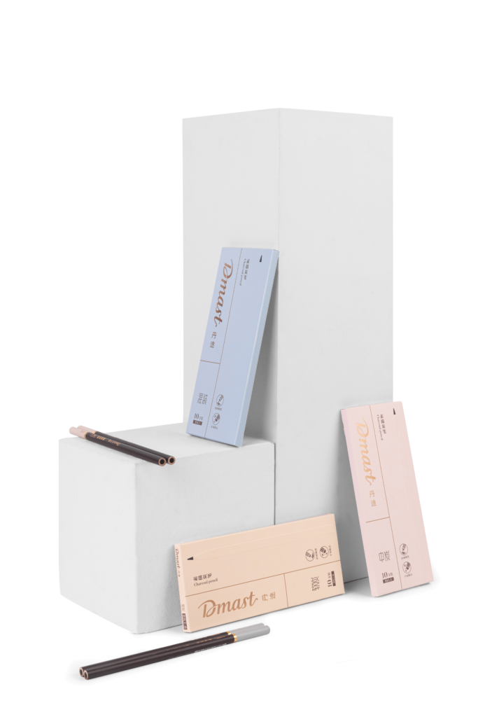
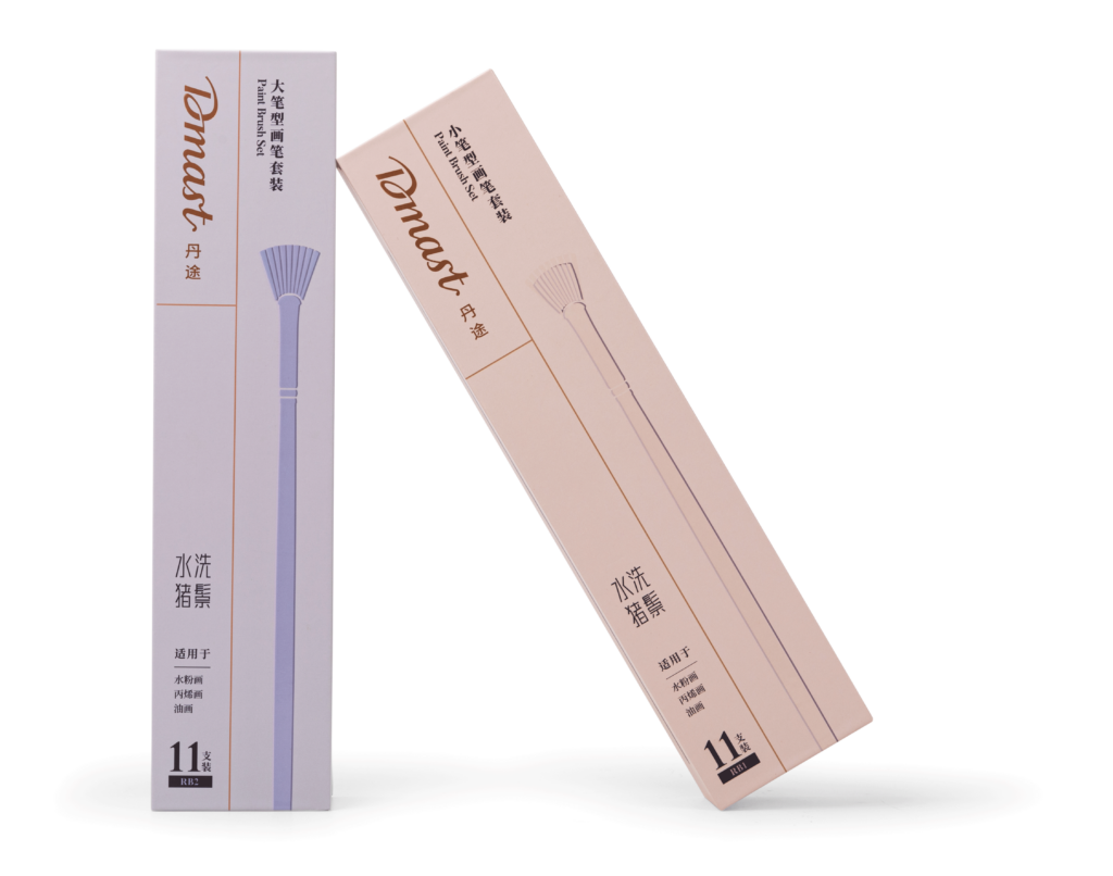
And a fair dose of thinking
- How might we make students understand that the path to learning is as important as the final masterpiece?
- How might we create an identity that feels less intimidating to students that the general art supplies industry but still premium and qualitative (reliable)
The concept: The Path from Amateur to Master
From Amateur to Master, Dmast is there with you on the path. The tools will make it easy for you to express what you need to convey and support your growth, delivering beauty every step of the way. You don’t need to be a master to create art, your path is the masterpiece.
The concept had to be reflected into the Logo Design (bilingual) and the Visual Identity direction (supporting graphics)
Breaking away from industry expectations
Unwilling to lead on the standards of their industry commonly found on for example 99 designs and pinterest packaging design boards, we embarked together on a journey to craft a unique brand positioning centered on enjoying the journey of creation and packaging design strategy that would feel more familiar to their audience, getting inspired by the packaging of other products they frequently use and enjoy.
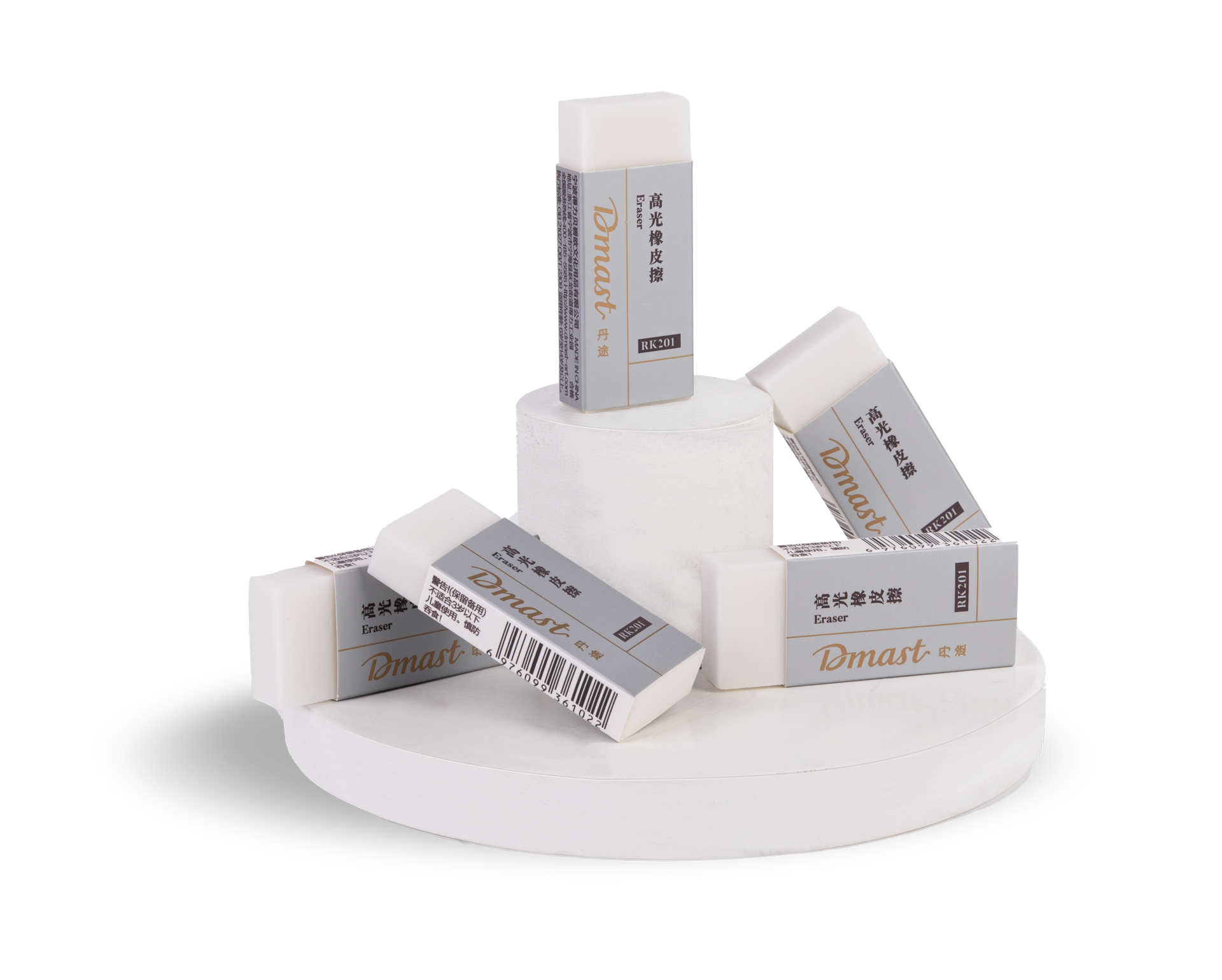
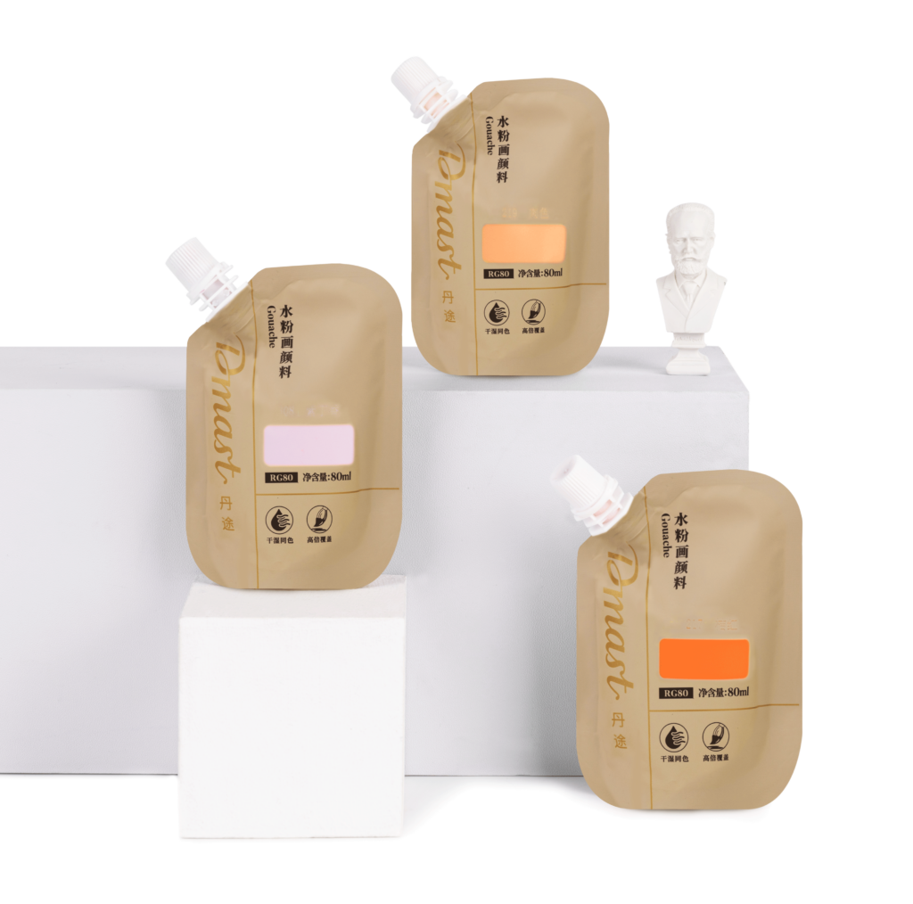
Borrowing design code that connect with the target audience
From concept to execution, we took inspiration from the realms of makeup and sweet delicacies (mhhh chocolate), which are designs that are both closer to the target audience and convey a premium, expert feeling.
This approach involved infusing a sense of style and self-expression into the world of art supplies, creating products that are not just functional for their education but also can feel like an ally in building the founding stone of an artistic career nowadays.
How would this be applied across a range of products?
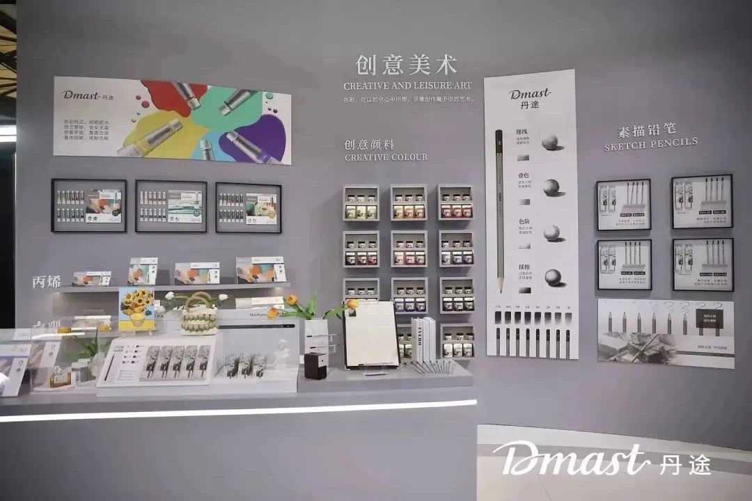
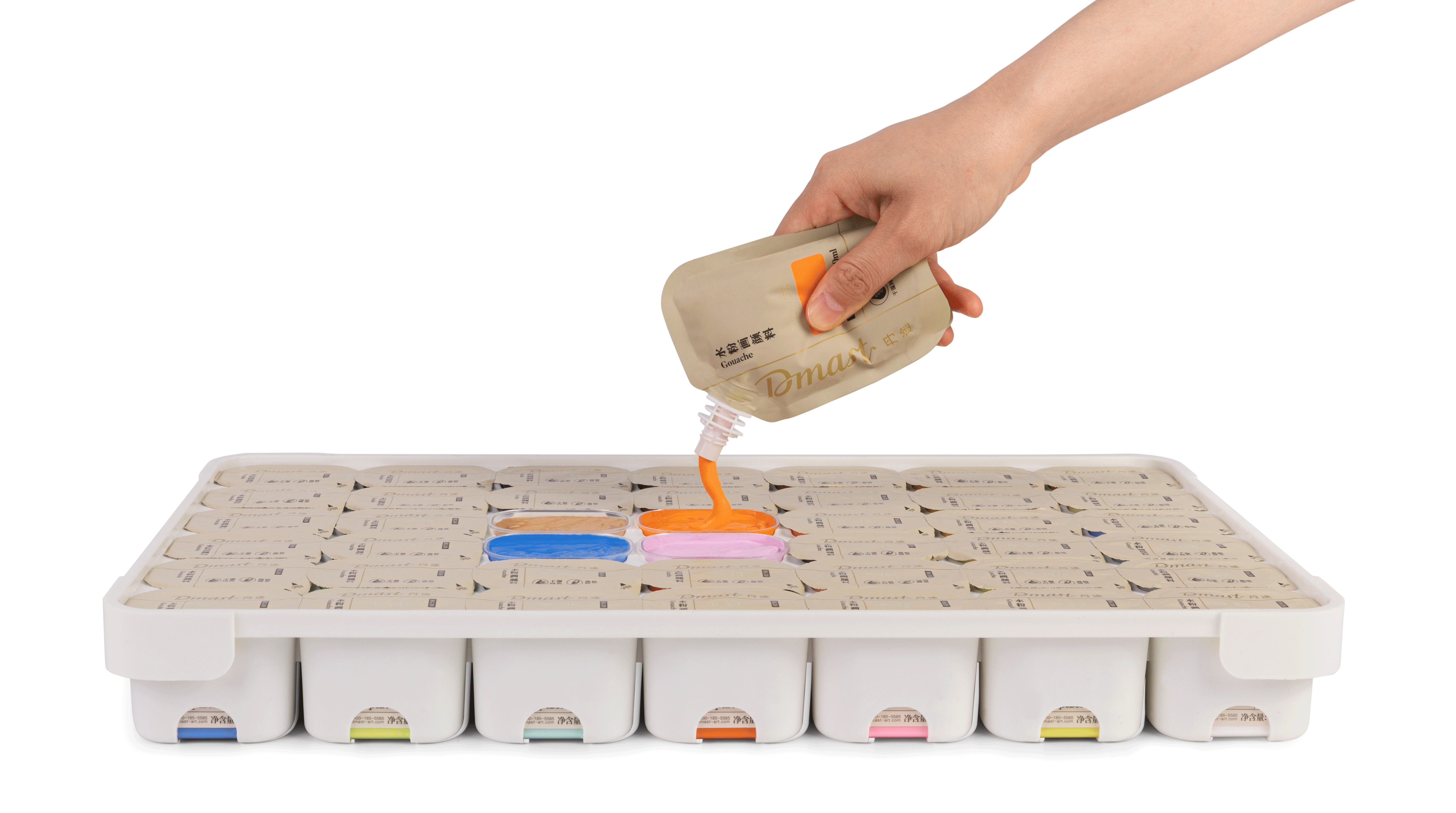
The reimagined art products include a range of vibrant painting tools (gouache, acrylic, water colors, you name it), trendiest colors marker sets, and other artist-quality brushes, all designed to resemble high-end consumer products.
How to create a packaging system that can carry all those SKUs and the ones to come in the future, remain appealing, on brand, and highly functional to navigate?


And what about online sales?
Having this distinctive identity was another asset when it came to shooting products into compelling thumbnails for their online sales platforms.
As sample to the left and below, what do you think? You can check out their store on TMALL.
The outcome?
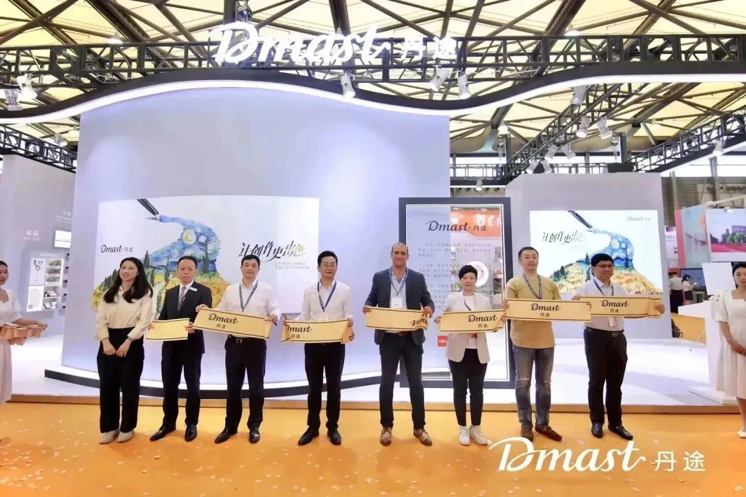
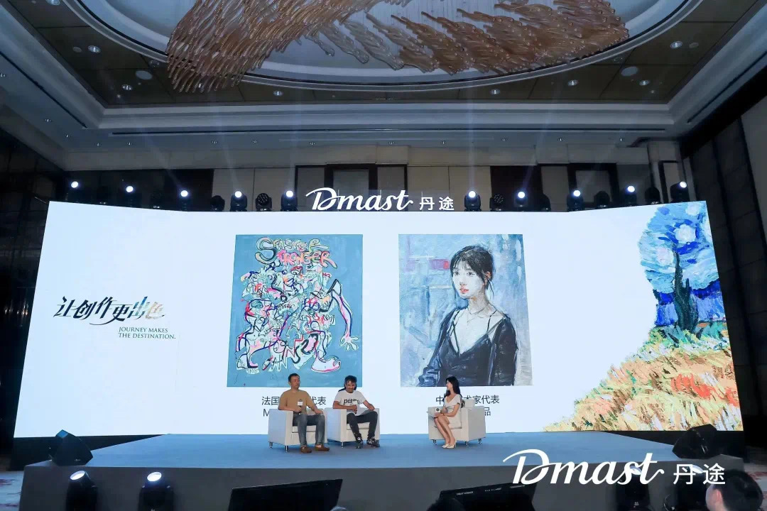
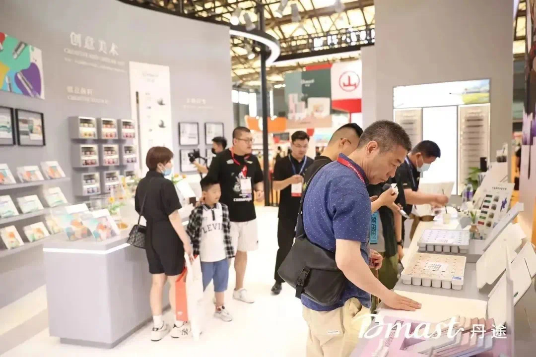
Dmast launched in June 2023 at the largest industry tradeshow. The initial range offered around a 100 products while they keep on adding new SKUs month on month, fully independently, thanks to the original packaging toolkit provided to them.
