Fook Wo Kwong Branding
Premium Cantonese Restaurant
Project
Branding
Location
Shanghai, China
At Thread Design, we approached the Fook Wo Kong project with the precision of a graphic design studio, crafting a corporate design that reflects the restaurant’s commitment to excellence. Our focus on brand identity services ensured that every element, from the logo and logotype to the custom logo signs, contributed to a cohesive and luxurious dining experience.
Fook Wo Kwong 福和光 is a high end dining experience, meticulously crafted to delight the most experienced connoisseurs.
Brand wise, Fook Wo Kong tell the story of a 20 years long friendship, built while working alongside each other, sharing the same passion for authentic Cantonese cuisine, an art so traditional yet complex to master.
It’s been an honor to help the team share it with the world; we are very grateful for the trust the team empowered us with throughout the entire project, from conceptualization to execution – from brand strategy to menu design, sourcing and food photography guidance.
Brand Story
Creative Strategy
Visual Identity
Menu Design
Brand Applications
Signage & Wayfinding
Custom Art Creation
Interior Integration
The core brand idea
Developing the Brand Story
At the heart of this project is an appreciation for the history and rich produces used in traditional Cantonese cuisine, and a 20 years old friendship and work collaboration.
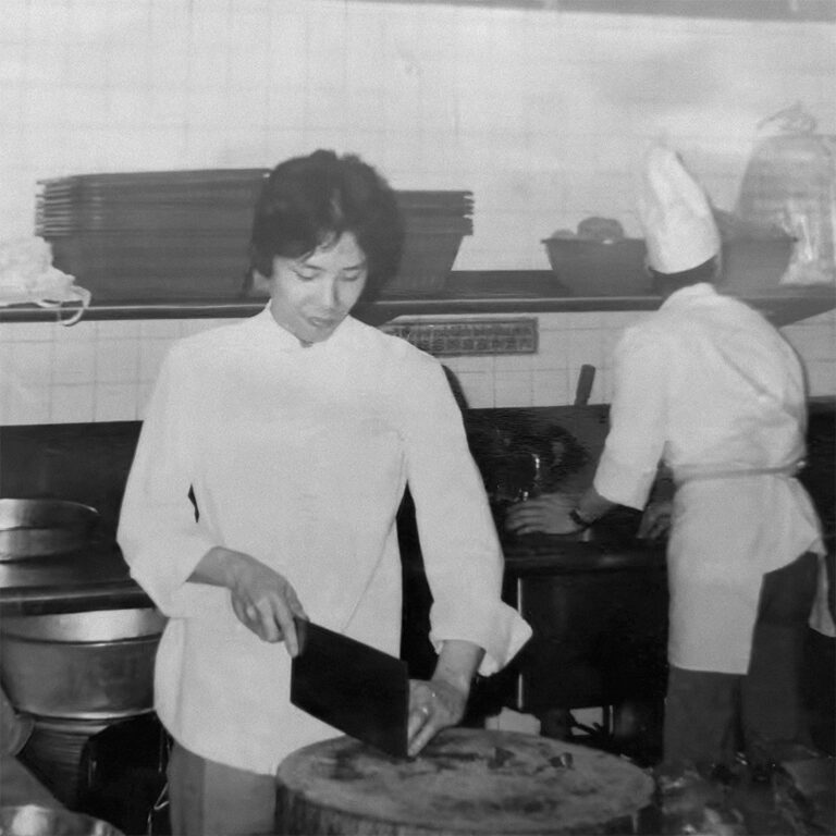

After decades of working with them with passion and the upmost respect, the highly skilled (and highly awarded) team still feels like it’s those ingredients that are teaching them how to cook the best recipes.
Their wish is to deliver an authentic Cantonese experience. While sharing their story to us, they showed us a number of vintage pictures which are dear to their hearts and an important part of who they are and what they do today.
The Brand Challenge then became:
- How to tell it in a personal way while inviting others in?
- How to create a contemporary experience while also true to its heritage?
- How to make it distinctive yet subtle and refined.
Those are the kind of challenges that our hungry minds really love munching on.
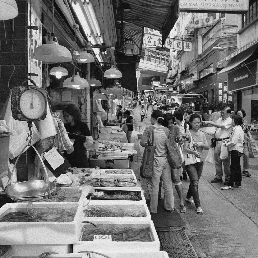
Benchmark your surroundings & Understand your consumers's expectations
Define the story you want to tell that will connect with your consumers
Define how to communicate it throughout the experience
Not traditional, but authentic
Connecting to a new demographic
There is a fine line between authentic and traditional. While traditional is 100% confirm to how it was done in the past, authentic leverages the codes acquired in the culture, but can display them in a more modern way.
This approach enabled the team to tell their original story, while connecting to their customers from the past decades and younger ones at the same time.
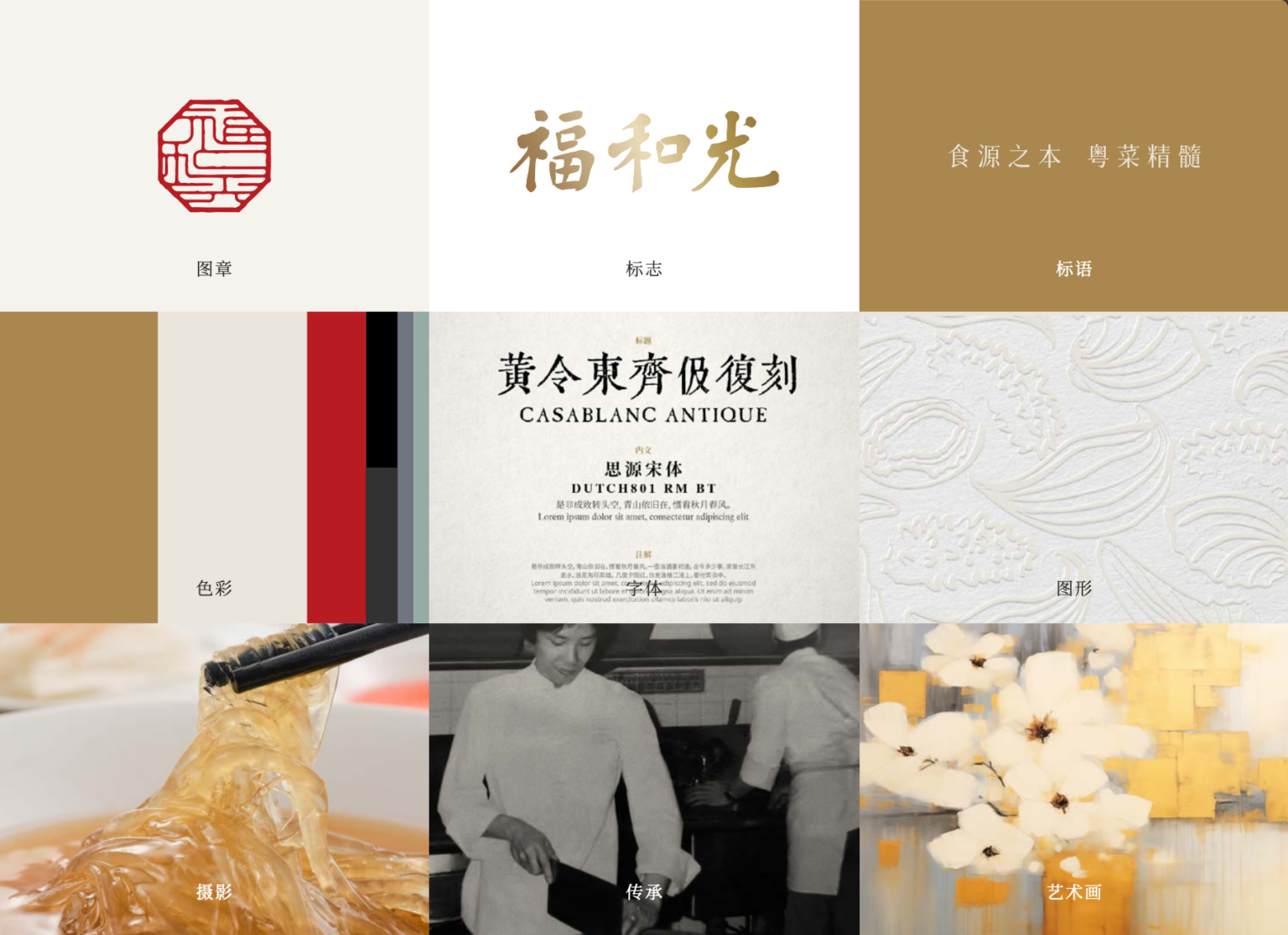
For instance, the traditional gold and red hues have been adapted to and coupled with more modern tones. Old images have been remastered, contemporary craft techniques leverage premium paper deboss of trendier illustrations instead of old fashion carving.
Integrating the story into the interior
Subtle touches through the space
Working with a strong interior direction, our role was to define clever and complementary spaces to unroll the brand experience throughout the whole restaurant, following the customer natural flow through the space.
How to create a photo walls for restaurant spaces
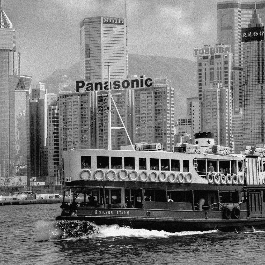
The main entrance hall is the path most customers use to enter the space. Combining the story of the traditional Cantonese ingredients, modern views of Hong Kong at interesting angles and remastered pictures of the team made for a unique blend, full of flavor and just a pinch of light heartedness.
Picture walls using a blend of original photos, stock and AI, are now easier and more cost effective than ever. Check out our photo ceiling at Pomodoro.
How to use AI create high end abstract art around the theme of Hong Kong
The high end restaurant offers about 16 VIP spaces. With a number of returning customers, it was important to create decorative art that would personalize each room, while being consistent with the space and branding. To this end, details from Hong Kong have been inserted here in there in more abstract compositions.
Food photography, in the style of the ingredients.
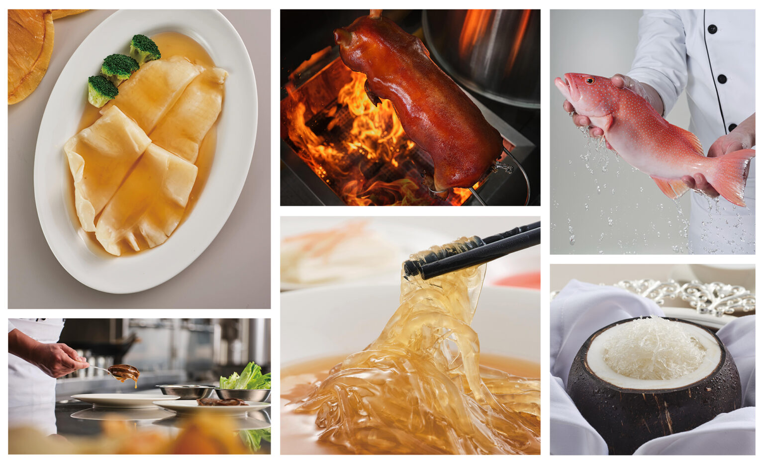
When it came to photography, some of which showcased in our photo gallery above, it was most important to be able to show the freshness of the ingredients. Our chefs took the back seat, presenting their stars at the foreground.
Integrating the brand story into every little design detail
From display cases to the last toothpick
What makes for a strong and long lasting brand is the consideration that goes into each and every item our consumers experience.
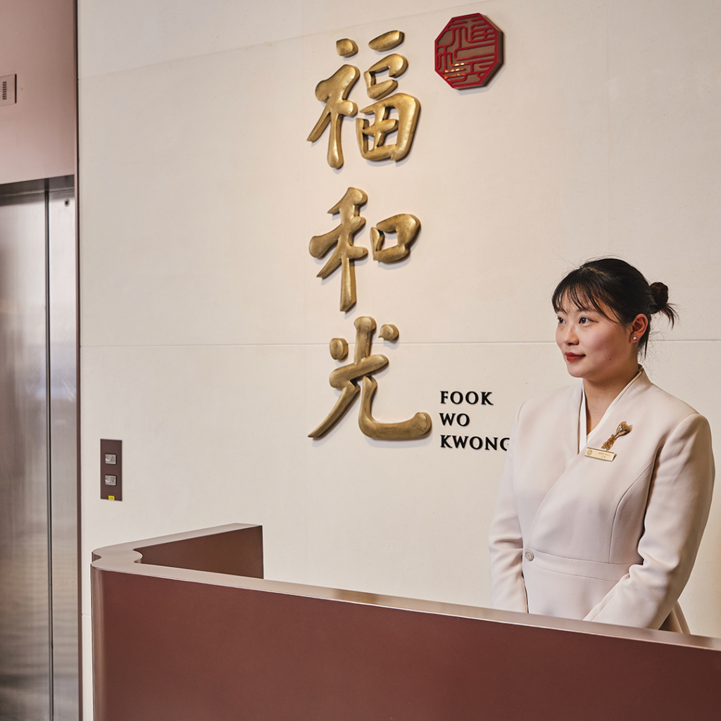
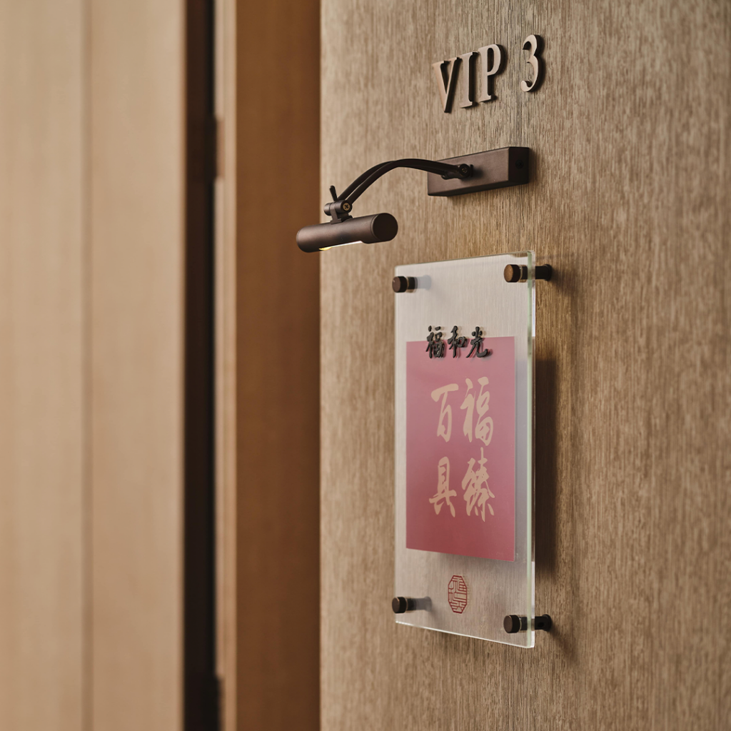
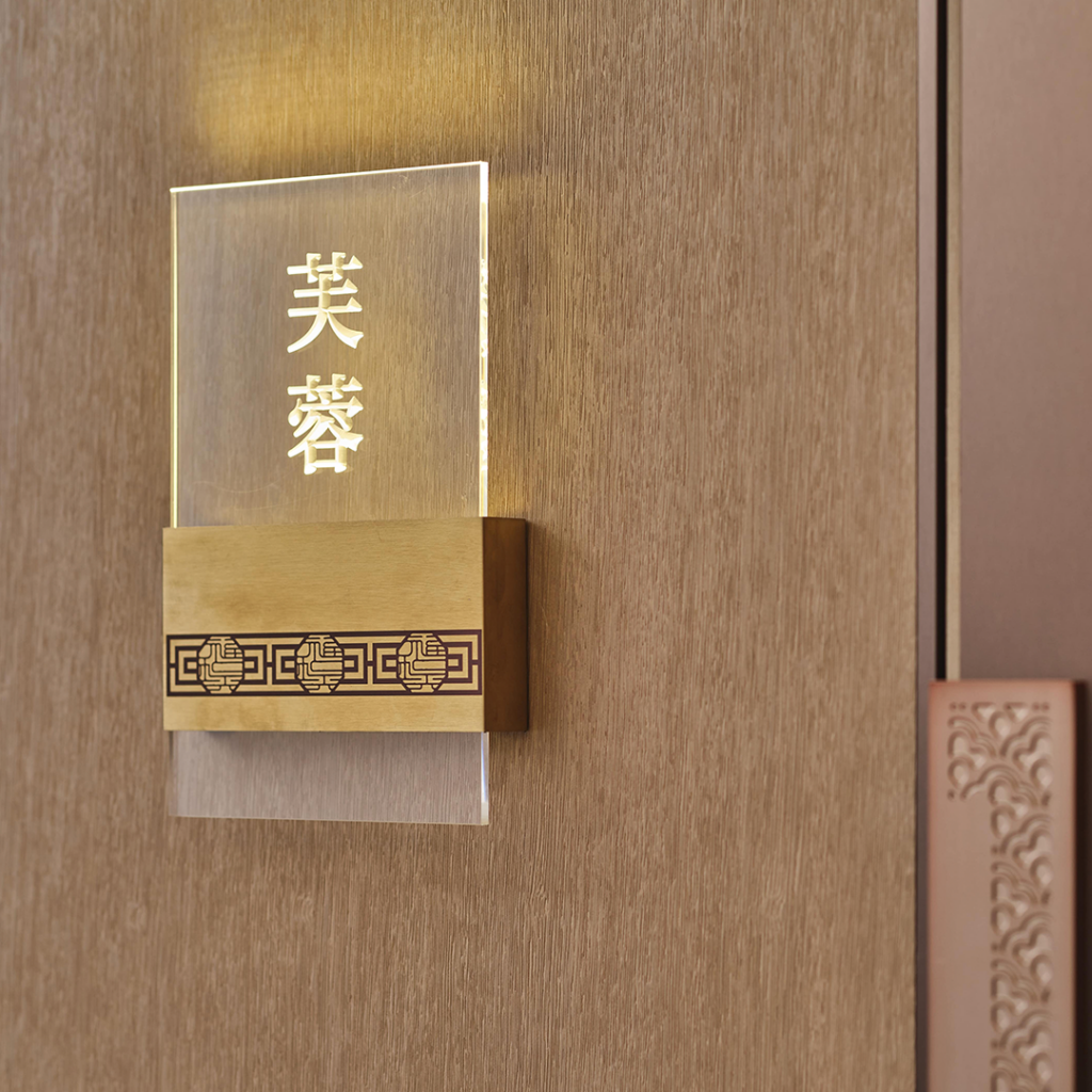
Restaurant signage design - Bringing Hong Kong to Shanghai
Cantonese Restaurant Menu Design - High end?
We’ve designed hundreds of menus in our time, this, unlike something like the Refinery Menu, this one needed to be premium but comfortable, extensive but not overwhelming.
The Challenge with Cantonese food menus is to support customers in ordering from a vast amount of dishes while featuring signature dishes. We selected an approach that would leave the pages clean with plenty of space for the quality of the ingredients to speak for themselves. The covers were also carefully selected with appetizing colors and sensory materials.
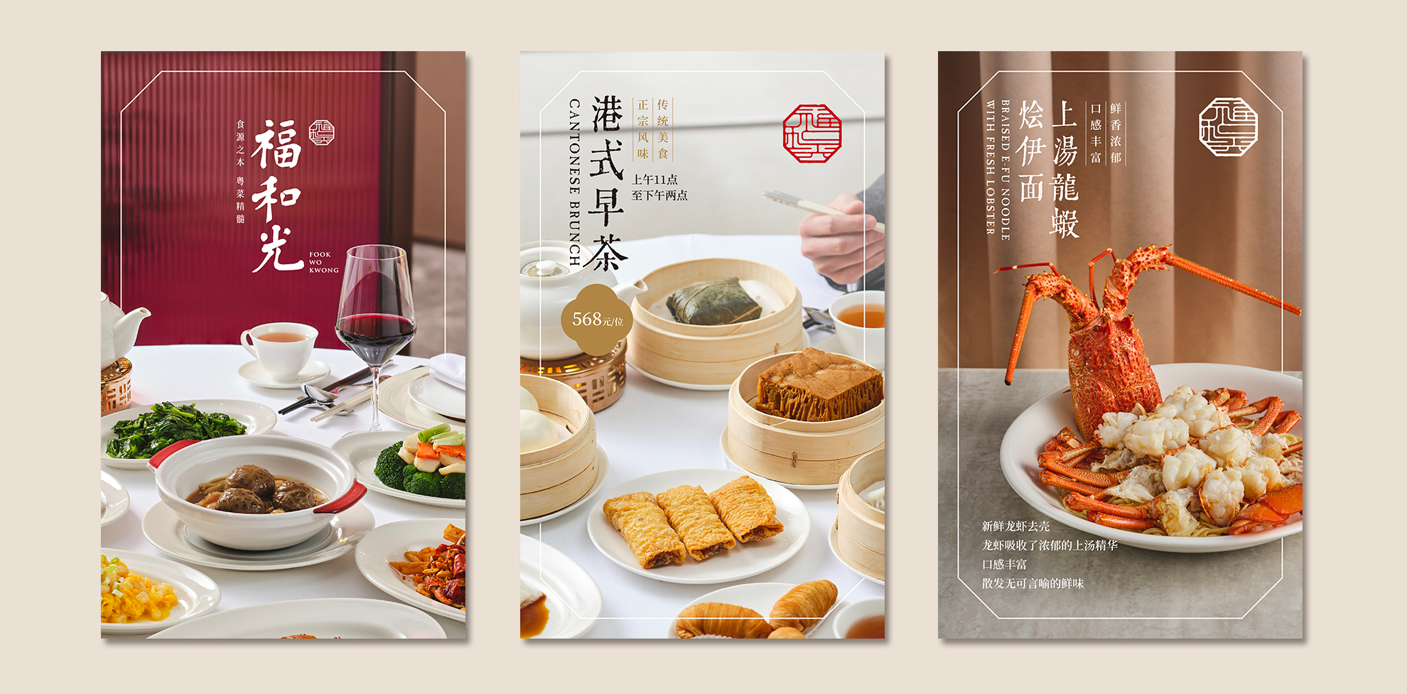
Restaurant Marketing Design - Asian market
Creating appealing seasonal and special occasion marketing templates are key to support the team in communicating their offering in the future. A well thought toolkit should enable the team to run their marketing independently for the foreseeable future.
High End Food & Beverage branded applications
At this level of hospitality, nothing is left unthought of. Custom embroidery and choice for fabric for the table napkins, tea sign for the tea pots, plateware, chopsticks, toothpick covers, party favors… all need to be considered with the upmost care, from design concept all the way to production. Want to know more about how this could affect your profits?
take away
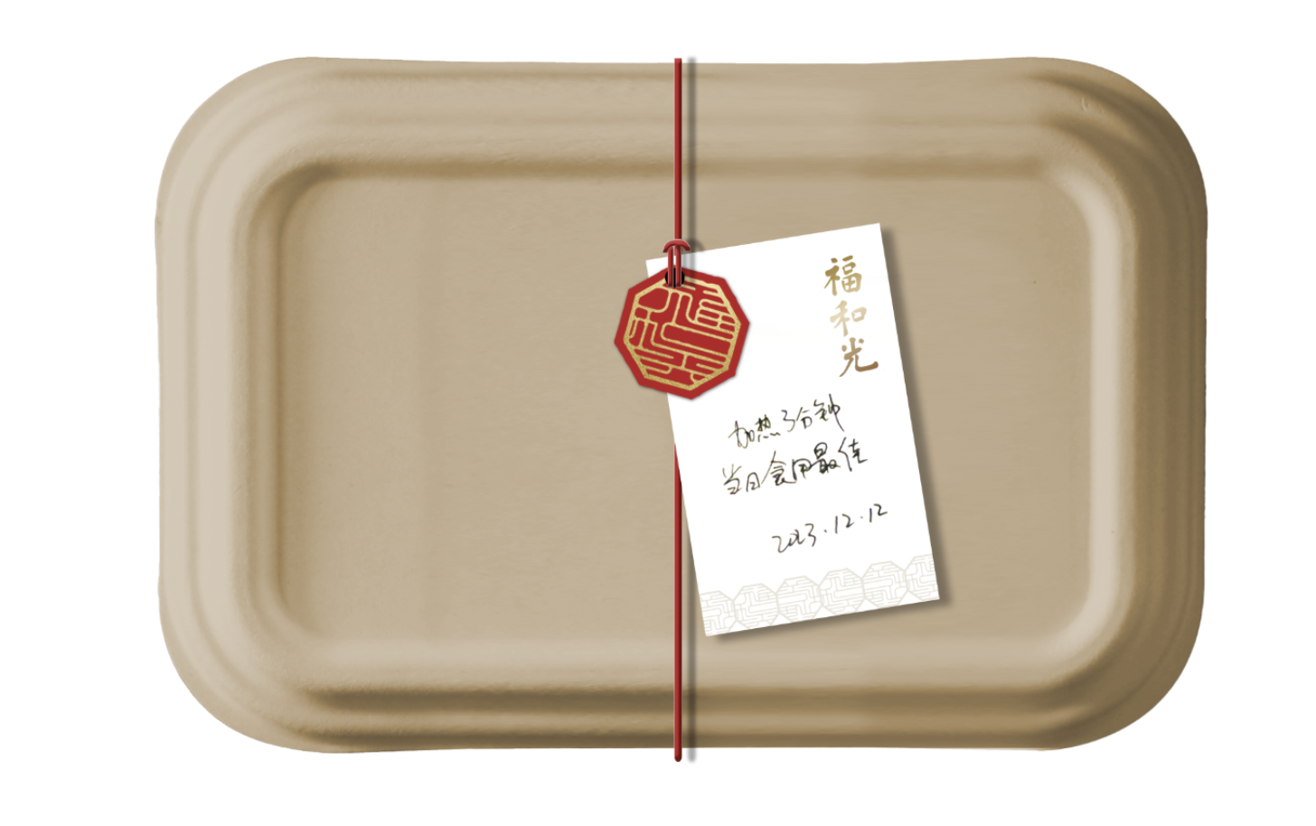
packaging
Take away is so important because it might be the one thing people will look tomorrow when thinking of your brand. It should feel like the extension of the experience they had in store.
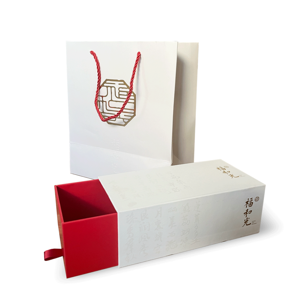
gift box
Special occasions call for special measures. The gift box was designed to be suited for a number of them, such as the main festivals and celebrations. Produced in high quantity, they come cheaper than you’d think!
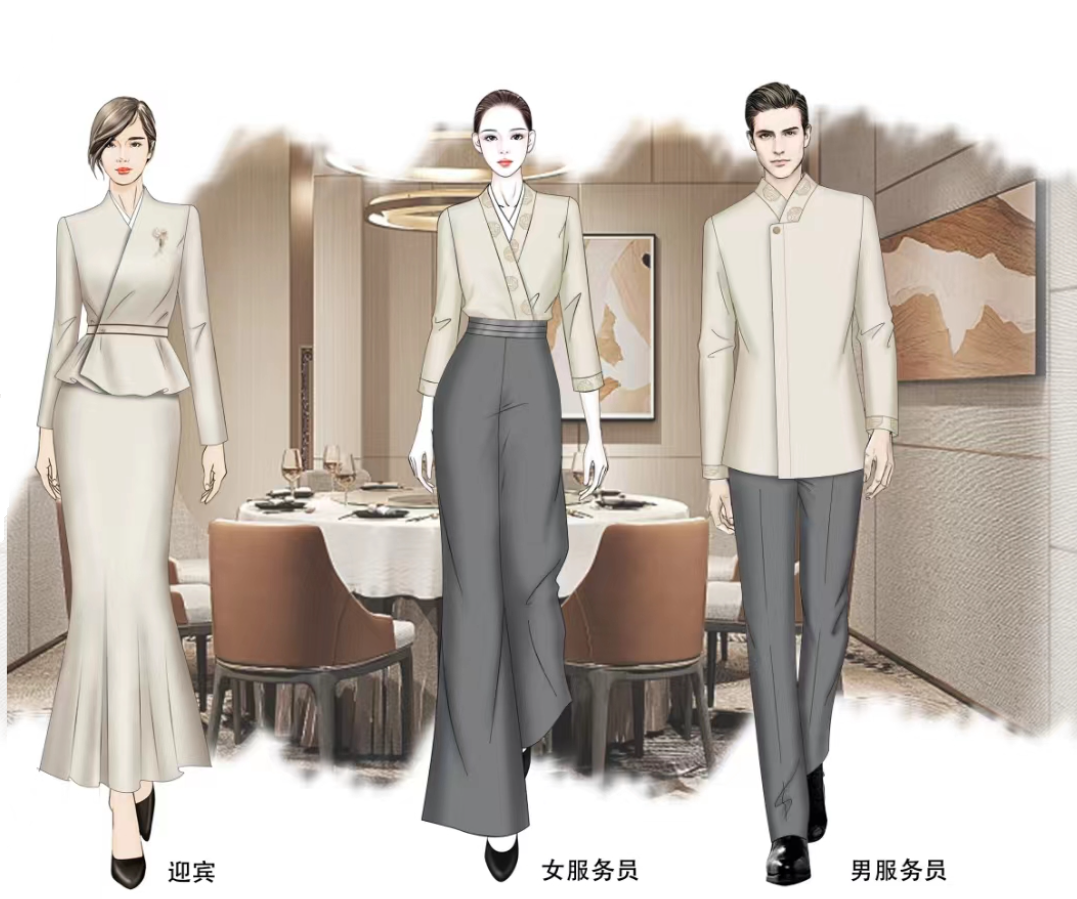
Uniforms
Consider working with a local fashion designer on the uniforms. A team that looks good in what they wear feels confident in their service and show your standing.

Branded Pins
The ultimate proof of belonging for your team to come all together!
Lastly, brand guidelines.
Turning six months of strategy design and marketing assets into a restaurant owners manual.
Brand guidelines convey a variety of information and tips about your brand, useful both internally to your company or organization and externally to your affiliates, partners, and customers. Although there is no industry-wide standard for what constitutes a brand standards document, the most notable organizations use brand guidelines as a tool to help everyone understand how to represent their brand.
Good guidelines connect different aspects of your brand, such as your logo, colors, and typography, to form a cohesive identity.
Great guidelines are highly useable, both to for you to check that anything you do is on brand but also, to create anything new in the future that you didn’t know yet you needed when they were written!

