Taking
MELITTA COFFEE
on a journey
Packaging Design
Project
Packaging Design Product Launch
Location
China
Originally from Germany, Melitta has held a leading role in the coffee history worldwide, having invented the paper coffee filter over a century ago which democratised the consumption of coffee at home.
Coming into China at a time when the market competition is fiercer than ever, how might they take the pole position of home consumer coffee products?
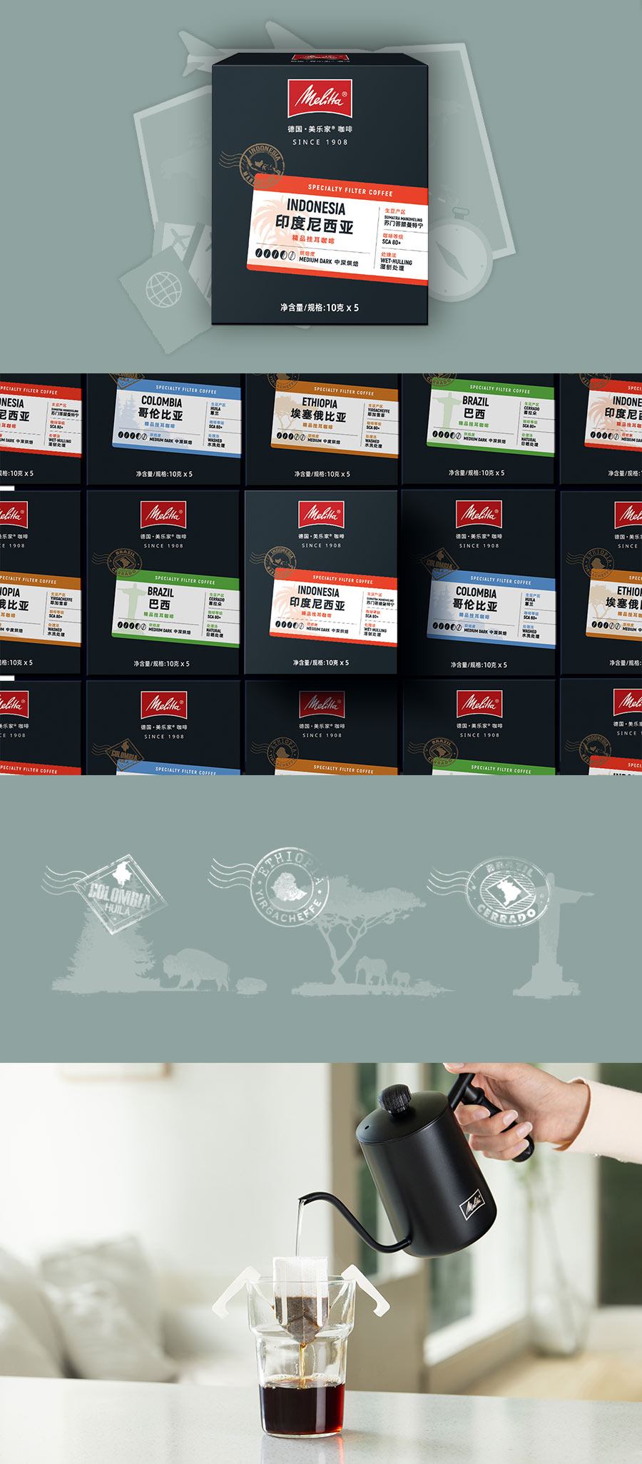
Together we focused on getting ready to launch their first localized multi-product coffee series – Single Origin Drip Coffee, Coffee Beans and Ground Coffee.
Skillset
Research & Insights
Strategic Consulting
KSP/USP/Messaging
Packaging Rationale
Packaging Design
Focus Group
Final Artwork
It all starts with the brief...
- conveys the German heritage & DNA of the brand
- echoes with the local market is premium, yet approachable
- is flexible enough to work across different products, works well online and offline,
- can be used to create secondary brand assets,
It’s a lot of boxes to tick!
And a fair dose of thinking
Learning, exploring, getting inspired are an essential part of the process, it is the foundation of what will later inform our design decisions. For Melitta, there ended up being 4 possible directions to take. How do you choose from there?
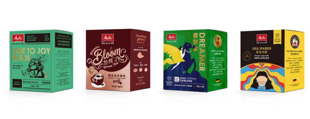
The concepts
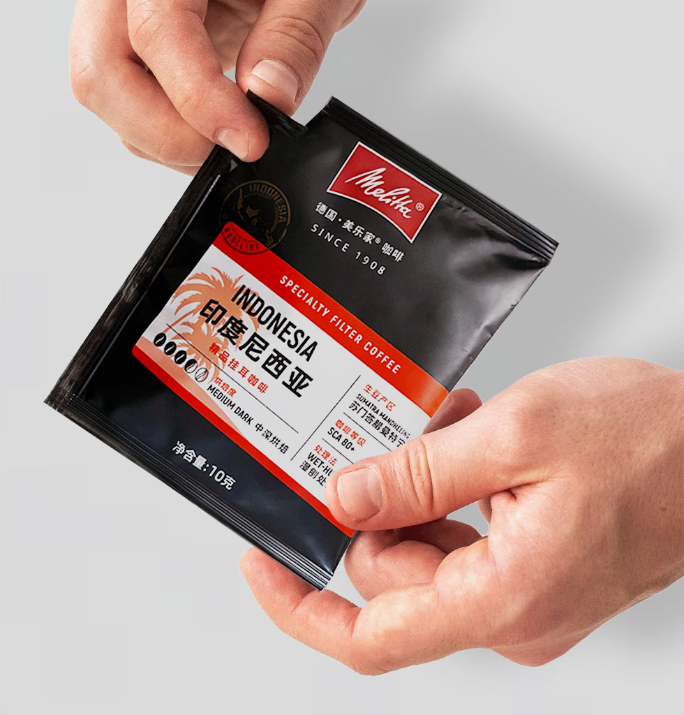
Asking consumers to try it out
When going mass market, a number of brands opt for consumer testing. There are different ways to go about it: from surveys, to focus group all the way to eye movement tracking and an infinity of possible questions to ask.
The most important question to avoid getting overwhelmed is, what do you actually want to find out?
Having prioritized their focus, Melitta was able to select undoubtedly the winning concept and quickly move onto final packaging artwork, right before the coffee came out of the roastery.
The one concept that has it all, and more
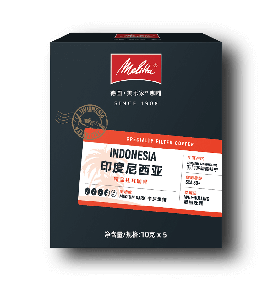
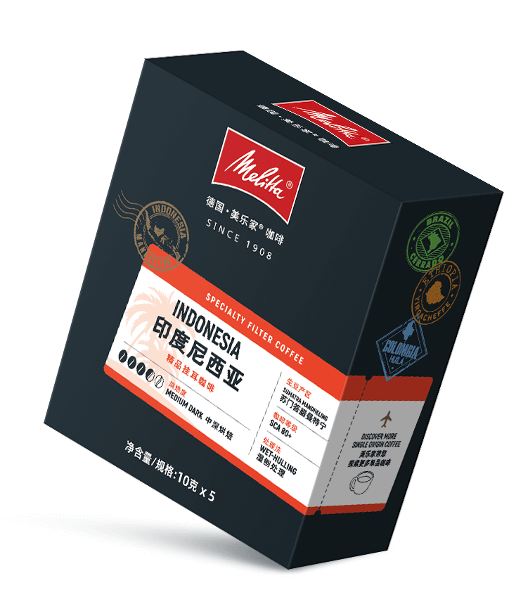
Inspired by the frustrations of covid, and wanting to show the variety of origins, the winning concept uses the visual language of travel. A modern combination of tickets, stamps, passports and postcards presented in a clean design style to inspire customers looking for a moment out of their daily lives.
Each (coffee) origin has its own story, color palette and design elements, used on the packaging, but also in the supporting digital marketing.

Core elements
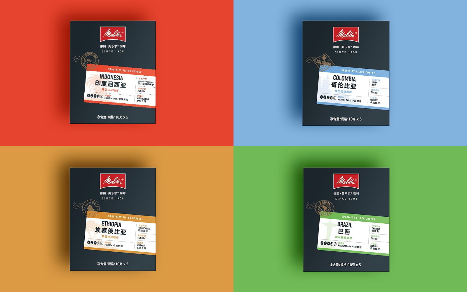
Colour palette
How would this be applied across a range of products?
Single origin and Blend, Ground or Beans, in bags or boxes. The challenge is to make it all work within one system.
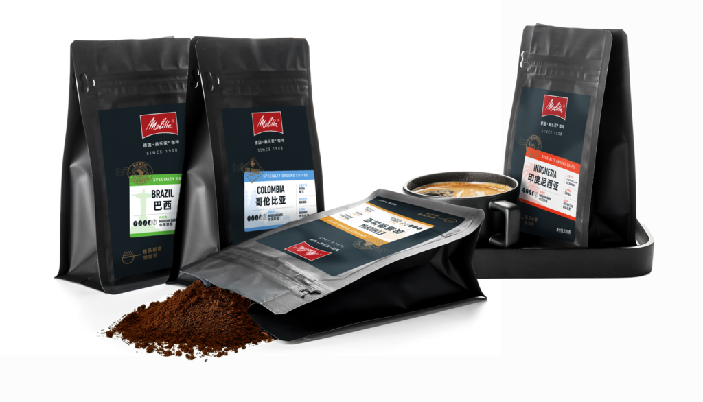

And what about online sales?
Looking good on the shelves and on the screens are just about as important these days.
When creating packaging, we need to make sure they will look eye-catchy in every situation.
As sample to the left and below, what do you think? You can check out their store on TMALL here.
The feedback?


Would you like a hand to enter a new market like Melitta did?

