Penrose - restaurant rebranding
Changing over the existing 3 stores simultaneously in 6 weeks
Project
Branding
Interior
Location
Shanghai, China
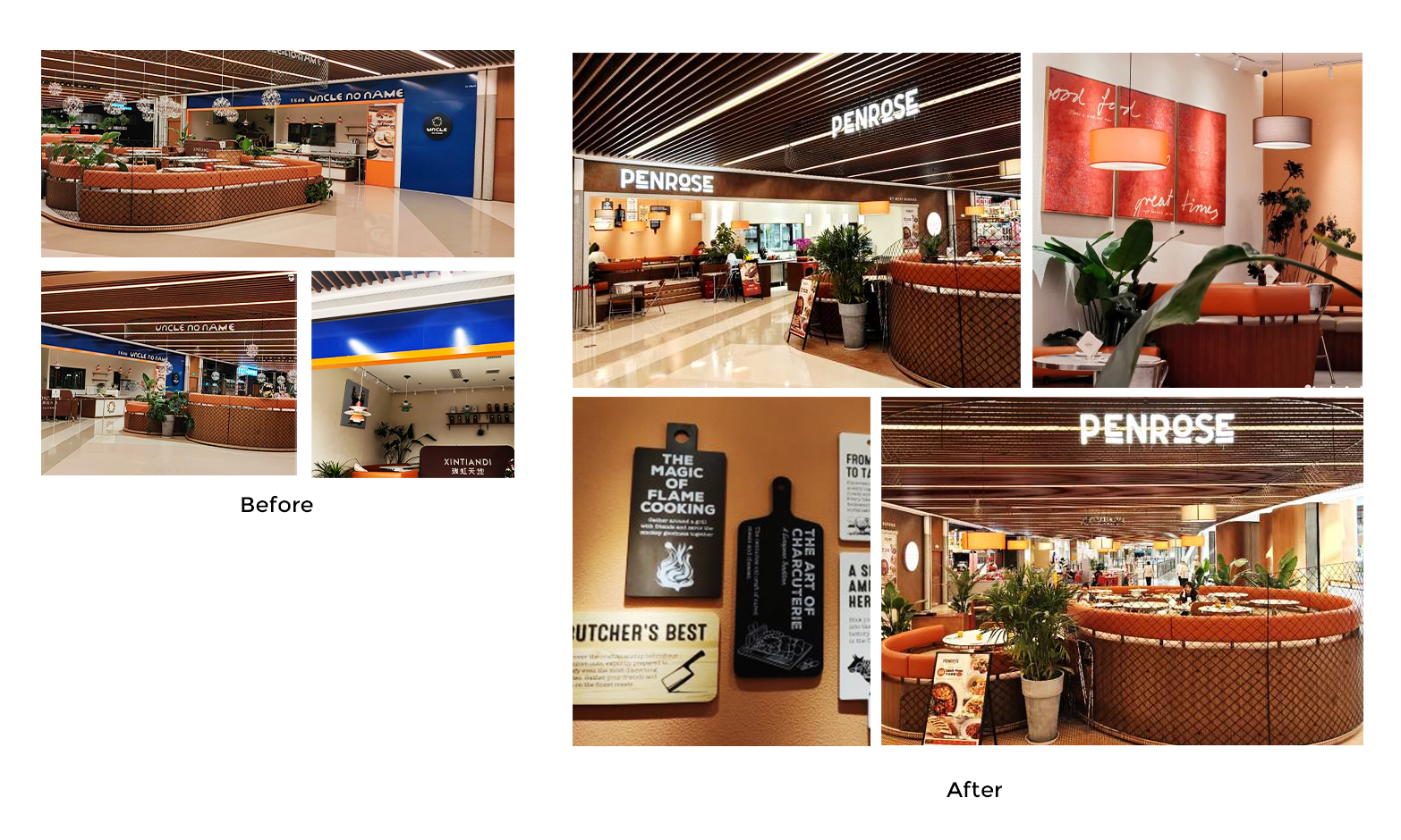
Excited for summer much? The penyous of Penrose were so determined to catch the first summer vibes on their terrace that we took on the audacious challenge of rebranding and changing over the existing 3 stores simultaneously, in as little as 6 weeks. Two of the stores even remained open all the way through!
Repositioning, naming, visual identity, in space brand pieces, decoration, furniture section and even… garden design!
We couldn’t be happier than when we saw their lush terrace 100% full on the first day!
Repositioning
Naming
Creative Strategy
Visual Identity
Brand Applications
Interior decoration
Garden design
Brand Guidelines
As much as branding is best enjoyed as a slow process, sometimes external constraints leave us no other choice.
How to get to a good outcome quickly?
Keep your eyes on the big picture & be pragmatic
The most important part is to quickly align everyone around one clear destination.
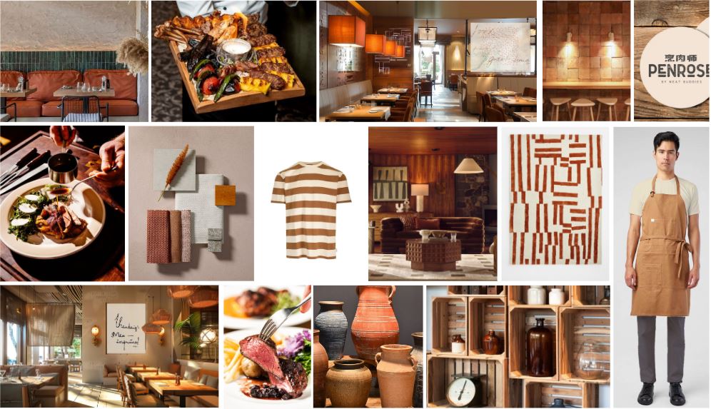
We presented only moodboard options that could be achieved within the timeframe, which the team choose from.
Make [quick] decision on the logo
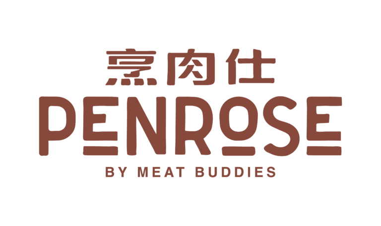
The logo is [only] one part of the brand. Selecting a type base logo enabled the team to move quickly, while leaving some room to create other visual identifiers elsewhere in the branding. When it comes to name selection, the team had pre-agreed internally how they could decide on the winning option, which saved them a lot of time and energy in case of a tie.
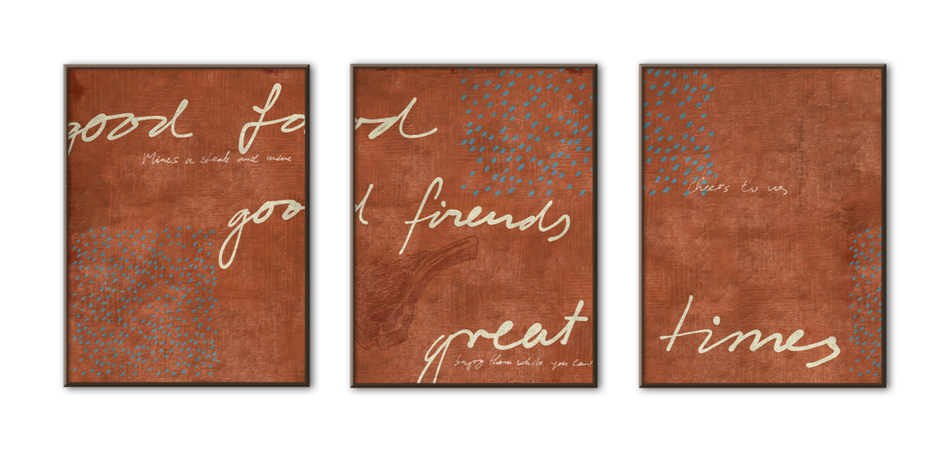
Create versatile touch points and brand anchors
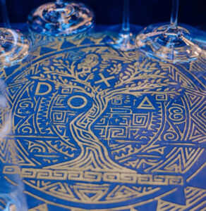
The color palette, patterns, types, materials are all elements that people associate with the brand.
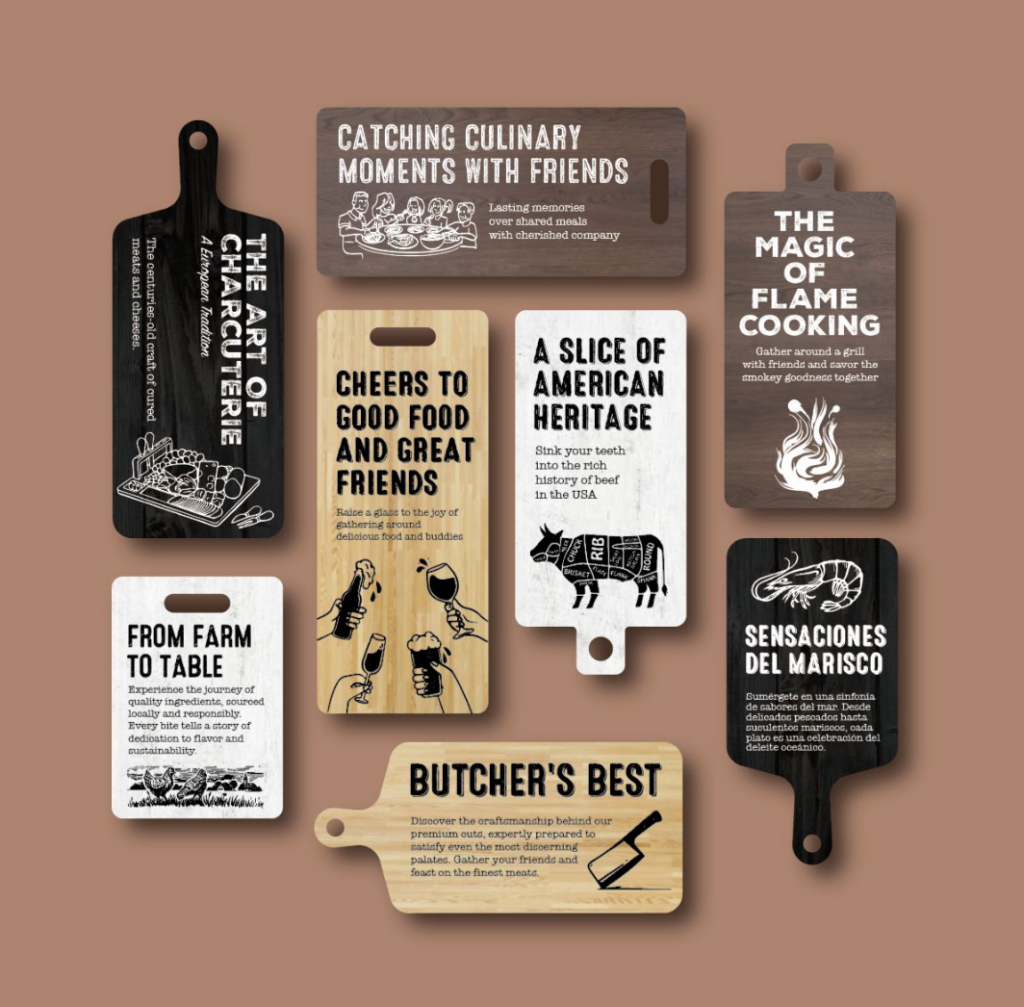
With those elements, we then created applications that could be easily adapted to each store, such as boards collages and framed art.
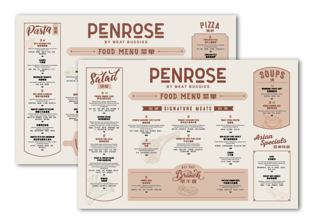
The menu also reflects the need for flexibility of evolving the dishes during the relaunch period. As such, the format and design are easy to change and edit directly by the teams on the ground.
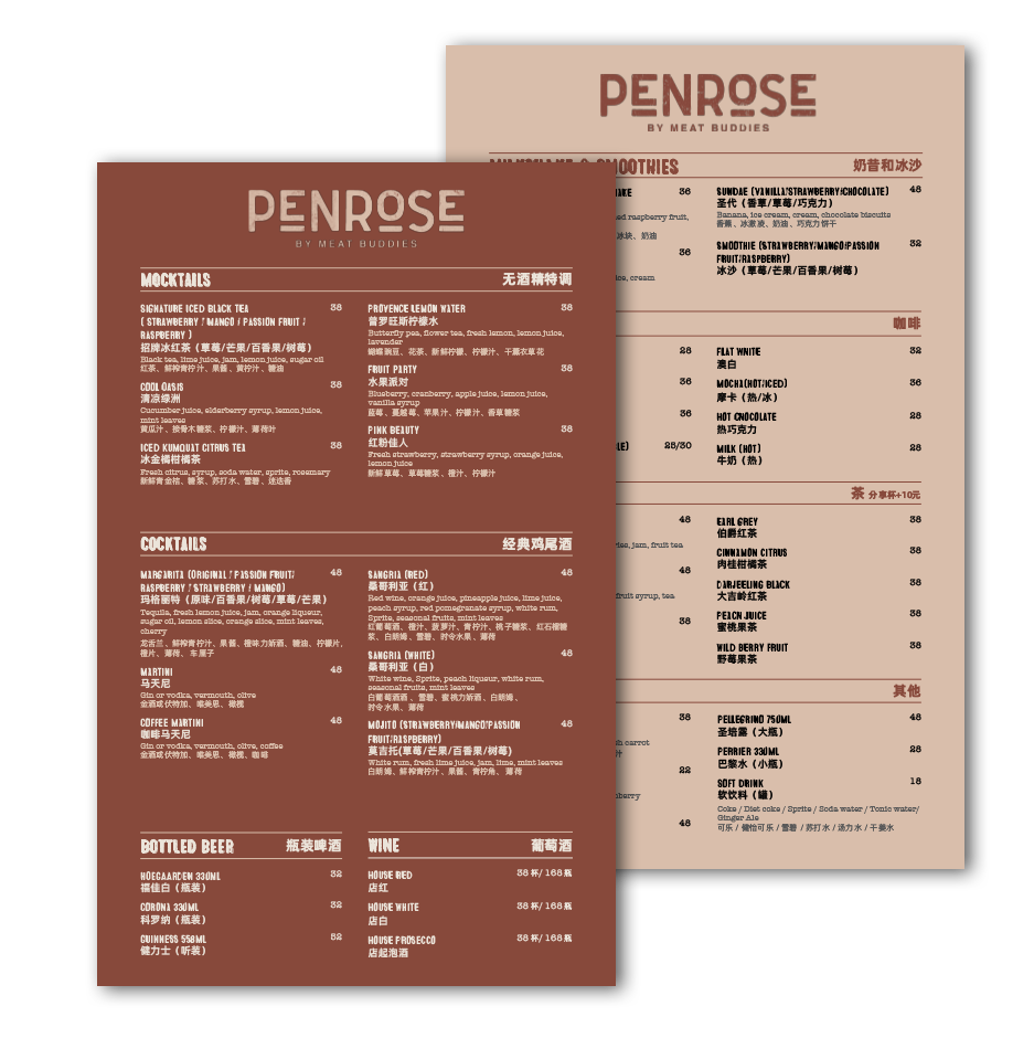
How to implement one brand identity across different types of stores?
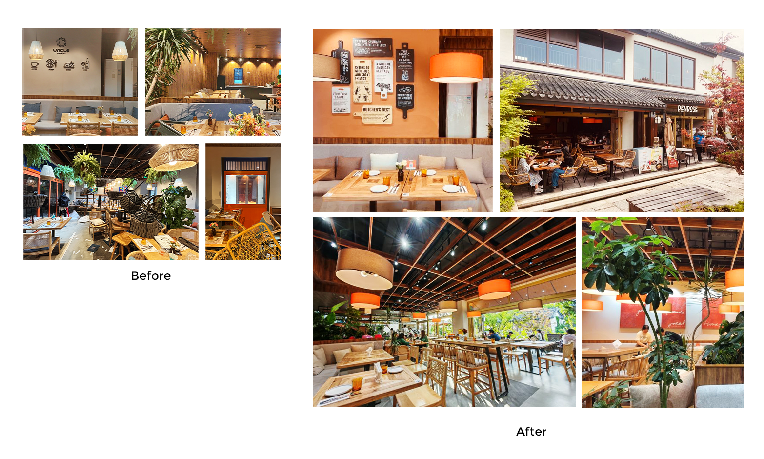
Flagship store
The flagship location of the brand had so much more to give! Letting the natural light in and bringing in genuine lushness made us feel so much more at home
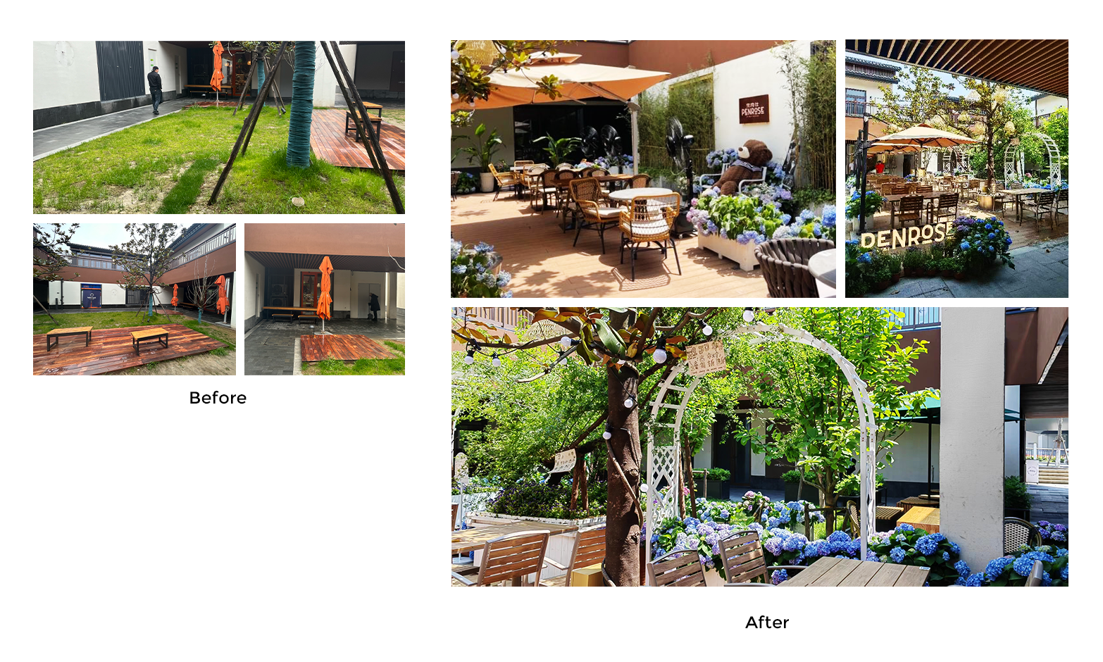
Street side store
What do you do when you don’t have so much light available? Create some more! Using brighter tones has really helped opening up the space, and warmer shades make it all much cozier.
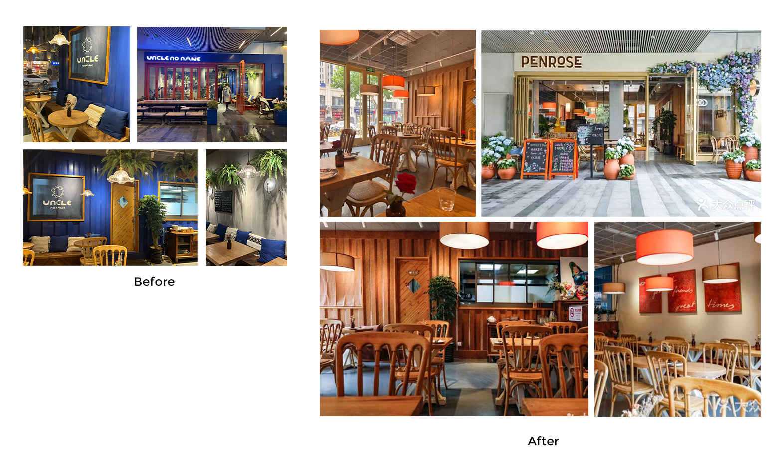
Mall location
Mall locations come with their own sets of challenges: limited space, strict landlord regulation, artificial light, renovation hours. The Penrose teams didn’t sleep at night for quite a few days (but not that many!) to switch it all up.
