When we created Pomodoro, we weren’t just opening another Italian restaurant but bringing Rome’s lifestyle to the table.
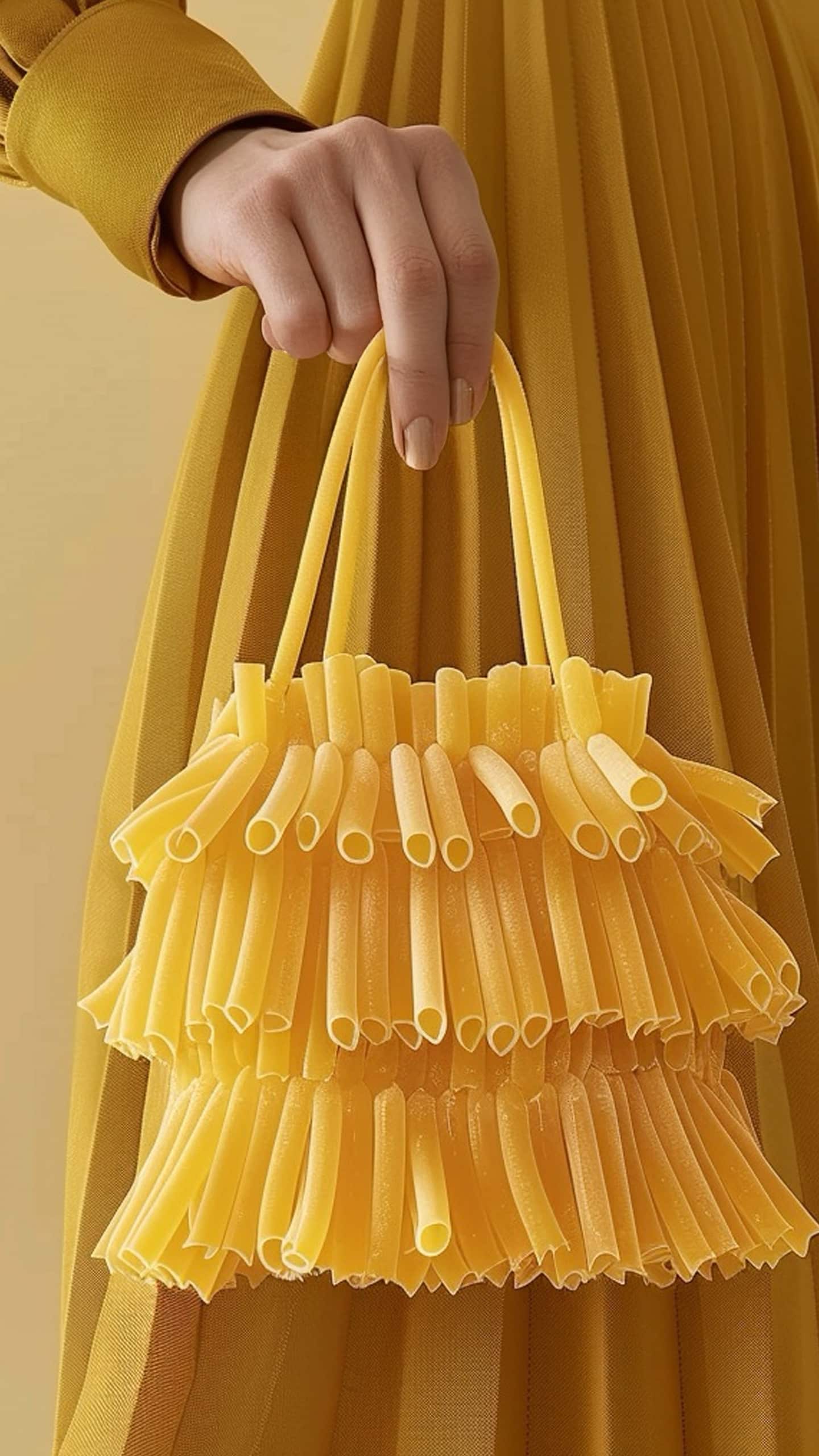
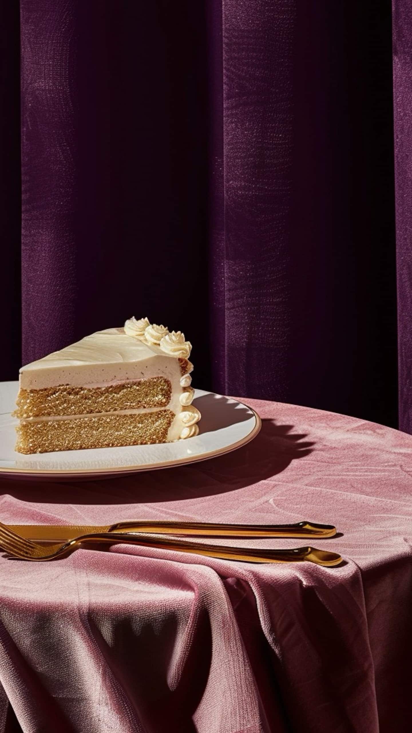
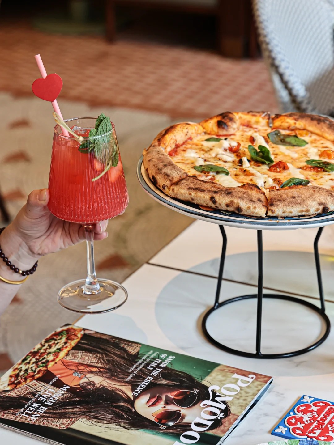
From bold flavors to effortless elegance, every dish reflects the city’s incomparable sense of style and Dolce Vita. Think coffee in a sunlit piazza, a crisp wine over lunch, or indulgent pasta by the coastline.
Salute & buon appetito!
Strategy & Brand Definition
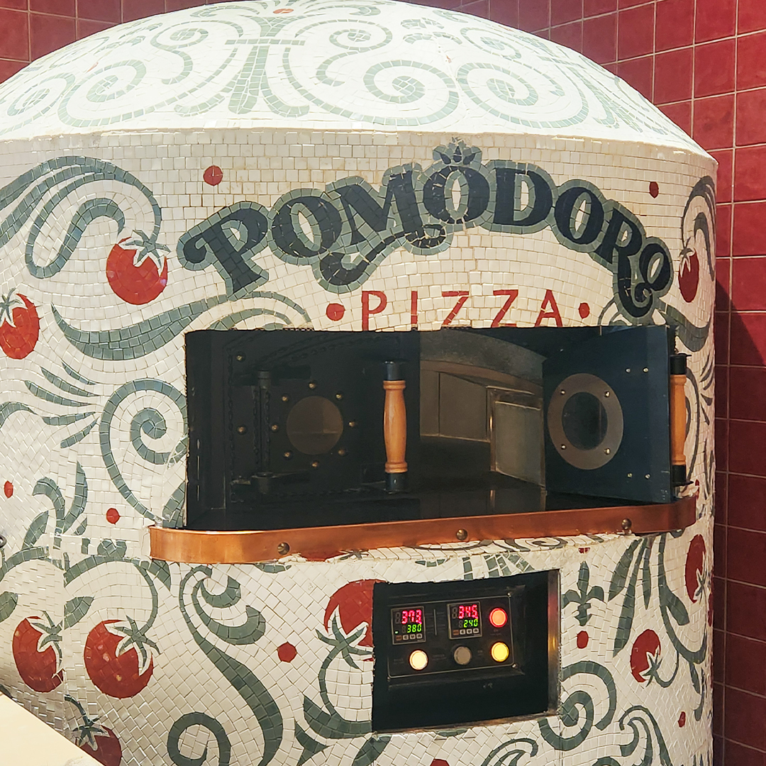
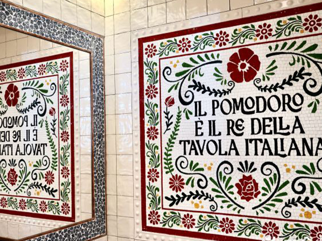
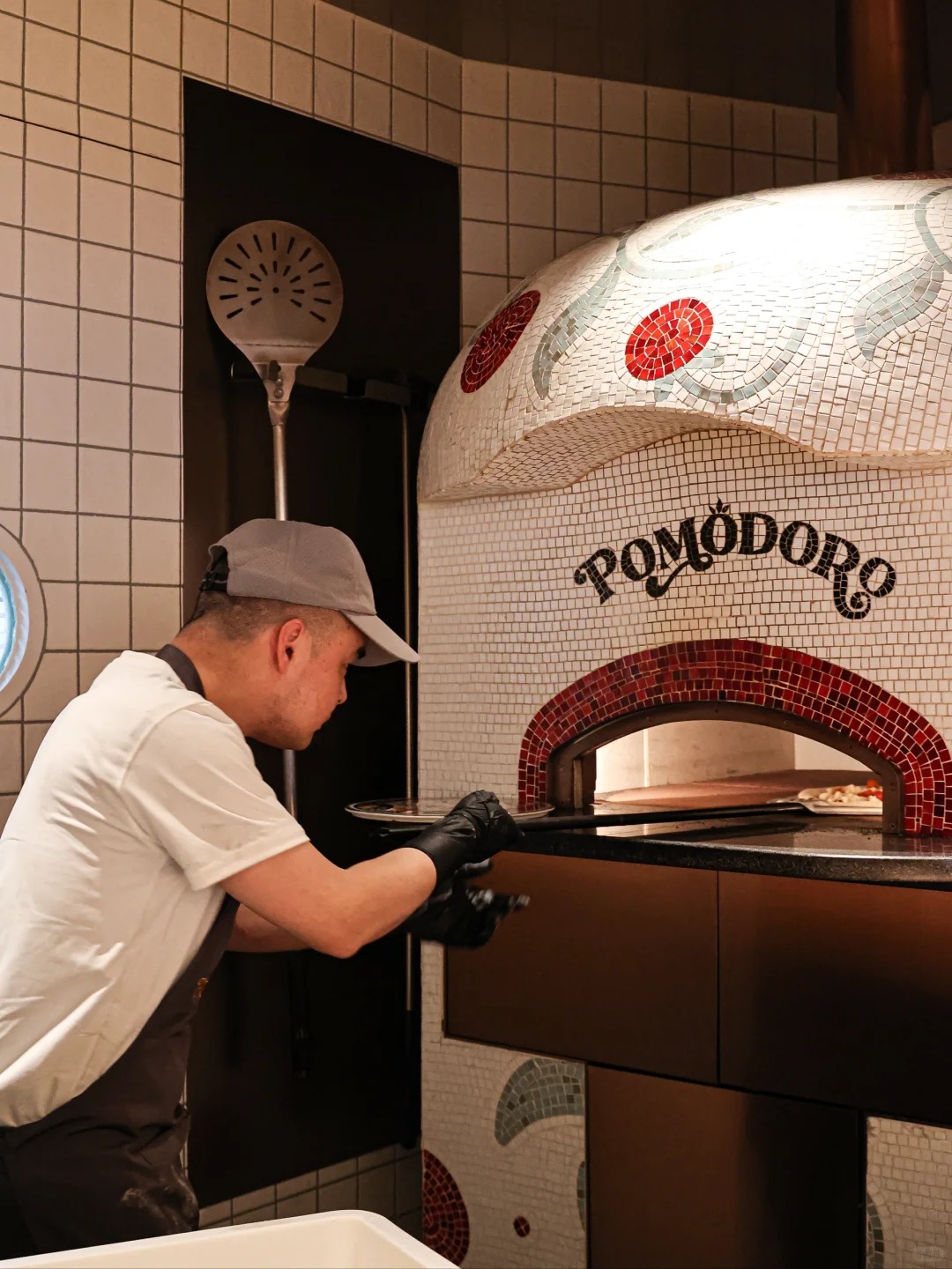
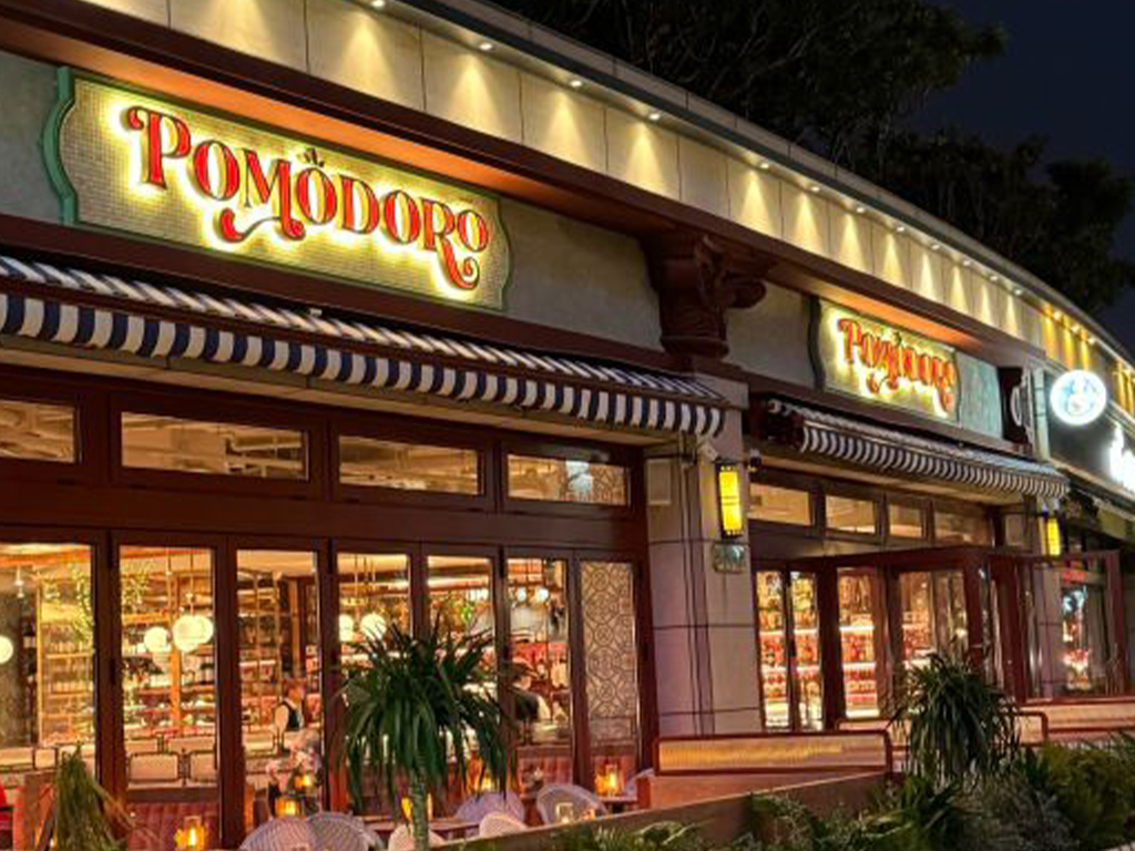
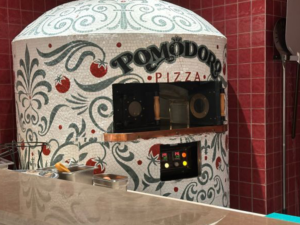
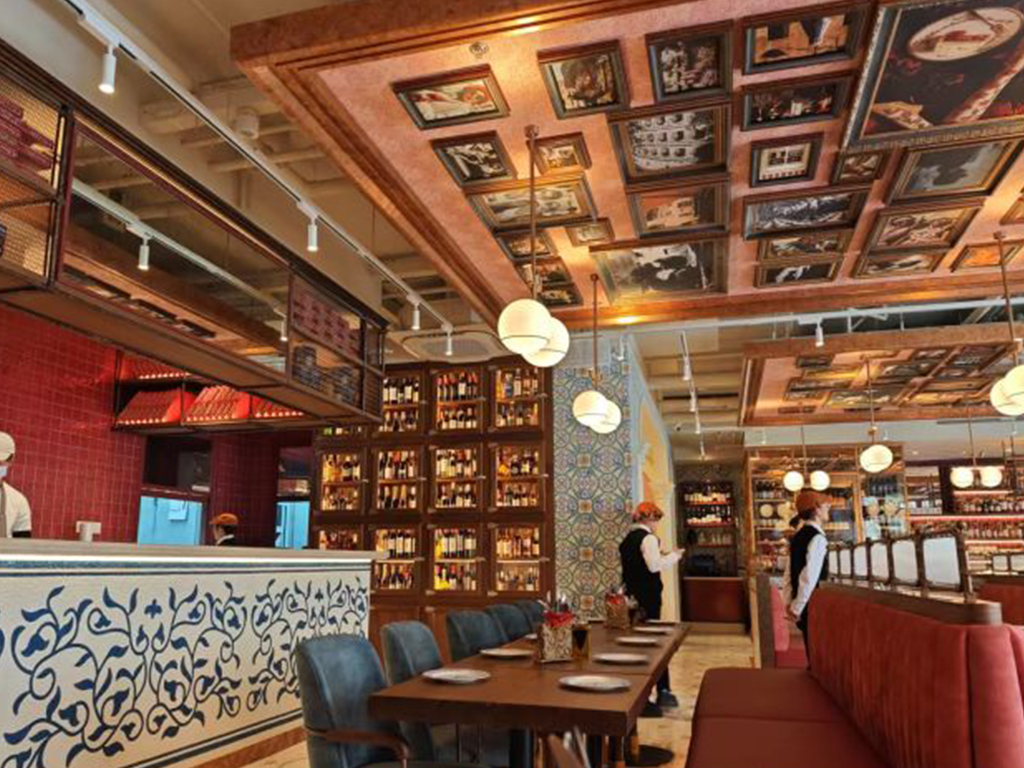
Interior Design Integration
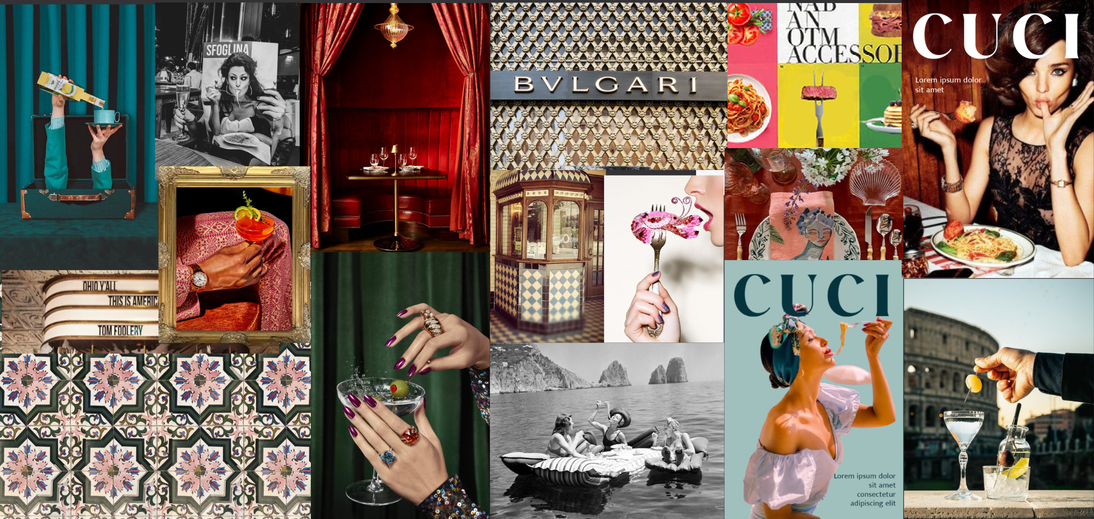
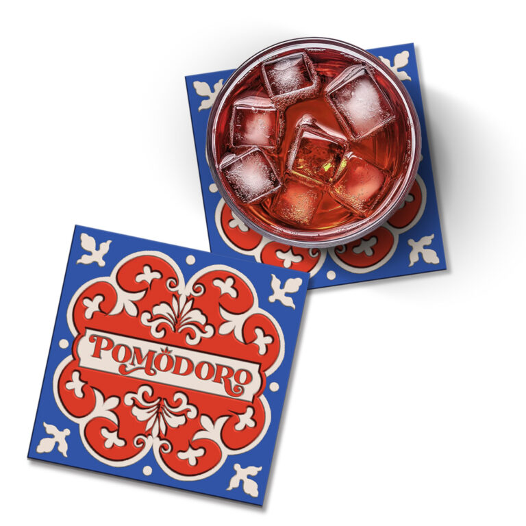
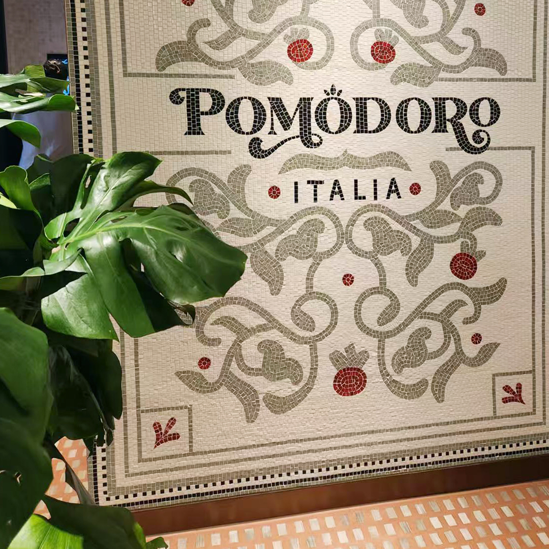
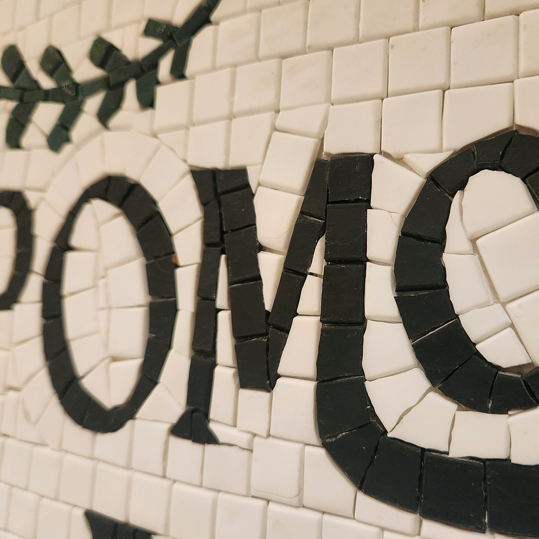
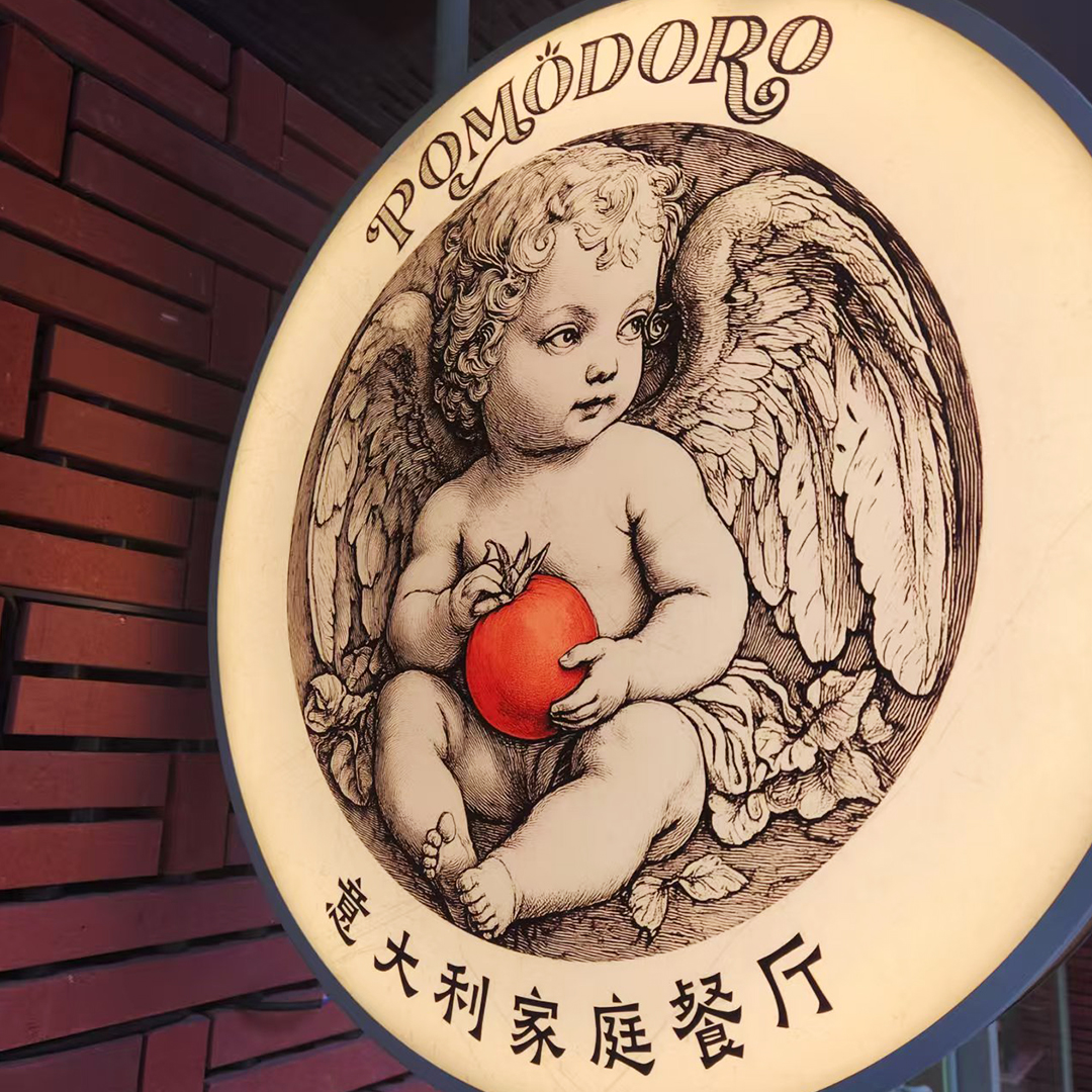
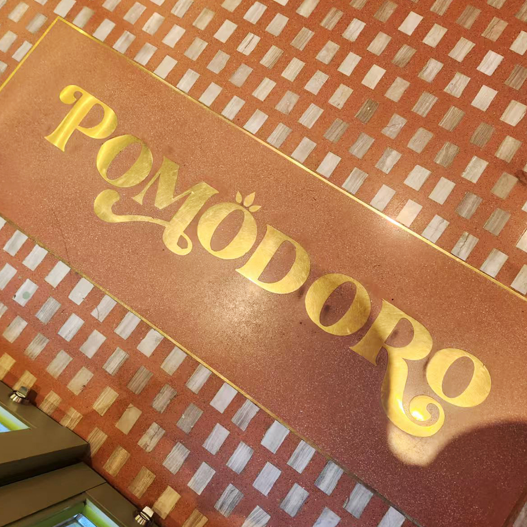
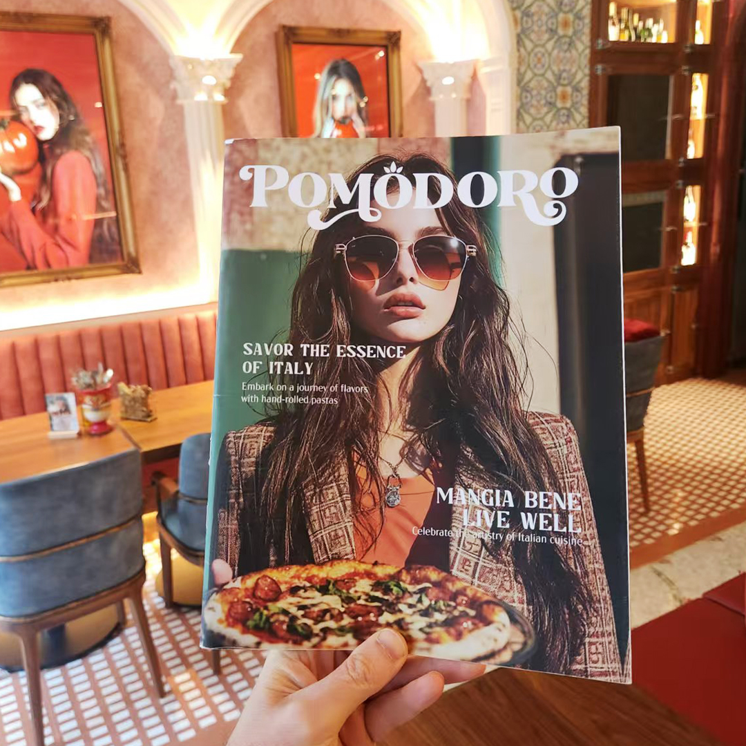
Visual Identity
Menu Design
Restaurant Applications
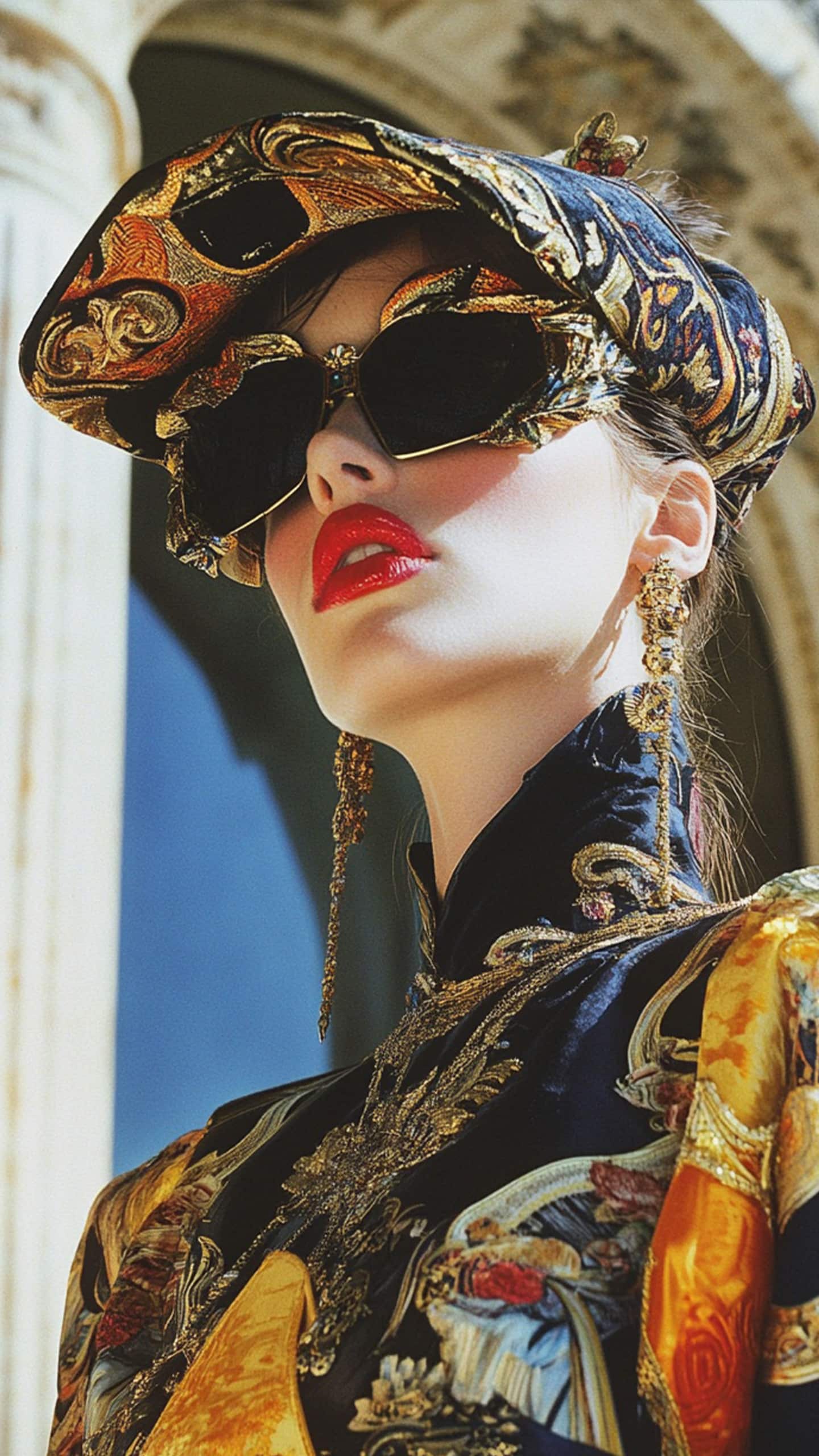
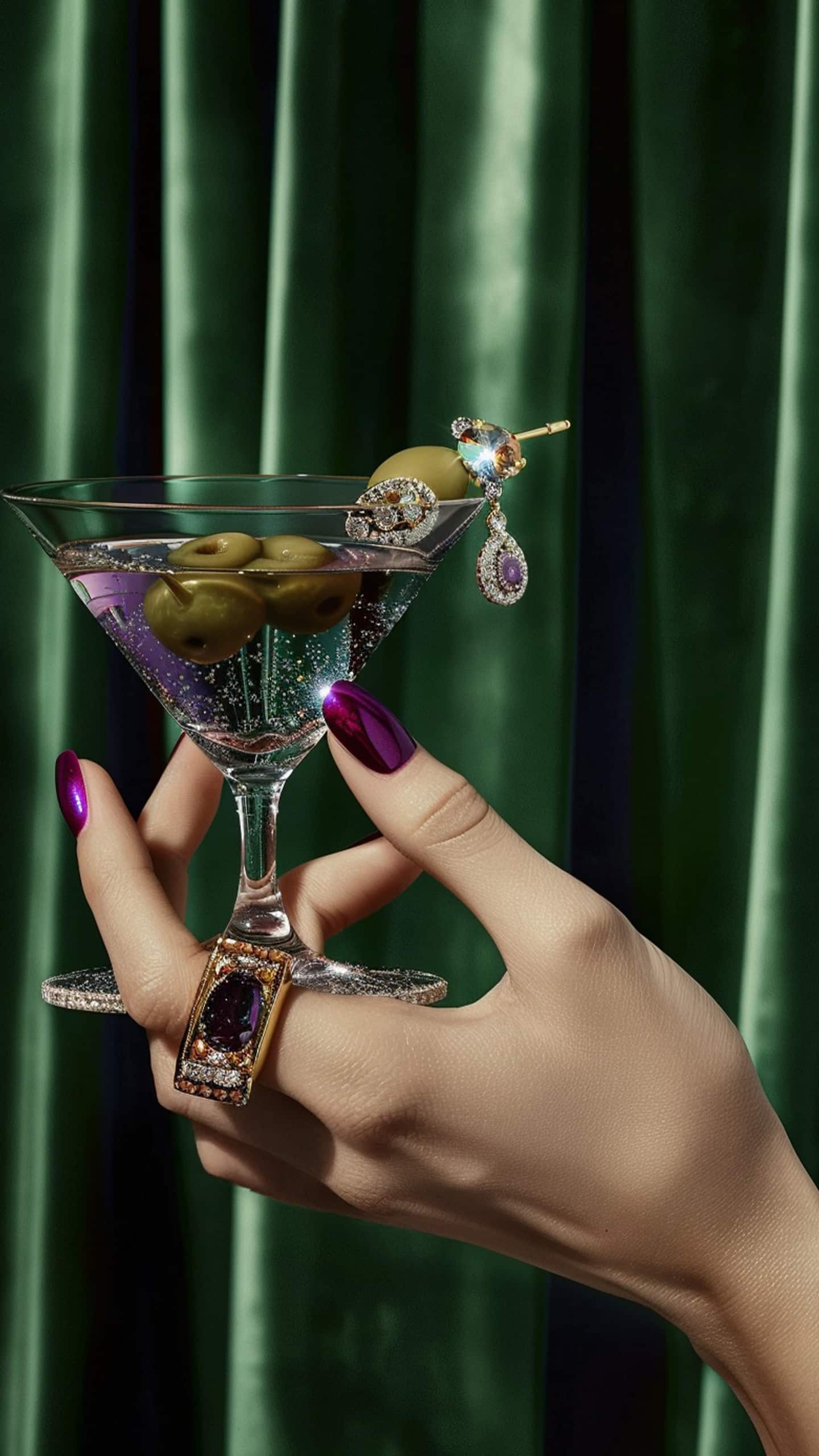
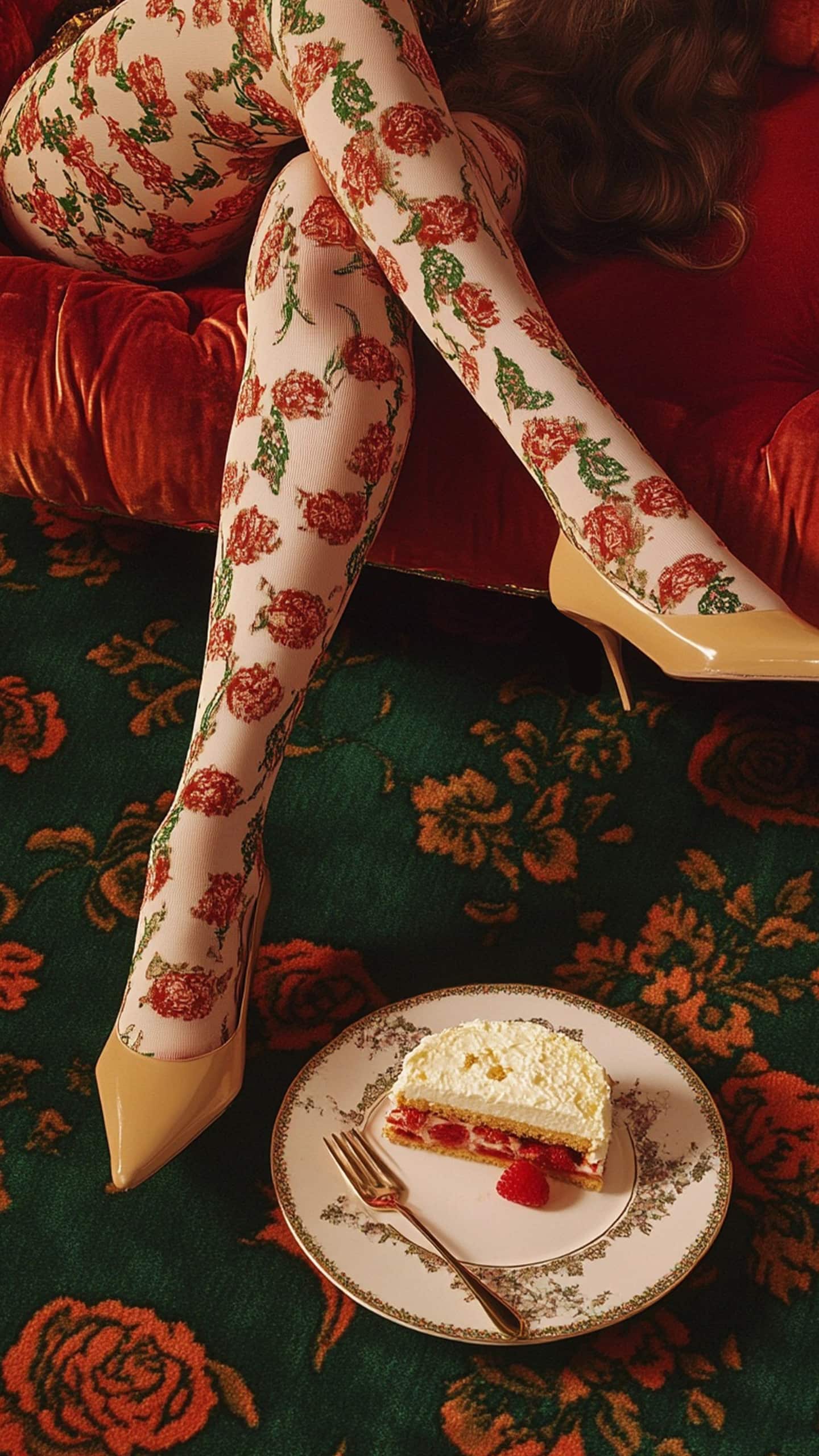
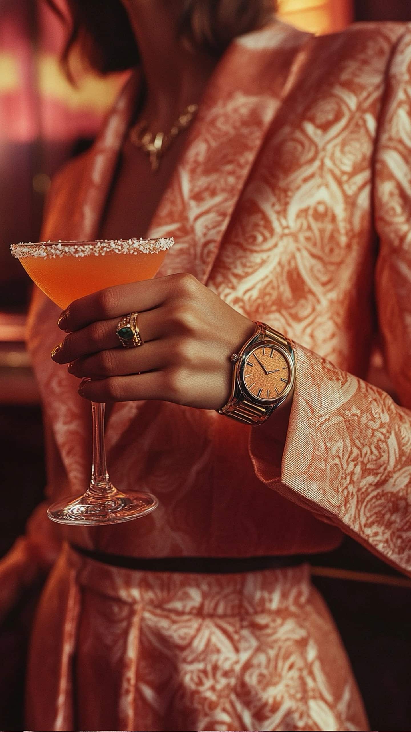
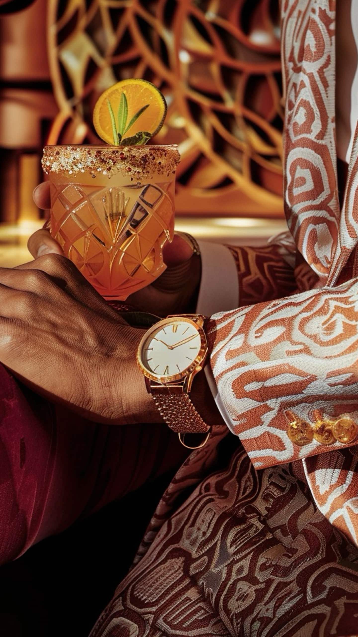
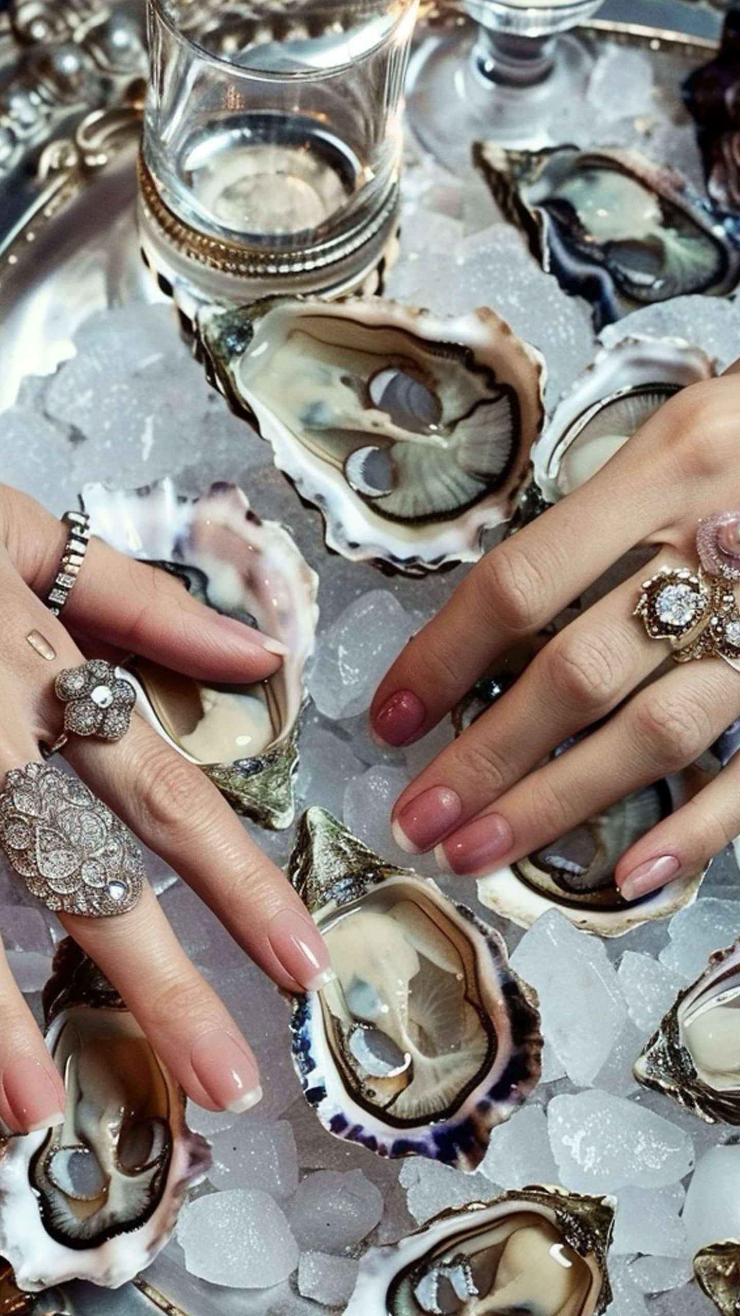
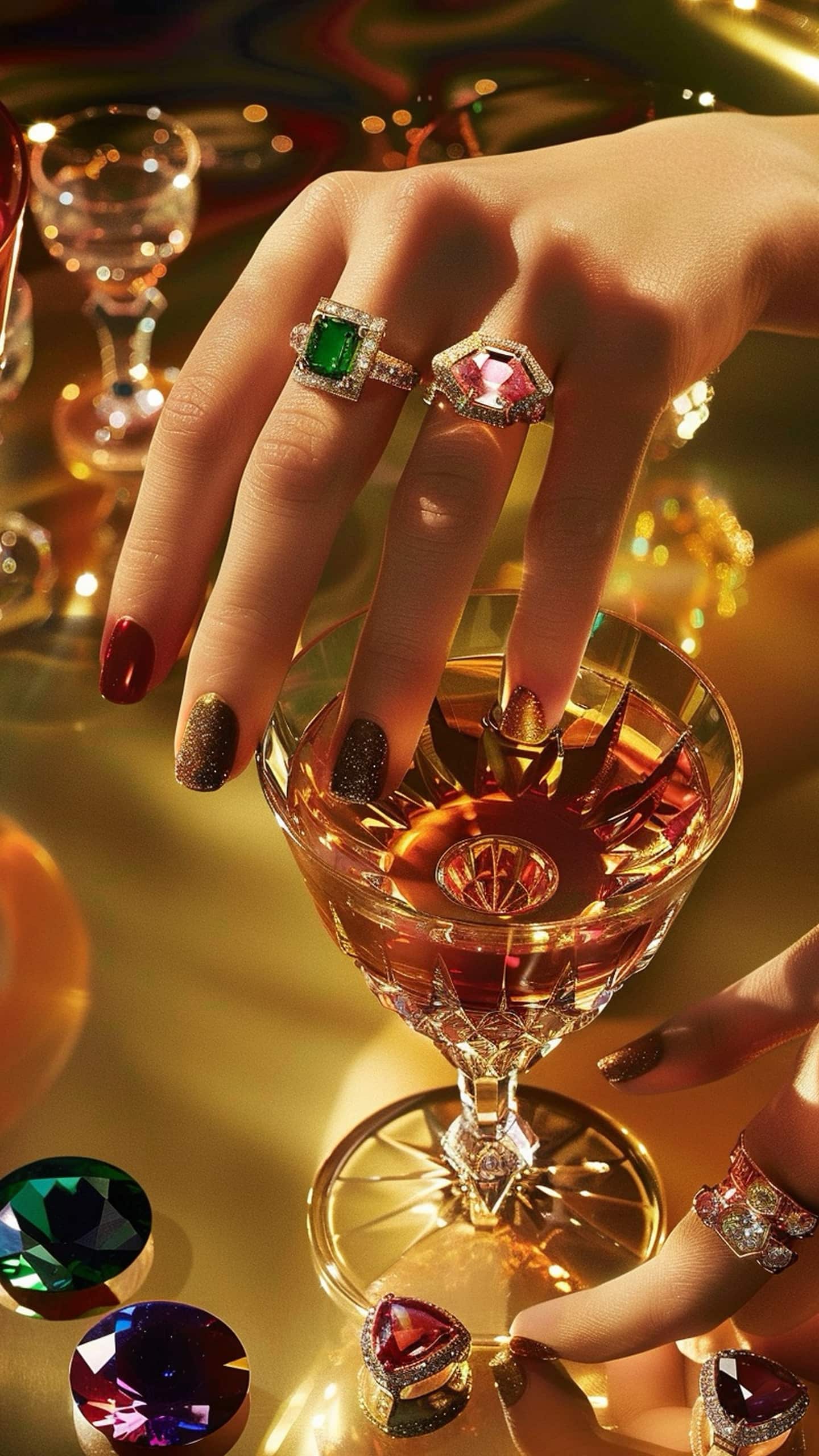
Like in Rome, every moment is a reason to look good and enjoy life.
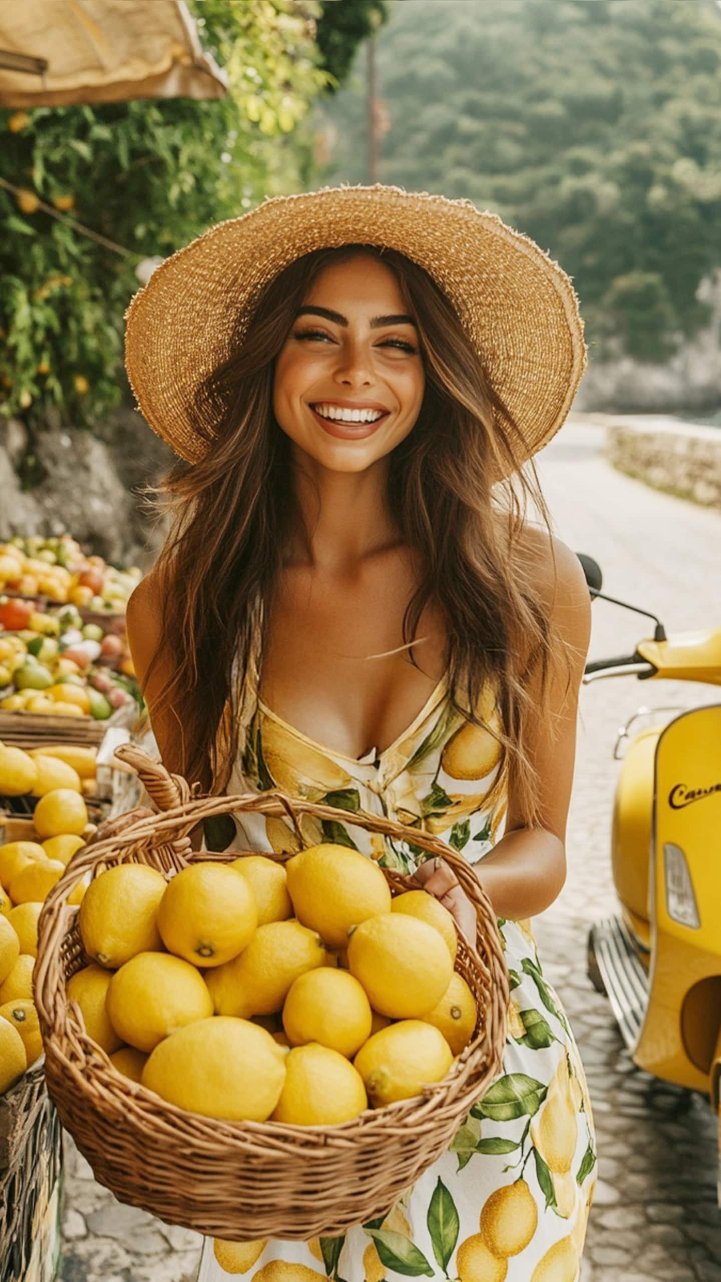
Cruising the streets on a Vespa in your scarf and sunglasses, just to stop for a coffee with the morning news.
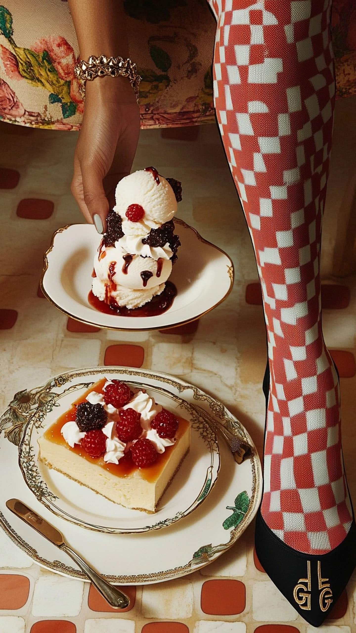
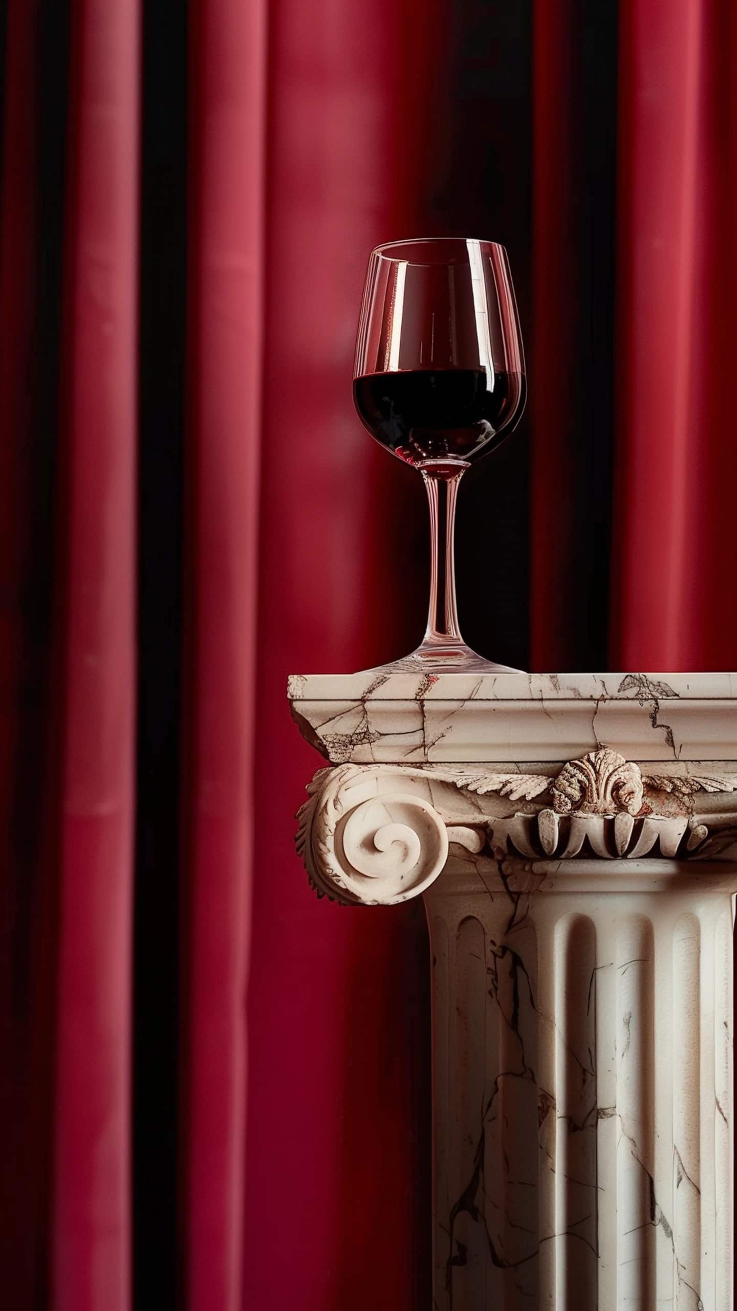
Meeting friends for a long lunch with crisp Italian wines.
Catching a Martini with antipasti for a golden sunset or a new outfit for dinner before heading to the theatre.
Or perhaps, it’s just the indulgent pasta during your weekend getaway to the Roman coastline.
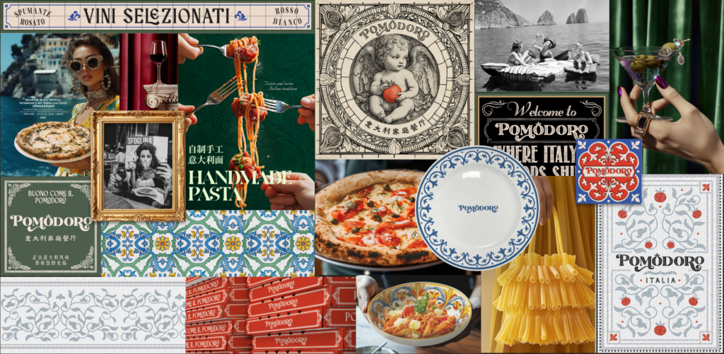
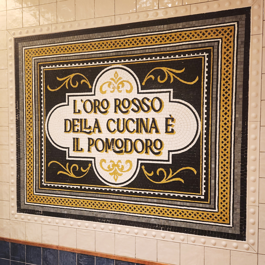
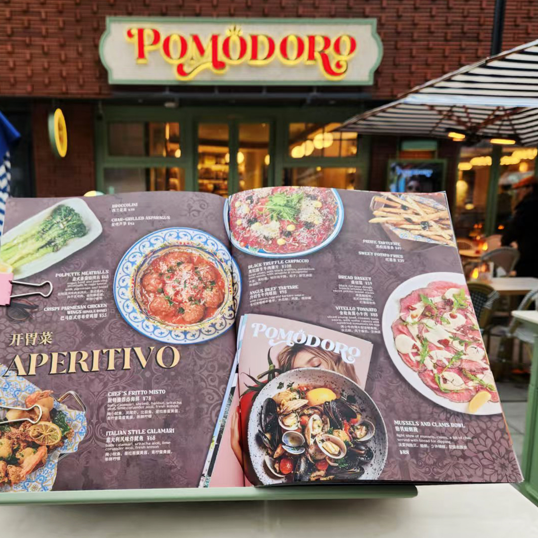
When designing an image based menu there are a number of things to take into consideration. There isn’t much goodness to get inspired from. Shanghai in particular is a fairly unique target market for menu design. Pictures need to look good, but great photos with nice backgrounds make for awful menus text backdrops! Having a photo of every dish is a nightmare too, as everything will be small and looking like one of those laminated menus on the counter at KFC or Yong He Da Wang!
The key is to have the right balance of images, simple backgrounds that allow you to adjust the composition and add the content. Bearing in mind of course, that in Shanghai you’ll have double the amount of content, as it needs to be bilingual. Additionally local consumers like to see English first, as it builds trust that this is an international brand and chef – which it is.
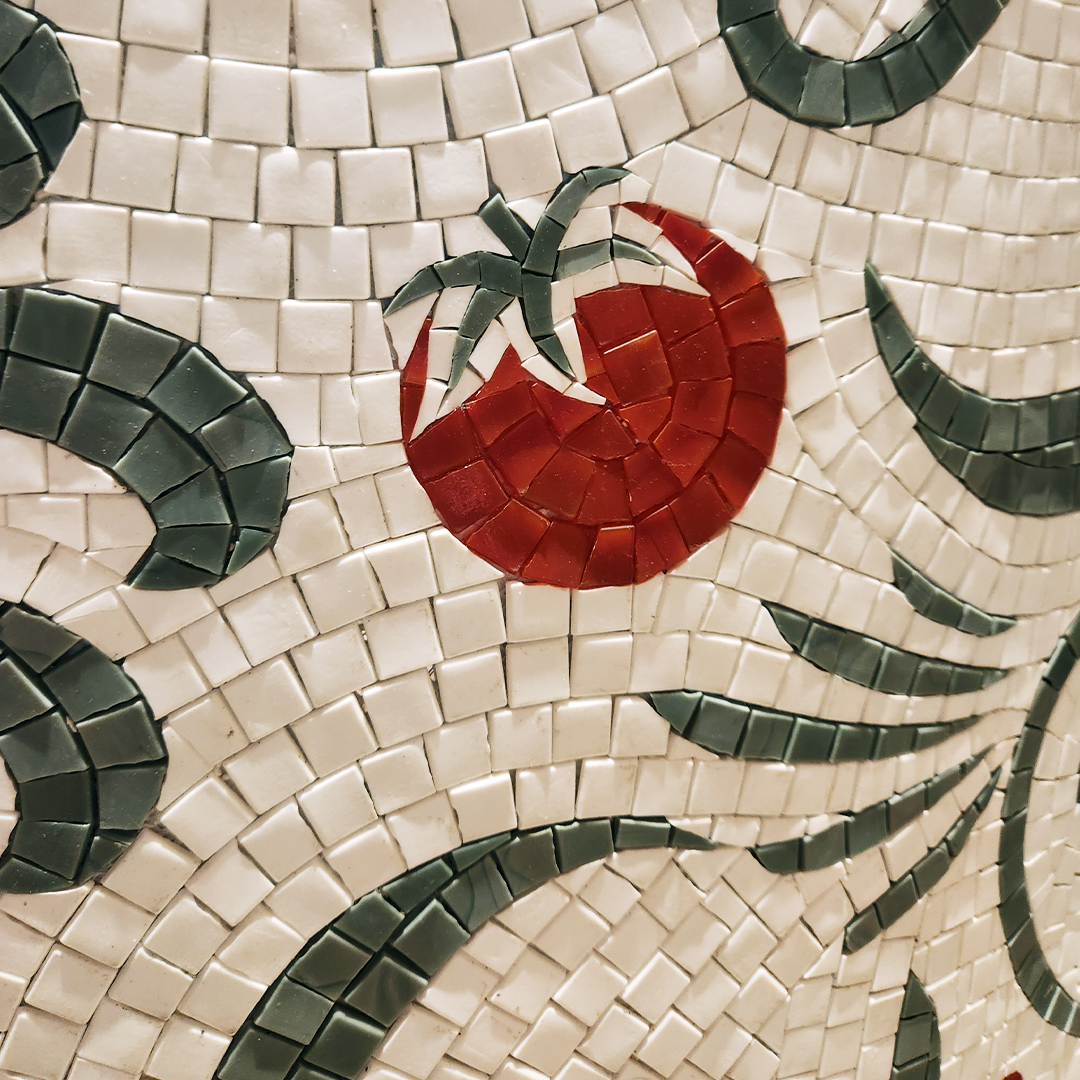
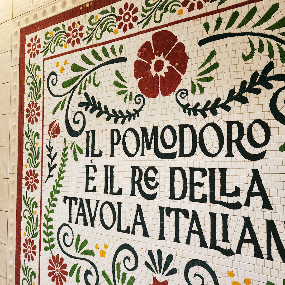
Finish it off with some textured background and illustration to tie it all together with the brand story, and here we have it!
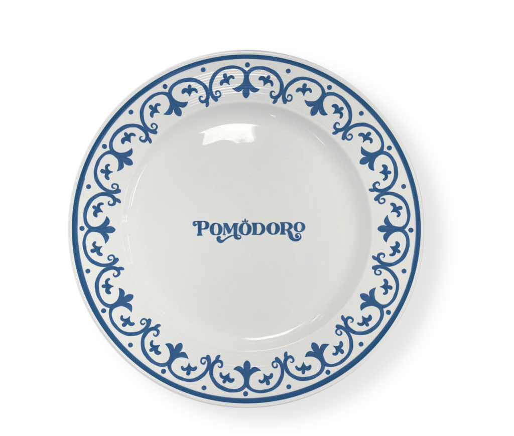
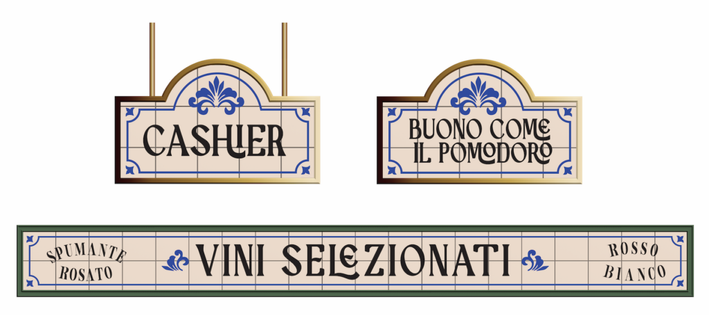
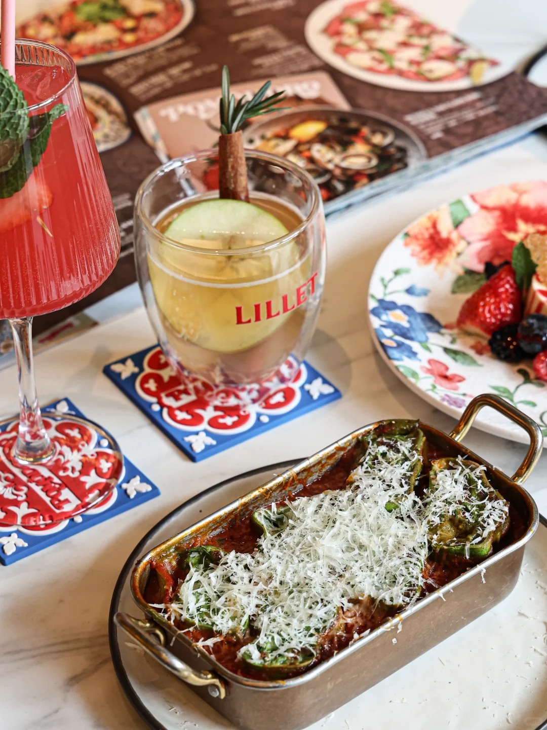
To finish with a handicraft touch is always appreciated. We made sure to take care of the design and sourcing of most pieces too. Produced in high quantity, they come cheaper than you’d think.
Besides assisting the team with marketing collaterals, our role also includes the styling and presentation of products served to guests, then all wrapped up in brand training and photography guides.
Feel like a getaway to Roma but closer to Asia? Go to check it out in Shanghai!