ALDI Launches in China
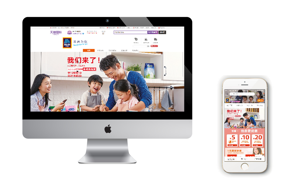
Today, the official launch of ALDI in China is marked with a fashion show and huge media push. Over the past few years hundreds of people have been involved in the build up, and now the real business starts. As the brand takes pride of place on the front page of TMALL, subway stations get billboards pasted and ad-shells lit, it’s an exciting day for all involved, not least us. For the last 12 months we’ve been working with ALDI to help define their brand in China; what have we been up to? Our first task was the name.
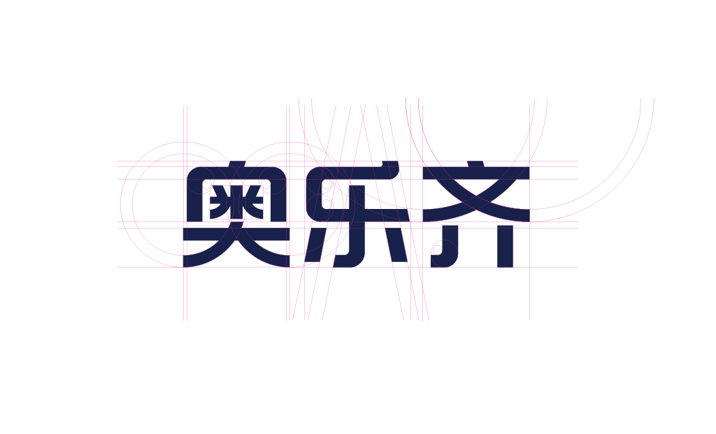
The brief was to create a name both phonetic and meaningful, not too difficult, however finding one that was not already registered and that had no negative associations in any of China’s dialects narrows choices considerably. The Chinese name for ALDI is 奥乐齐. By combining these three characters, it brings to life ALDI’s positioning within China, while also ensuring there is a phonetic match to the German name. 奥 ( Ào ) translates to ”a feeling of wonder” and 乐 ( Lè ) to “happiness” creating the meaning that ALDI is a place where you can discover a range of products for a happier life. 齐 (Qi ) translates to “complete”, which touches on ALDI providing a complete range of international products to its consumer.
From here, Chinese typography was designed to fit with the new version of the global identity.
The new global logotype is a heavy weight typeface with little detail, a tough template to mirror into a Chinese logo type with 24 character strokes. We focused on being as bold as possible, while remaining legible at small sizes, considering that most users will see the logo via the Tmall app.
With a country launch of this size there are many different partners involved, many of which have never heard of ALDI before. Phase three of the project, the Brand Book, serves as a bible to all those new to the brand. The Brand Book explains the history of the brand, their mission and vision in China, and does so with examples of key visuals and application design.
Key to all of this is to create guidelines that are not only respectful of the brand’s origin, but flexible enough so that they can be adapted and relevant to the local market. In order to bring this to life, we held photoshoots to create key visuals of families and product categories that are used on each of the TMALL product pages.
Building a trusted brand in China takes time and commitment and we’re excited that we’ll continue to support ALDI into the next step. If you’re curious how this has all come together, click here to check out more.


