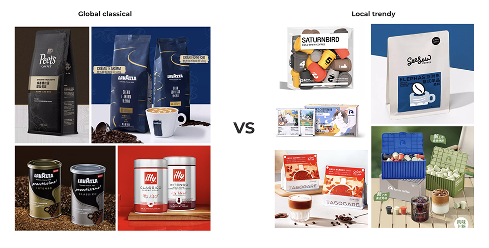
From the bold, cheeky Oatly drinks packaging to the classic allure of Italian coffee, what’s on the outside now sells what’s inside. In coffee, the contrasts are sharp: the vintage Peet’s Coffee logo signals legacy, while China’s Saturnbird Coffee thrives on vibrant, trend-savvy design.
But it’s not just style—it’s brand strategy. Today’s younger coffee drinkers aren’t investing in expensive equipment. They want convenience, affordability, and fun. That’s why local brands are leading with drip bags, liquid coffee, and freeze-dried formats—packaged in playful, youthful designs that speak directly to this new generation.
Global brands face a choice: stay classic or localize fast. This article explores how coffee packaging now wraps more than beans—it wraps culture, price point, and personality—from old world to new wave.
Let’s uncover some of the latest branding strategies for coffee products
How to design coffee packaging for local markets: Balancing Global Brand Image with Local Consumers' Needs – Peet’s & Lavazza
Peet’s Coffee and Lavazza take different routes to stay visually relevant, yet both aim to balance global brand consistency with local resonance.
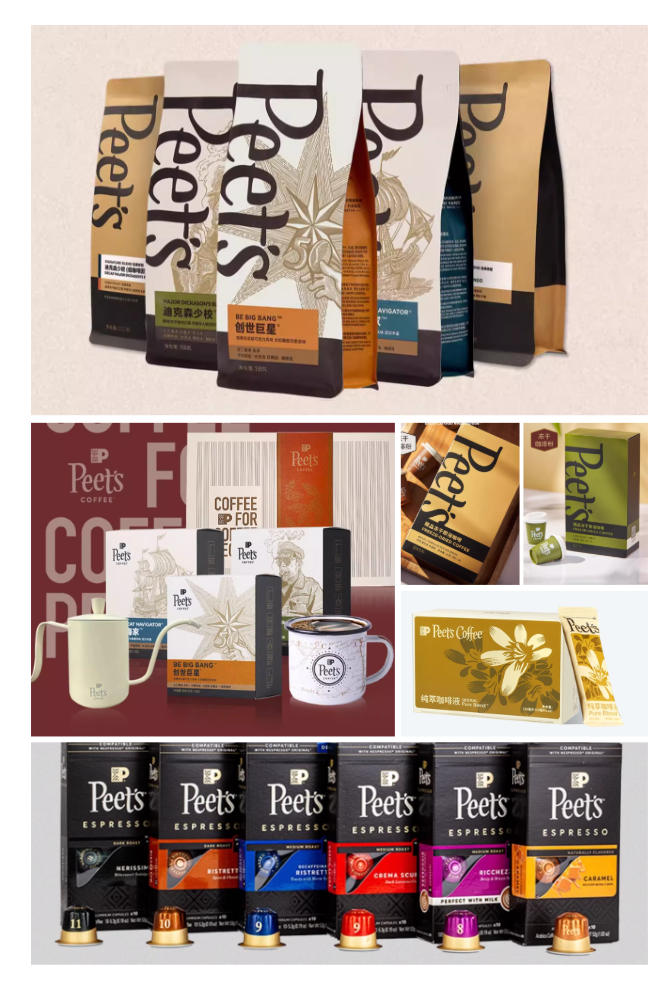
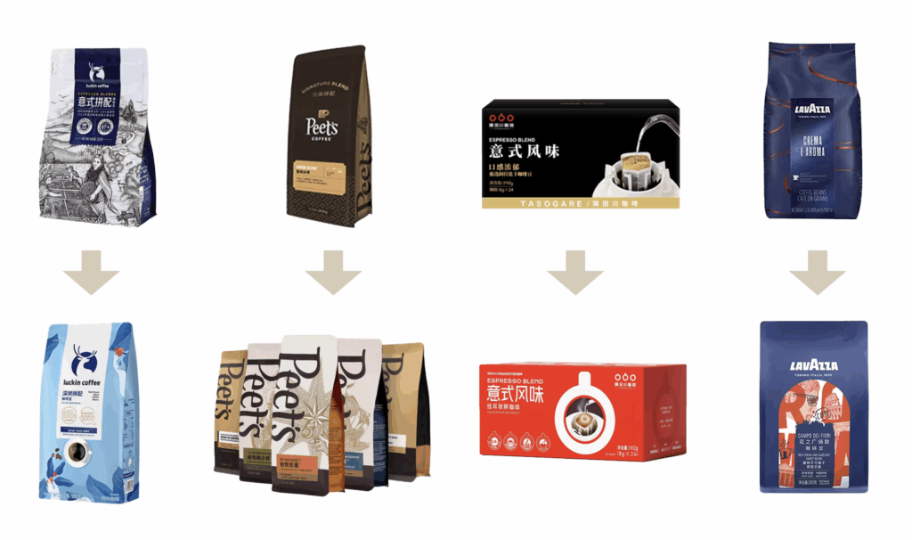
Peet’s has an advantage: its design already feels modern. The use of low-saturation colors, elegant line art, and a refined logo system designed to appeals naturally to younger consumers. Rather than reinvent itself, Peet’s focuses on building a tight packaging system design across formats—whole beans, drip bags, and freeze-dried—adjusting layout and color without losing visual identity. It’s a case of consistency made cool.
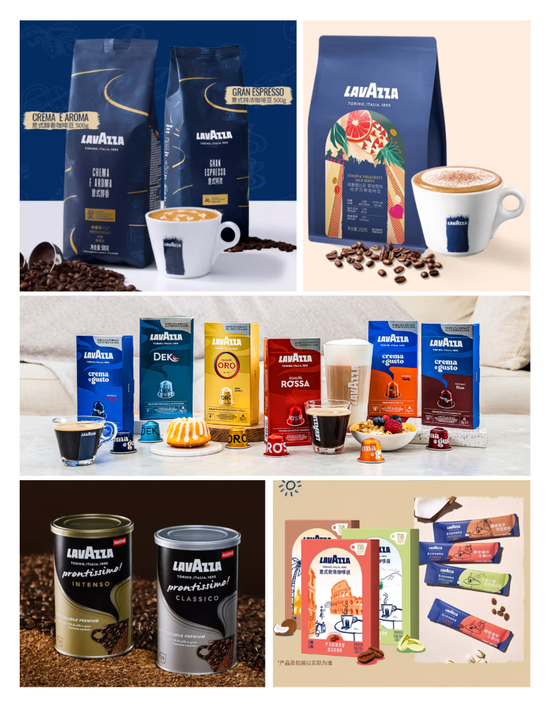
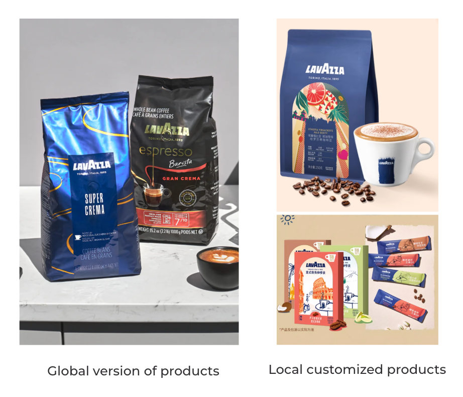
Lavazza, in contrast, is evolving from a more traditional base. Known for its deep blues, metallic, and signature “aroma curve”, its imported packs can feel overly formal in fast-moving, lifestyle-driven markets like China. Recognizing the gap, Lavazza has started localizing its packaging—introducing brighter colors, cleaner layouts, and culturally relevant themes to appeal to a younger audience.
Both brands face the same challenge: how to evolve their brand identity without losing their core essence. One sharpens its system, the other loosens its brand image. Either way, adaptation is no longer optional.
The Local Twist – Luckin & Tasogare Brand Identity
If global brands refine, local players accelerate.
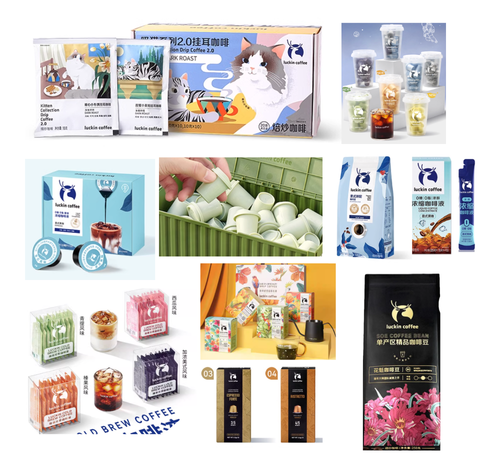
Luckin Coffee, born digital, uses packaging as a lifestyle tool. Its drip coffee line is treated like seasonal drops—colorful, theme-based, and constantly refreshed through pop culture collaborations and IP tie-ins. Freeze-dried and liquid formats are clean and minimal, designed for convenience. The look feels friendly, affordable, and made for social sharing.
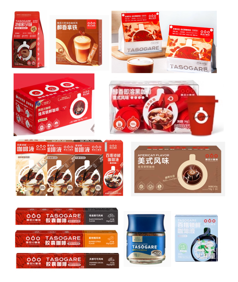
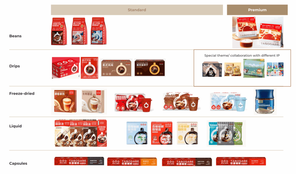
Tasogare, while a Japanese brand, has localized exceptionally well in China. Most of its products follow a clean, red-led system—simple layouts, bold brand presence, and consistent messaging. It’s instantly recognizable and easy to navigate. Only in its drip coffee line does Tasogare occasionally play with limited editions or themed designs, echoing Luckin’s agility—but with more restraint.
Both brands understand the current market truth: packaging is not static. It’s visual communication designed to be shared, posted, and remembered. Especially in China, the look often sells the cup.
Clash or Convergence?
At first glance, global and local brands seem to live in different visual worlds—heritage vs. hype. But the gap is closing.
Lavazza is loosening its traditional identity to fit better with local tastes, adopting lifestyle-focused visuals and softening its design codes. On the other side, brands like Luckin and Tasogare are growing more structured. Their visuals may be vibrant, but there’s increasing consistency and system logic behind them.
Instead of a clash, it’s a quiet convergence. Global brands are localizing. Local brands are maturing. The most successful borrow what works—refining it to their own rhythm.
From Heritage to Hashtags
Coffee packaging today isn’t just about shelf presence —it’s about social media presence.
From Peet’s timeless design system to Luckin’s themed drops, brands are rethinking what packaging needs to do. A clear trend is taking shape: less heavy, more liveliness, larger color fields, modern graphics, and a definite move away from black backgrounds. The new standard is fresher, cleaner, and easier to navigate.
But it’s also not just about looking good—it’s about building a system that works across products, platforms, and cultures. Brands that blend heritage with relevance, and clarity with personality, will lead the next wave.
Because in a market where attention is short and choices are endless, packaging is no longer decoration—it’s your first word.
Good design earns attention. Smart design turns it into action. Want to customize your packaging strategy?
Want to check out some of our packaging portfolios and insights?