Supporting
HOMESLICE PIZZA
to their delicious future
Rebranding from strategy to guidelines
Project
Branding
Location
China
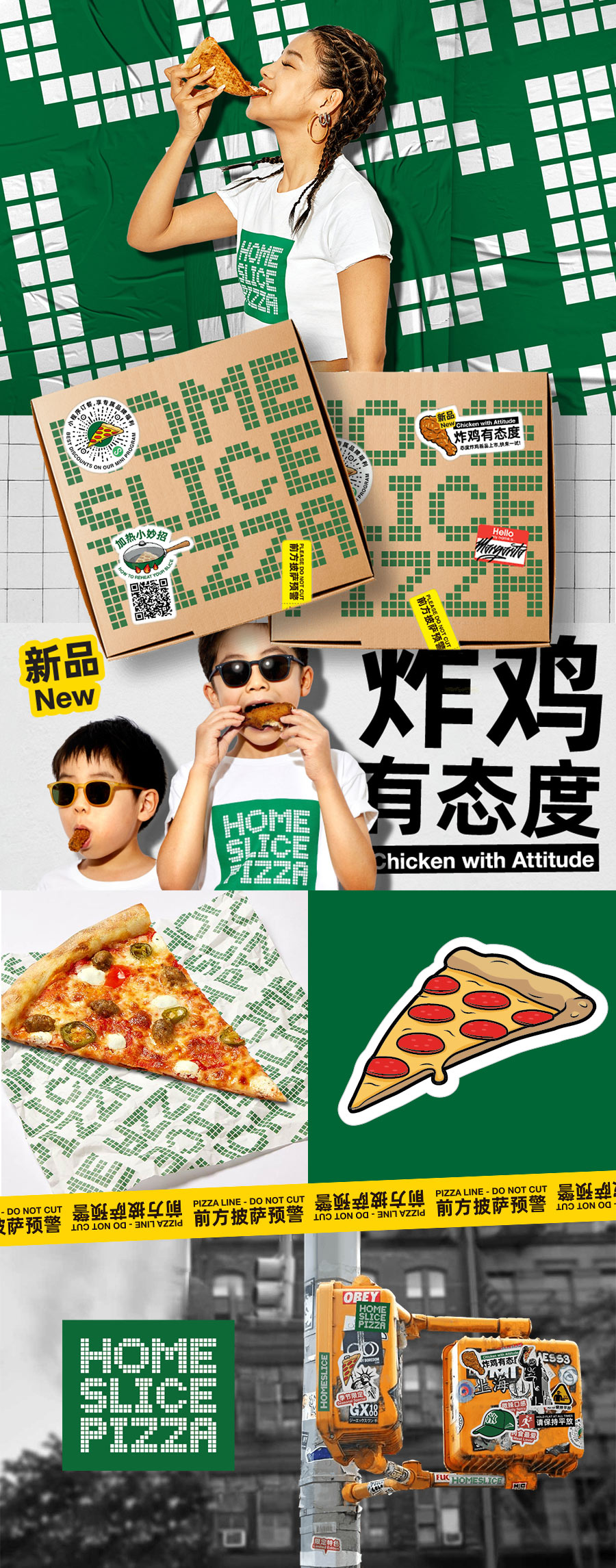
For HOMESLICE PIZZA, we delivered brand identity design services that captured the essence of New York’s street culture. Our role as a freelance branding designer involved developing a branding template and brand kit template that reflect the brand’s bold personality. The result is a distinctive identity that stands out in Shanghai’s competitive food scene.
As a pizza that grew organically they only had limited brand assets and felt like those didn’t support their target market connecting with their core messages: New York Slices and a strong New York Attitude. Research quickly showed they were right.
Our role was to audit, generate insights, moderate workshops, reposition, then roll out the brand across every touch point, and create brand consistency tools to get ready for all their ambitions for growth.
We then embarked on their first step on their expansion journey; to launch yet another outstanding product. Crunch crunch crunch!
Brand Strategy
Creative Direction
Design
Copywriting
Wayfinding
THE STRATEGY PROCESS
Generate Insights, Understand the consumer journey
Upgrade into an impactful Brand Identity
Build a Toolkit ready for anything
SETTING THE MOOD!
Out of our strategy sessions, one of the key outcomes is the moodboard.
This carefully curated selection of our favorite images – pinned together as a team – becomes the north star we’re heading towards.
Over the course of the project, we progressively evolve and replace the images to create the final brand board, filled with proprietary assets.
The brand in a nutshell
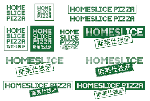
before
SIMPLIFYING AND ENHANCING THE VISUAL IDENTITY SYSTEM
Straight out of consumers insights, the new HOMESLICE logo had to be adjusted to ensure balance and consistency between the English and Chinese typeface.
Most importantly, we wanted as many interactions with the brand to be lead with the core logo: the iconic green box.
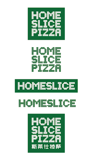
after
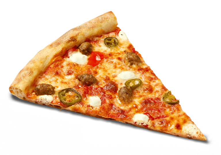
MAKING THE FOOD LOOK SEXY!
Designing a food and beverage brand primary communication device.
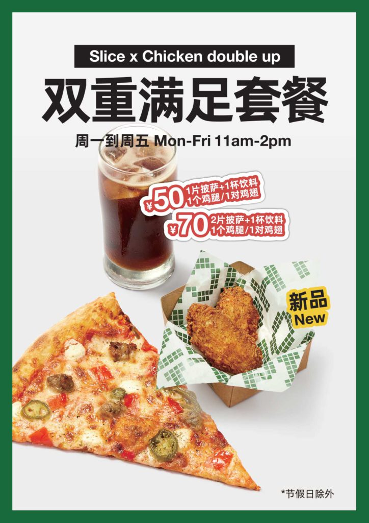
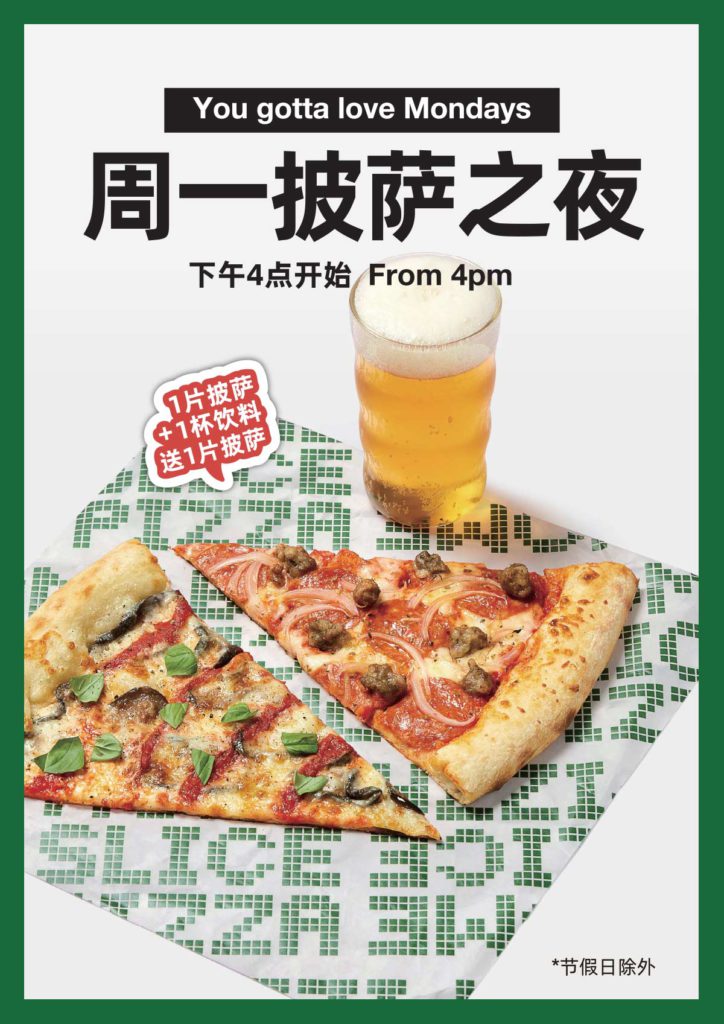
From photography to menu screens, delivery platforms and beyond.
GIVING EXTRA SPECIAL CARE FOR ONLINE DELIVERY PLATFORMS
While designing hundreds of menus over the years, we’ve come to realize, simple doesn’t necessarily mean simpler! The challenge with the HOMESLICE menu is that it needs to be iconic, delicious but also functional.
While the instore menu was important, for a pizza joint, delivery platforms sales are just as important.
With so many other restaurants selling pizza, how do we make sure our brand stand out while making our food looks mouth watering?

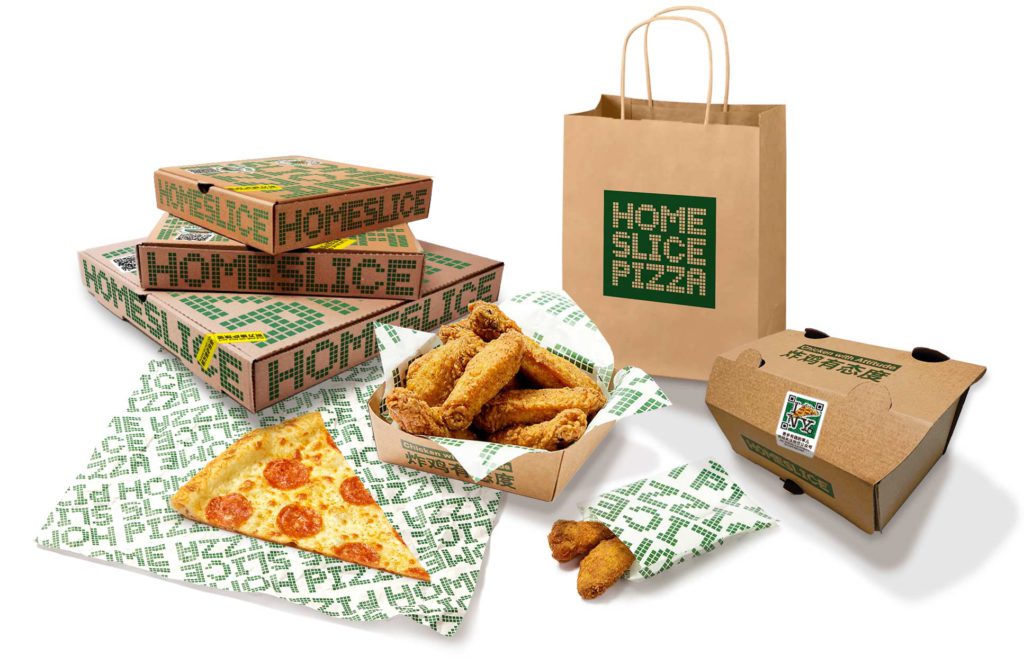
APPLYING THE BRAND ACROSS ALL TOUCH POINTS
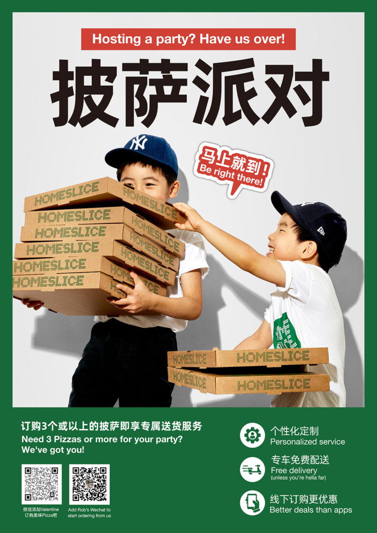
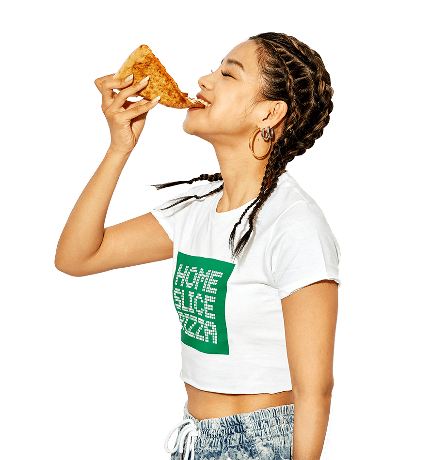
With our logo nailed down and supercharged by our redefined brand essence, we went on to redesign every piece that a customer may come in contact with along its user journey.
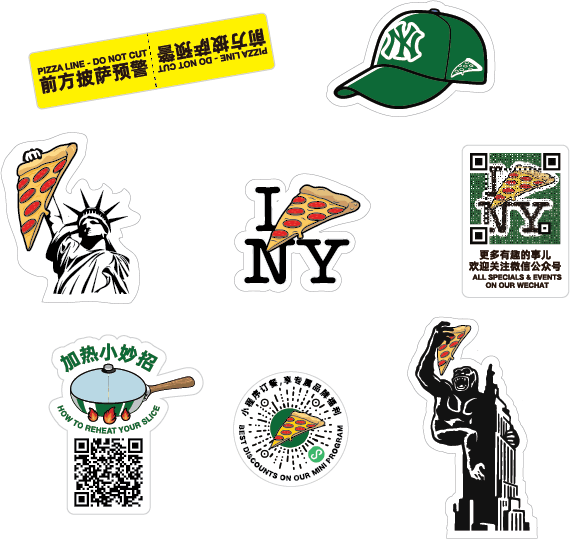
BRINGING USERS OFFLINE TO ONLINE TO OFFLINE AGAIN!
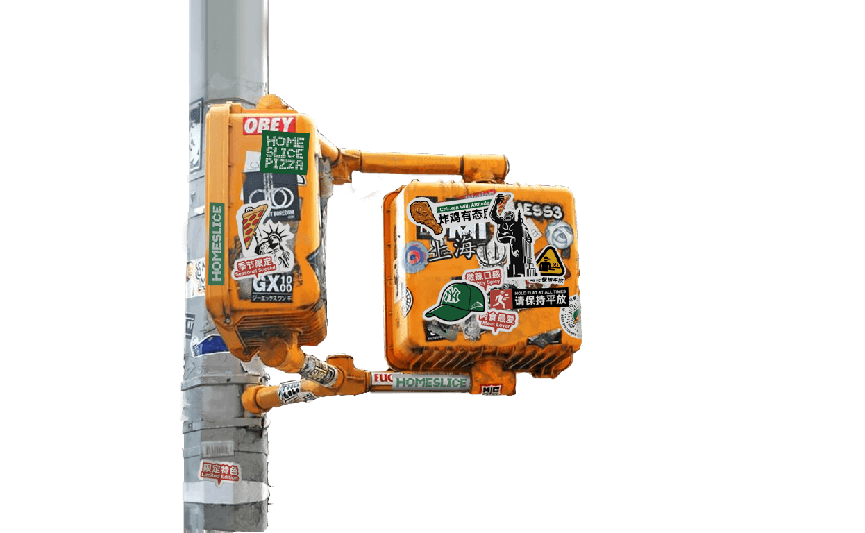
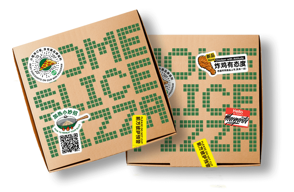
Besides looking badass, our brand stickers serve two functions. For one, it brings that New York street attitude into the brand in a fun, engaging way.
For two, it can hold call to actions that consumers can interact with on any touch point. Our leading being of course our pizza boxes.
If you can’t send traffic to your Wechat from delivery platforms, try doing it while consumers are chowing down on your pizza!
BRINGING THE BOLDNESS INTO THE STORE
Giving the store interior design the same brand attitude
AND INTO SOCIAL MEDIA
Online styles, more than image selection
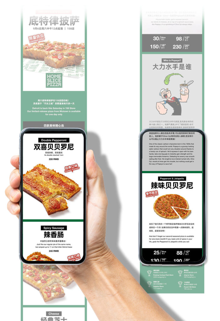
Wechat is the primary channel to communicate with loyal fans and potential new fans. From weekly posts to mini programs, it all has to feel HOMESLICE and engaging.
To make this gigantic task easier, consistent photography, copywriting, templates have all been set up online, easily editable by anyone on the brand team, at any skill level.



AND THEN THERE WAS CHICKEN!
Pushing THE RULES for An impactful LAUNCH CAMPAIGN
Sometimes you gotta make em to break em!
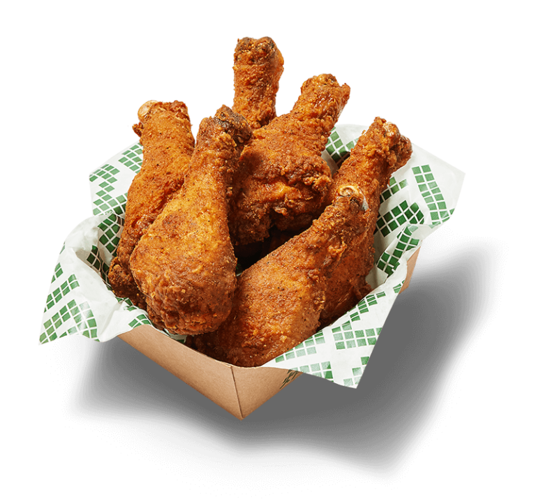
Based on market research, local consumers voted for fried chicken as the perfect (read essential) complement to Pizza. As with any of their products, Homeslice would only to bring fried chicken to the market with the high quality and flavor that made them famous.
While it wouldn’t be possible to say American fried chicken for political reasons, and New Yorks fried chicken wouldn’t really make sense, the campaign was built around the Attitude. Impactful photography has set the tone for many other marketing assets further down the line.


Turning our biggest fans into brand ambassadors
What better way to find “the faces” of our brand than to set up a competition for your most loyal fans. The prize? A year of free pizza!
To the right, the promotional campaign to bringing people on board.

What a pizza and chicken photoshoot looks like!
The final campaign live in store
...and finally
turning six months of strategy design and marketing assets into guidelines.
Brand guidelines convey a variety of information and tips about your brand, useful both internally to your company or organization and externally to your affiliates, partners, and customers. Although there is no industry-wide standard for what constitutes a brand standards document, the most notable organizations use brand guidelines as a tool to help everyone understand how to represent their brand.
Good guidelines connect different aspects of your brand, such as your logo, colors, and typography, to form a cohesive identity.
Great guidelines are highly useable, both to for you to check that anything you do is on brand but also, to create anything new in the future that you didn’t know yet you needed when they were written!
What did the client think?
We loved working closely with Thread to gain a deeper understanding of our brand, and we got a fantastic update that feels just right at the end of it.
Nat Alexander, Founder CEO
Would you like to take your brand to the next level, just like Homeslice did?
