How the Best Branding Agencies Make Drink Packaging Pop
5 branding strategies used for Eye-Catchy beverage packaging
As a client, you might wonder: how do some drinks immediately grab attention on the shelf—while others just fade into the background? The truth is, great packaging isn’t just about nice graphics. It’s about making fast, smart visual choices that stop people in their tracks.
From the nostalgic Vita drink to the modern revamp of Sprite packaging, each Chinese brand proves that what’s outside the bottle matters just as much as what’s inside. Today’s drink shelf is a design battlefield, where a bold Chinese logotype, a pop of color, or a clever layout can steal the show. From Tsingtao China beer to boutique functional drinks, and even alcohol branding, visuals are what connect brands to fast-moving, design-savvy consumers.
To stand out—on shelves or in a swipe—agencies are rethinking every detail: color, layout, type, and hierarchy. The goal? Not just to look good, but to deliver flavor, attitude, and clarity in one instant. Here are five visual strategies top teams are using to make drinks pop.
Here are 5 visual tricks top agencies use to make drink packaging stand out—fast.
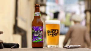
1. How to design beverage packaging using Gradient Backgrounds: Colorful Drink Packaging Without The Overwhelming Feels
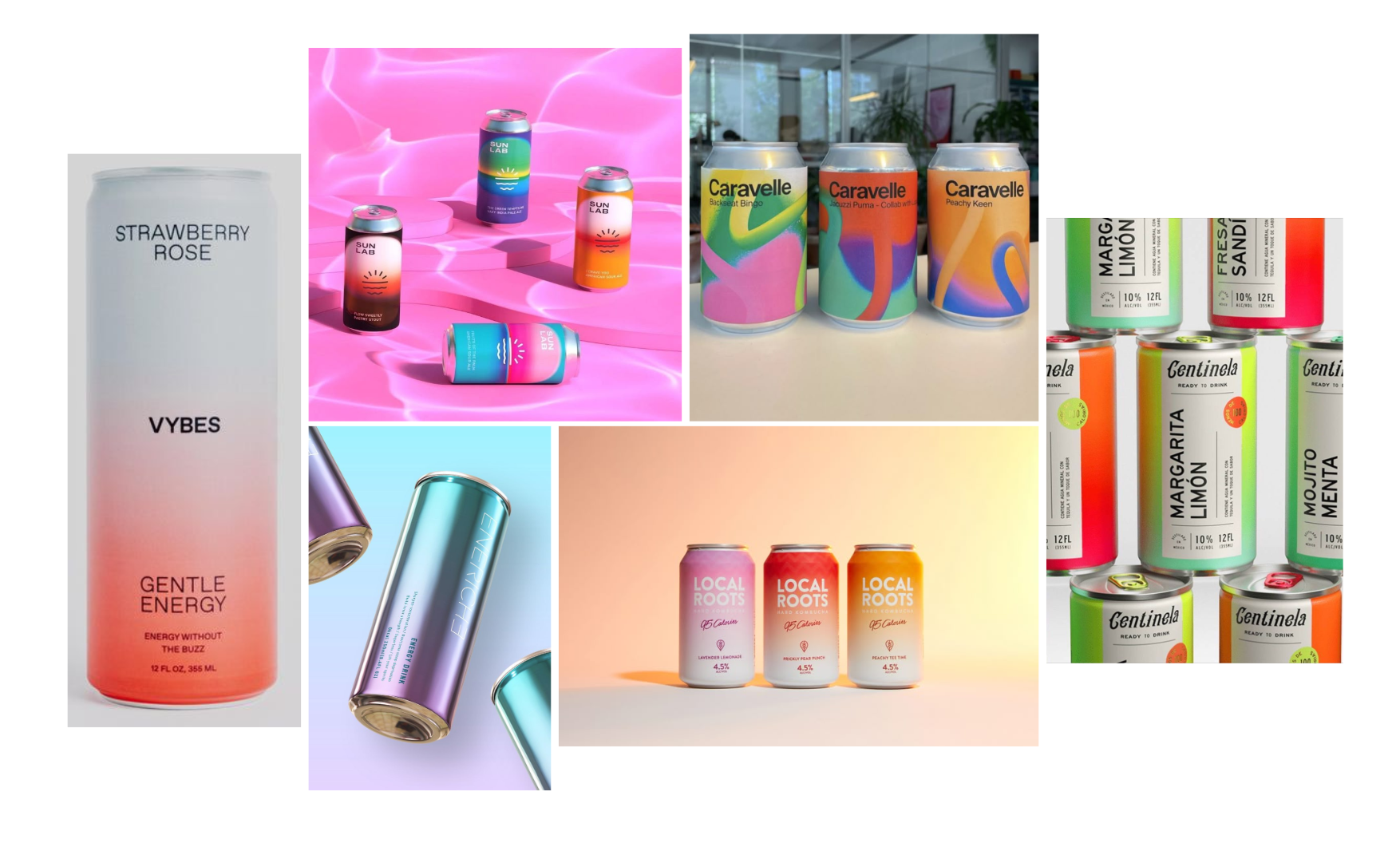
Flat colors can sometimes feel too harsh, too artificial, or just too much—especially when you’re working with bold shades. That’s why more brands are turning to gradients. They let you use multiple colors while keeping the overall look soft, bright, and balanced. It feels more natural and modern—perfect for drinks that want to look fresh, playful, or slightly premium without shouting.
One thing to keep in mind: gradients can be tricky to print cleanly, so make sure your materials and production methods can handle the detail and smooth transitions.
Here are some inspirations about gradient packaging design:
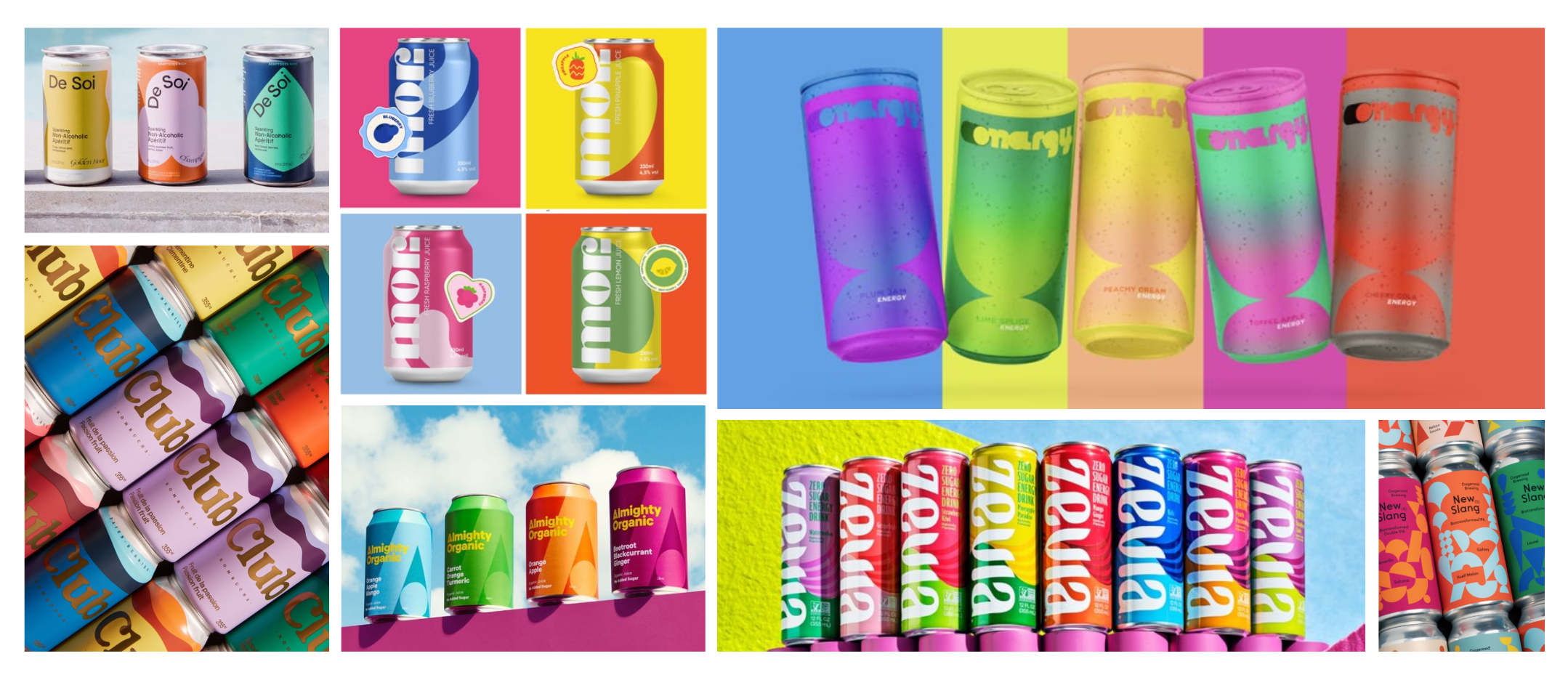
2. Drink Flavor Icons & Illustration: Make Beverage Packaging Feel Tasty at First Glance
Unlike snack packaging, beverage labels usually have limited space—especially for cans, bottles, or functional drink sachets. That means every visual element on the front has to earn its place. There’s rarely room for decoration just for decoration’s sake. Instead, illustration and icons are used as tools to deliver a clear message, fast.
Flavor icons—like fruit slices, herbs, or ingredient-inspired shapes—help consumers “taste” the product with their eyes. Whether it’s a juicy soda or a superfood drink, a quick visual hint makes the flavor instantly recognizable. The illustration style depends on your brand tone: playful and bold for mass-market drinks, clean and minimal for premium or wellness-focused products.
The key is clarity. A good icon or image should tell the story in one glance—what it is, how it tastes, and what it feels like.
Here are some inspirations about flavor icon/illustrations:
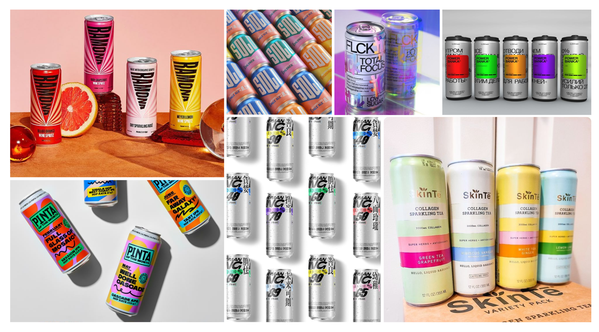
3. Abstract Shapes & Patterns: Help Visualize Flavors That Can’t Be Easily Shown
Not every drink can be summed up with a fruit icon. For more abstract or experimental flavors—like a mystery berry soda or a functional blend with a “boost” feel—brands often turn to bold geometric shapes, cropped brand marks, or graphic patterns. These designs don’t show the ingredients, but they create an emotional or sensory impression.
This approach often works best with high-contrast colors and strong compositions. Think of it like using design to express a mood—energy, freshness, coolness—rather than a literal flavor. It’s a great fit for brands that want to feel modern, edgy, or minimal.
But it’s not for everyone. In the mass market, abstract designs can confuse or feel too niche. This style usually works better for brands that already have strong recognition, or for sub-lines that target more design-conscious or younger audiences.
Looking for more tasty packaging flavor references? Click here.
4. Playing with Layouts: Breaks Design Rules to Stand Out and Get Remembered
When it comes to packaging, layout is one of the most powerful ways to stand out. Forget the usual “Z-pattern” or left-to-right visual flow. If everyone follows the same structure, everything starts to look the same. The most eye-catching designs often break that rhythm completely.
Product names can go vertical, stack to one side, sit at the bottom, or run across an image. The key is to build a layout that feels fresh and unexpected—combining text, logos, and illustrations in ways that surprise and delight. This not only grabs attention but helps consumers remember your brand among a sea of similar products.
What matters most isn’t following visual theory—it’s making sure your content hierarchy is clear: what’s the product, what’s the flavor, and who’s the brand. Once that’s in place, layout becomes a creative playground.
Click here to check some good reference images that might inspire you to create your unique layout
5. Bold Typography: Grab Attention and Help People Decide in a fraction of a Second
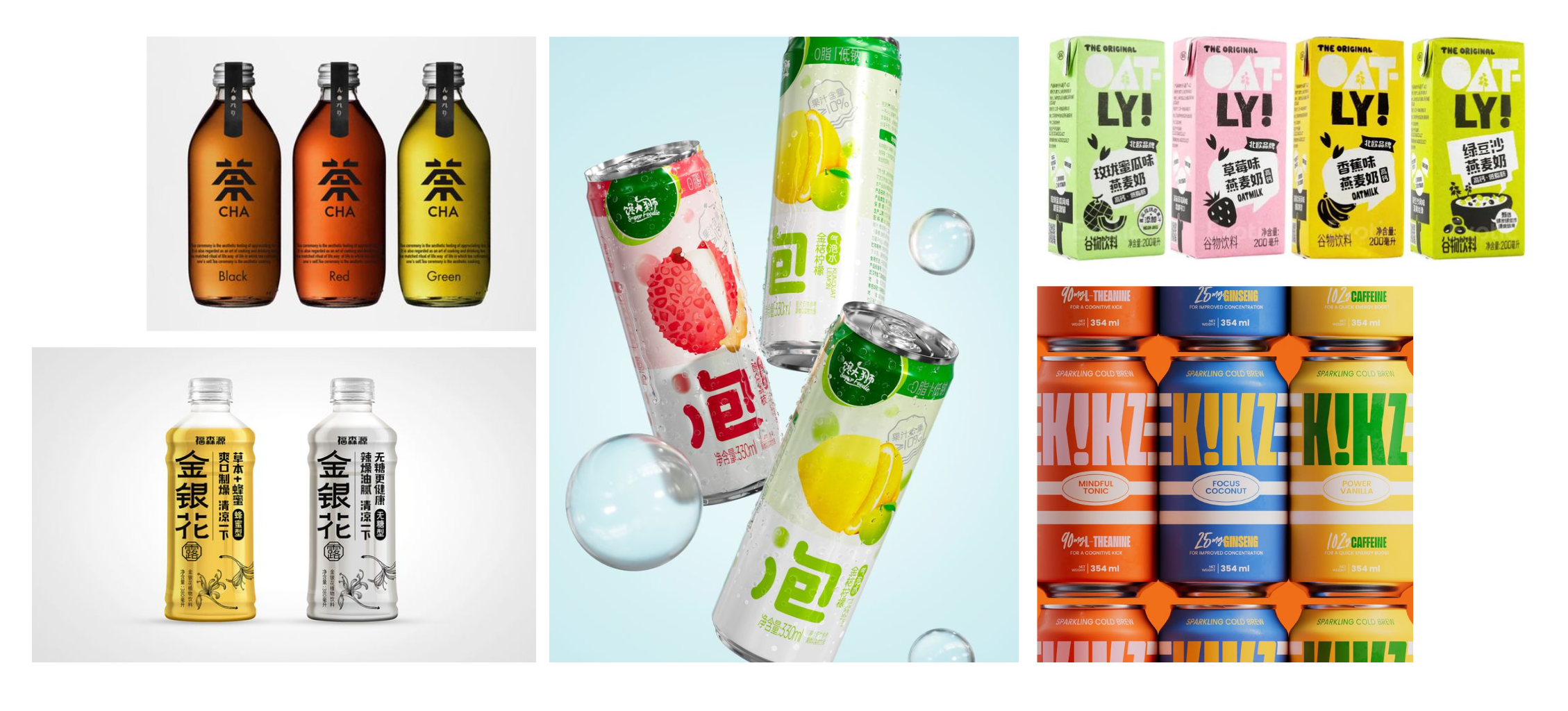
When it comes to Chinese beverage packaging—especially in recent years—bold typography has become the star. Brands often place one oversized character or word right at the center, like “茶” (tea) or “泡” (bubble), making the product type instantly clear. It’s direct, loud, and effective—especially when shoppers are scanning quickly, feeling thirsty, or just want something to cut the grease. One big word helps them decide in a second.
This approach isn’t just about scale—it’s about using type as your main graphic. Some brands, like Oatly, go a step further by turning bold fonts into playful layouts, combining product info with design in a way that feels fun and fresh.
Whether your tone is functional or expressive, bold type can do both the talking and the selling. It grabs attention, delivers the message, and makes your product easier to remember.
Wrapping it all up
Great packaging isn’t just about looking good—it’s about communicating fast and standing out with intention. Whether it’s through gradients, flavor-focused illustration, abstract form, bold layout, or oversized type, each element should serve a purpose: to make the product clear, memorable, and visually distinct.
These five strategies are more than trends—they’re tools. Use them to build structure, spark emotion, and shape how people connect with your brand in that split second of decision-making.
Want to know more about typography on packaging? Check below links to find out more:
38 Beautiful Examples of Packaging That Feature Typography-Driven Designs
Good design earns attention. Smart design turns it into action. Want to customize your packaging strategy?
Want to check out some of our packaging portfolios and insights?