The perfect bowl
Pho Store Rebrand
From fun western to modern high end.
Project
Branding
Location
China
At Thread Design, our work on the PhoStore rebranding project reflects our expertise as a branding agency with a strong focus on creating cohesive corporate identity. We developed a new corporate design language for PhoStore, supported by a tailored brand guidelines PDF to ensure consistency across all touchpoints. Our team also designed custom logo signs that enhance the brand’s visibility in physical spaces. Acting as a strategic design consultant, we helped translate the brand story into a contemporary, approachable dining experience.
Pho Store (our favourite pho restaurant in Shanghai) reached out to us with 3 challenges:
- How can we make our brand more attractive to higher end locations and their clientele.
- How can we make our brand better reflect our roots, our mission and dedication to quality.
- How to we rebrand without confusing customers?
The owner, part Vietnamese, part Chinese, growing up in Melbourne Australia, had experienced how pho brings people together. After moving to China, they wanted to share this in Shanghai.
Our role was to audit, generate insights, moderate workshops, reposition, then redesign and roll out the brand across every touch point. Creating a new look with brand consistency tools to get ready for all their ambitions for growth into many more venues.
This is the Pho Store Story.
Brand Strategy
Creative Direction
Identity Design
Copywriting
Merchandise
Menu Design
Photography
Wayfinding
The core brand statement
To us, rather than reproducing an authentic recipe, Pho is a global quest for the perfect bowl .

Developing the Brand Story

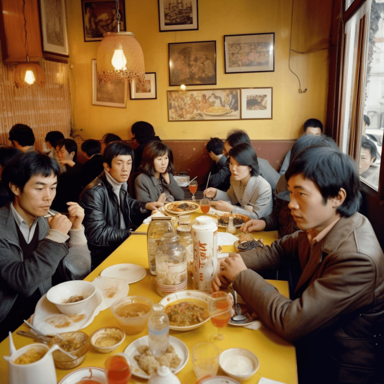
For us overseas Vietnamese, Pho has become a global family story.
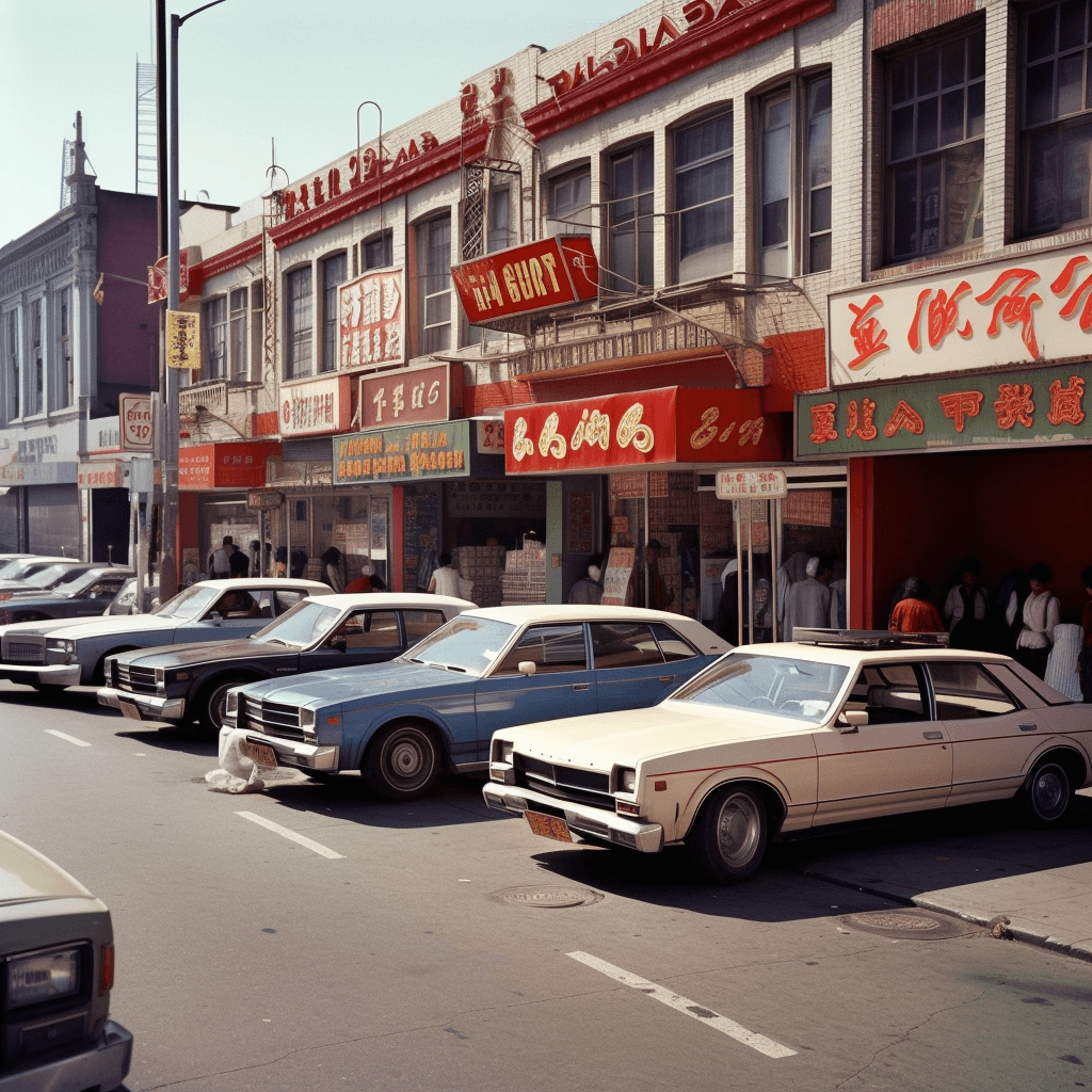
As our Vietnamese communities relocated around the world, Paris, LA and beyond, they started opening Pho restaurants where they would gather together and enjoy a taste from home,
as well as bringing the enthusiasm for our flavors to the locals.
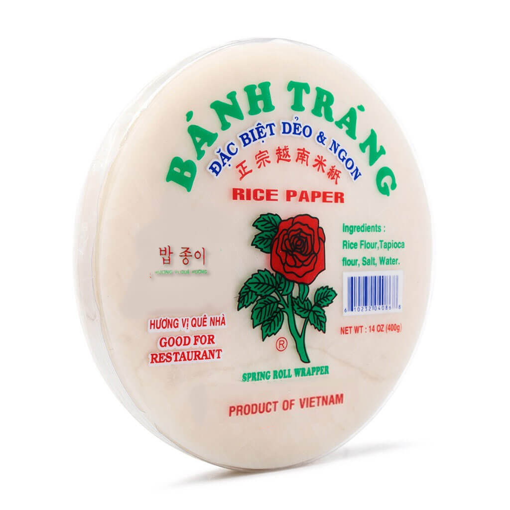
To support them, my Grandma started supplying the Vietnamese ingredients. That’s how the Rose Brand was born for export.
Nowadays, you’d probably find it in just about any Asian shop around the world, thanks to my Uncle’s work who made it available to all.
As far as I can remember, our favourite dinner topic when we visit each other overseas is what local ingredient we have tried to spark our Pho’s to the next level.
After I landed in Shanghai to start our family in my wife’s country, I too embarked on my quest to offer the best Pho to our local community.
Though inspired by my family’s story, my Pho Store aspires to be simple, minimal so you can fully enjoy the flavors of your Perfect Bowl in a comfortable environment.
FROM WHIMSCAL TO FASHIONABLE
Connecting to a new demographic
Pho Store’s new target demographic wanted something simple and stylish. Clean like Hey Tea and Apple, cool like COS and ZUG ZUG.
Generate Insights, Understand the consumer journey
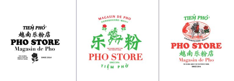
Rethink and Redesign into an impactful Brand Identity
Build a Toolkit ready for anything
MAKING THE STORE A STORE
Deep connection to the brand story.
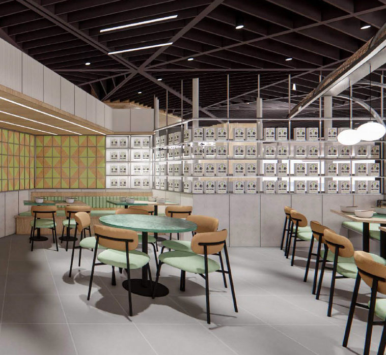
Taking inspiration from shops like Aesop, we wanted to bring the idea of Asian supermarket into 2022 high end shopping malls.
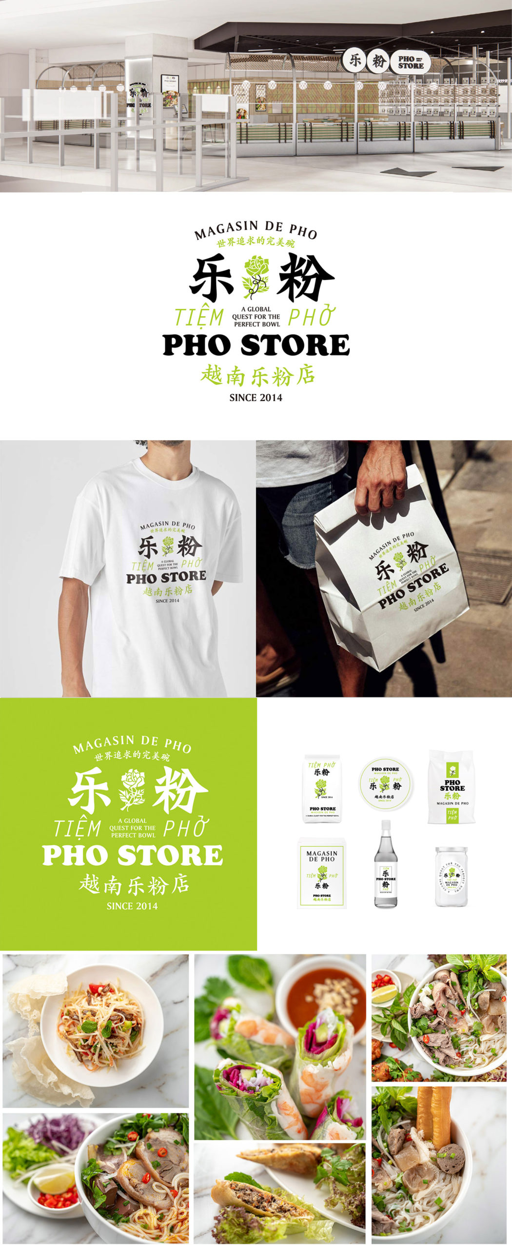
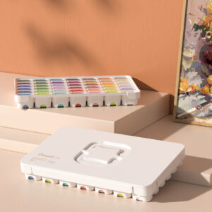
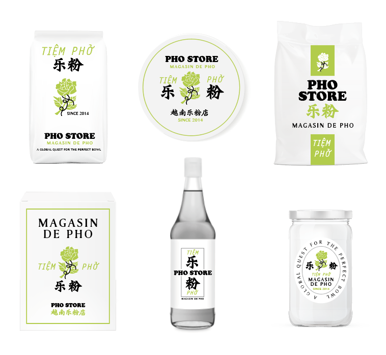
We created a set of packaging for all the ingredients of pho, all reminiscent of the owners grandmothers famous Rose Brand. These sit along the walls of the restaurant like a high end store, creating both and art installation, interior design feature, and deep connection to the brand story.
Interior design by Studio Doho
MENU DESIGN, THE BEFORE AND AFTER
How can you still communicate great value lunch deals, but also appear premium
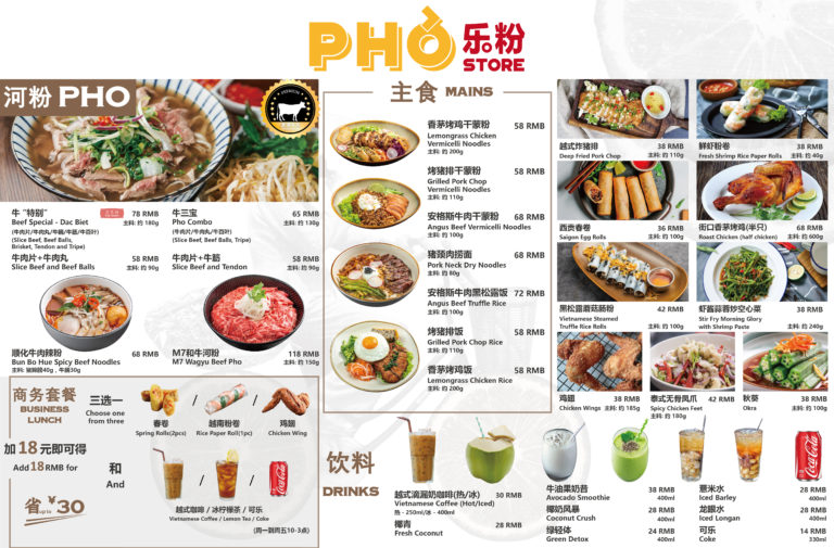
BEFORE
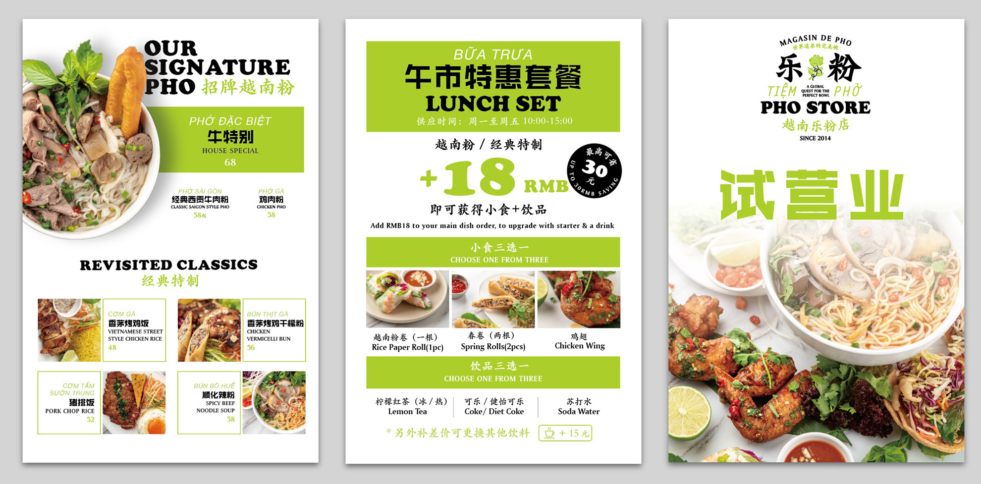
The new menu conveys quality, yet is simple to read and quick to order from.
Lunch sets are a huge part of the business, they need to be quick, concise and sell value.
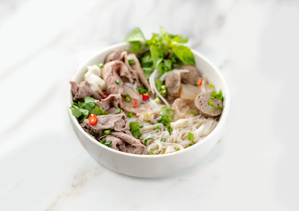
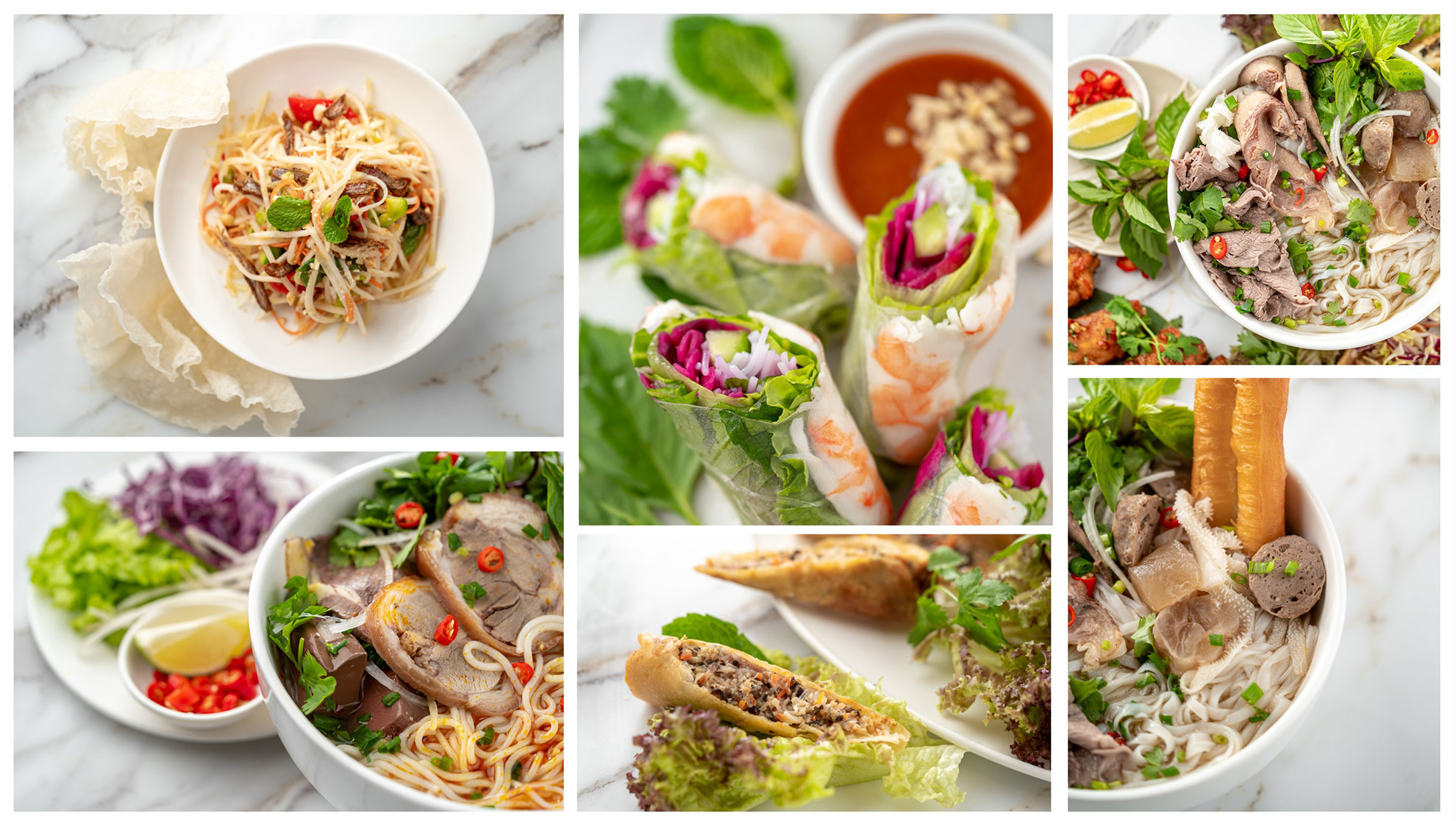
FOOD PHOTOGRAPHY
Something as simple as having a clearly defined brief for all your product photography not only creates a recognizable brand, but can quickly communicate your position in the market.
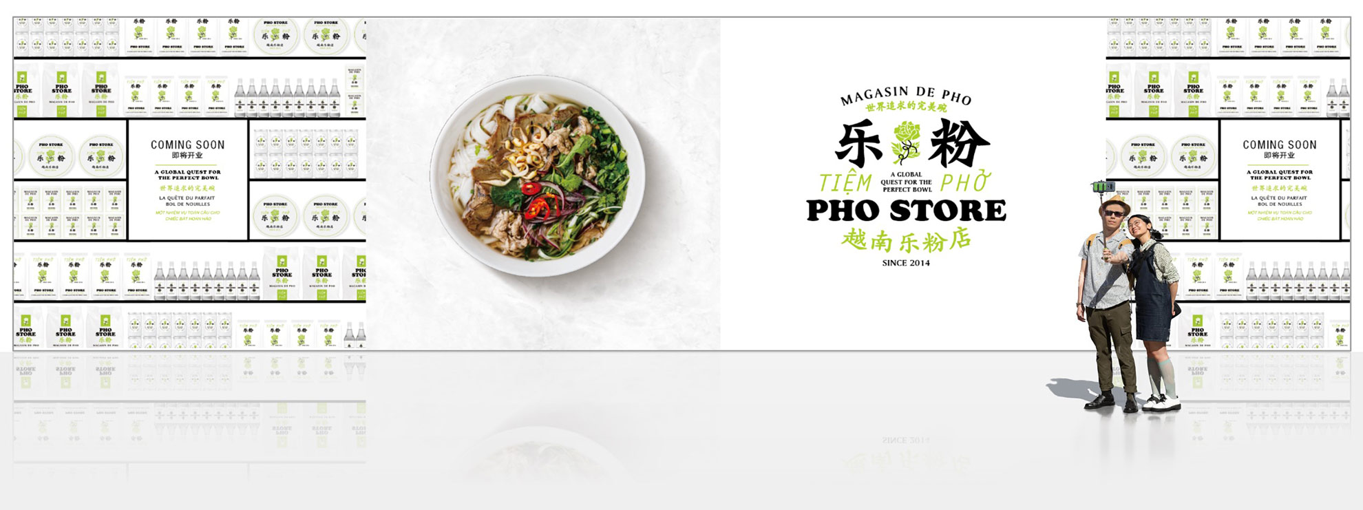
BRAND SIGNAGE
At Thread, we plan for all aspects of signage and wayfinding. Signage is an essential element of branding. It helps creating a recognizable and memorable image for your cafe that customers can associate with your products and services. Consistent and high-quality signage reinforces your brand proposition and build customer buy in.
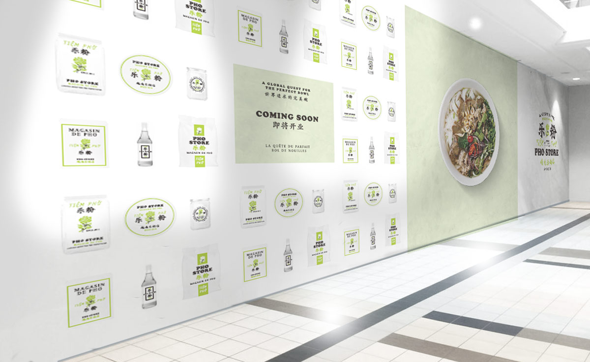
PRE OPENING BRANDING
Pre-opening helps to build anticipation and excitement among potential customers for the opening of your shop. By creating a buzz around your brand and generating interest in your concept, you already have a queue of customers ready to line up when your store will open.
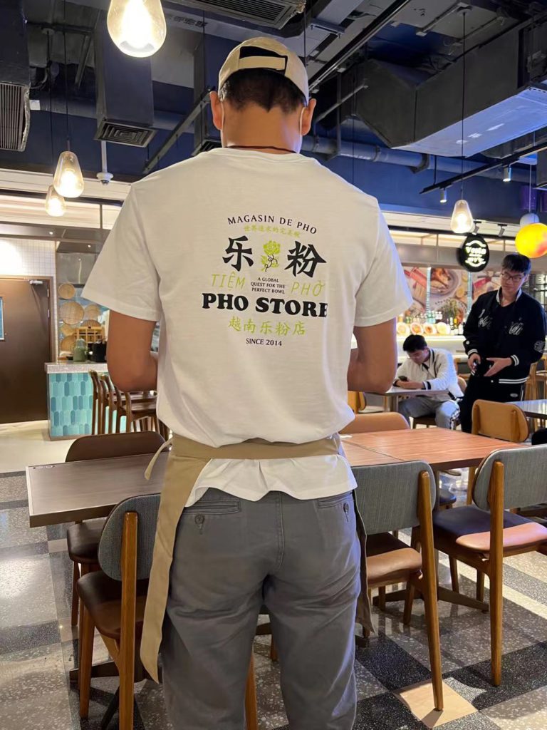
Turning our TEAM into brand ambassadors
Consider working with a local fashion designer on the uniforms. The staffs love their aprons, khaki pants, cap and shoe choice.
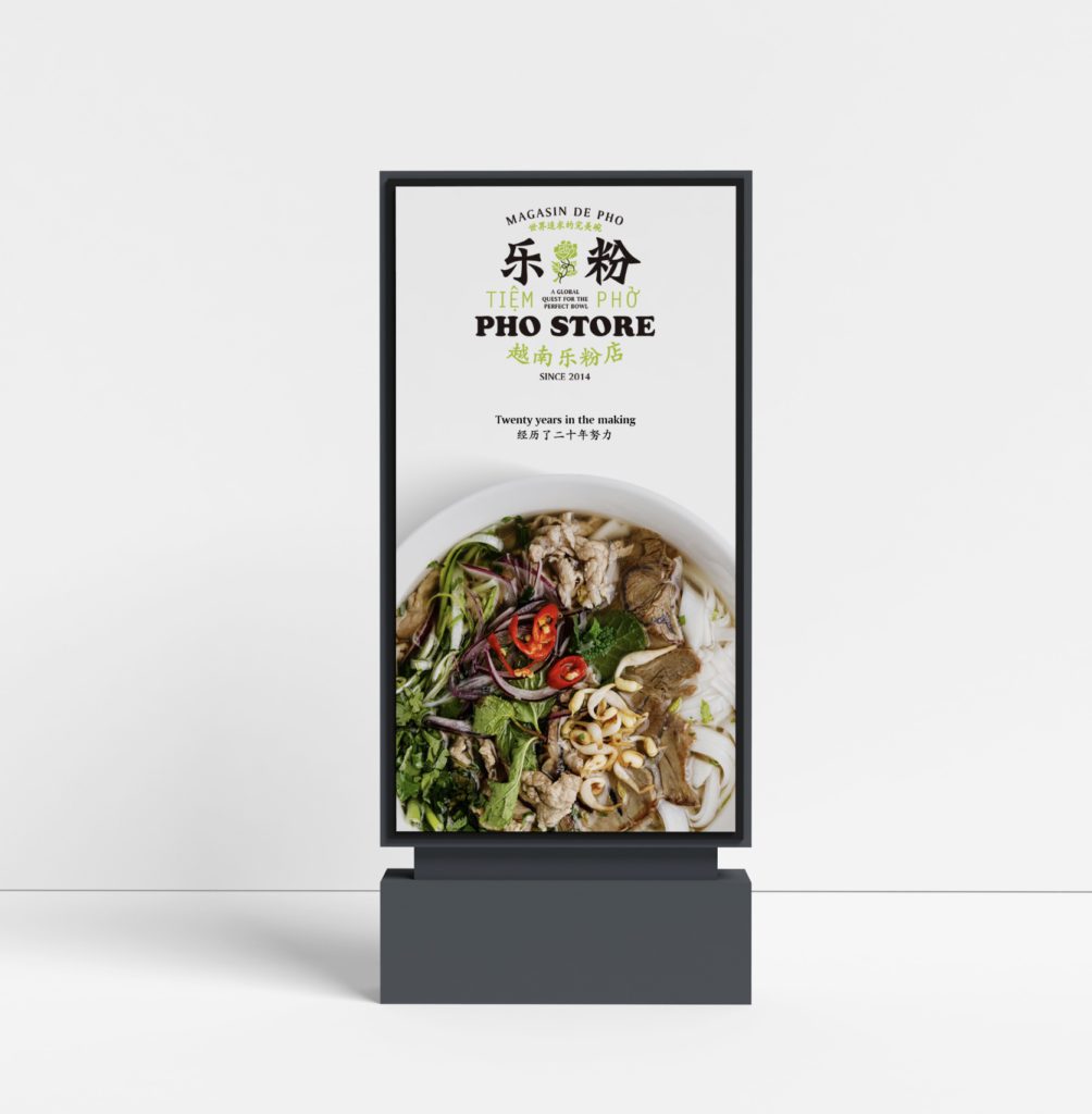
Mall Advertising
Our brand packaging included a comprehensive marketing template plan to help mall landlords drive traffic as well.
...AND FINALLY
Turning six months of strategy design and marketing assets into guidelines.
Brand guidelines convey a variety of information and tips about your brand, useful both internally to your company or organization and externally to your affiliates, partners, and customers. Although there is no industry-wide standard for what constitutes a brand standards document, the most notable organizations use brand guidelines as a tool to help everyone understand how to represent their brand.
Good guidelines connect different aspects of your brand, such as your logo, colors, and typography, to form a cohesive identity.
Great guidelines are highly useable, both to for you to check that anything you do is on brand but also, to create anything new in the future that you didn’t know yet you needed when they were written!
What did the client think?
Amazing work and I really appreciate how you guys came up with such a creative solution. For us it was a journey into the ‘unknown’, knowing we wanted to elevate Pho Store and its business through its branding. I think we got there with Thread’s professionalism, care and guidance. Furthermore, all the work delivered at the end towards the mad rush of opening a store whilst I was not there was greatly appreciated.
Stephen, Founder CEO
Your 5 most important points checklist while (re)branding your restaurant
Define your personality, Who are you?! Before you start the rebranding process, it’s important to have a clear idea of what you want your restaurant brand to stand for. Consider what makes your restaurant unique and how you want to position yourself in the market.
Know your target audience: Understanding who who, and what they are looking for in a dining experience is crucial when rebranding a restaurant. Conduct market research to gain insight into your target demographic’s preferences and habits.
Develop a consistent voice: Your brand voice should reflect the personality and values of your restaurant. Ensure that your messaging is consistent across all touchpoints, including your website, social media, and advertising.
Revamp your menu: Rebranding a restaurant is an opportunity to update and refresh your menu. Consider incorporating new dishes, updating existing ones, and sourcing local, sustainable ingredients.
Refresh your space: This might have been at number one, but it can be big budgets. A restaurant’s interior is a significant part of its brand identity. Consider updating the décor, lighting, and layout of your space to reflect your new brand identity. This can help create a more cohesive and memorable dining experience for your customers.
Read more about the rebranding challenges in Justine’s article here.

